The Search for a Better Accordion


Userlevel 7
Badge +5

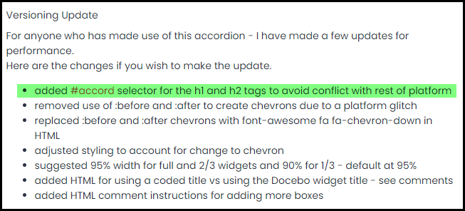
Warning - Long geeky post ahead!!

Lots of questions have come up surrounding accordions.

I’ve toyed around with these and shared a relatively simple example in my animation series.

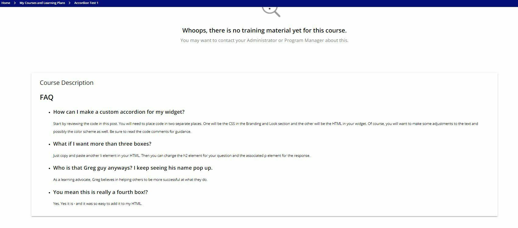
I have since put together an FAQ accordion that I believe looks and functions well - at least in my environment. I have taken the CSS and heavily commented it for your ease of application to your own environments should you wish to make use of it. I’ve also added a short gif and some pictures so you can sort of see it in action.

The code provided is for exactly what you see in this post.

You’ll want to adjust as desired and test as usual for your environments.

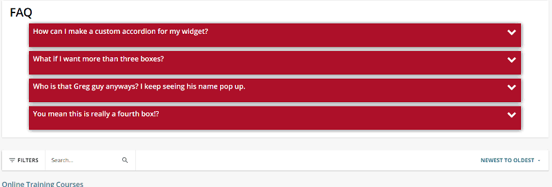
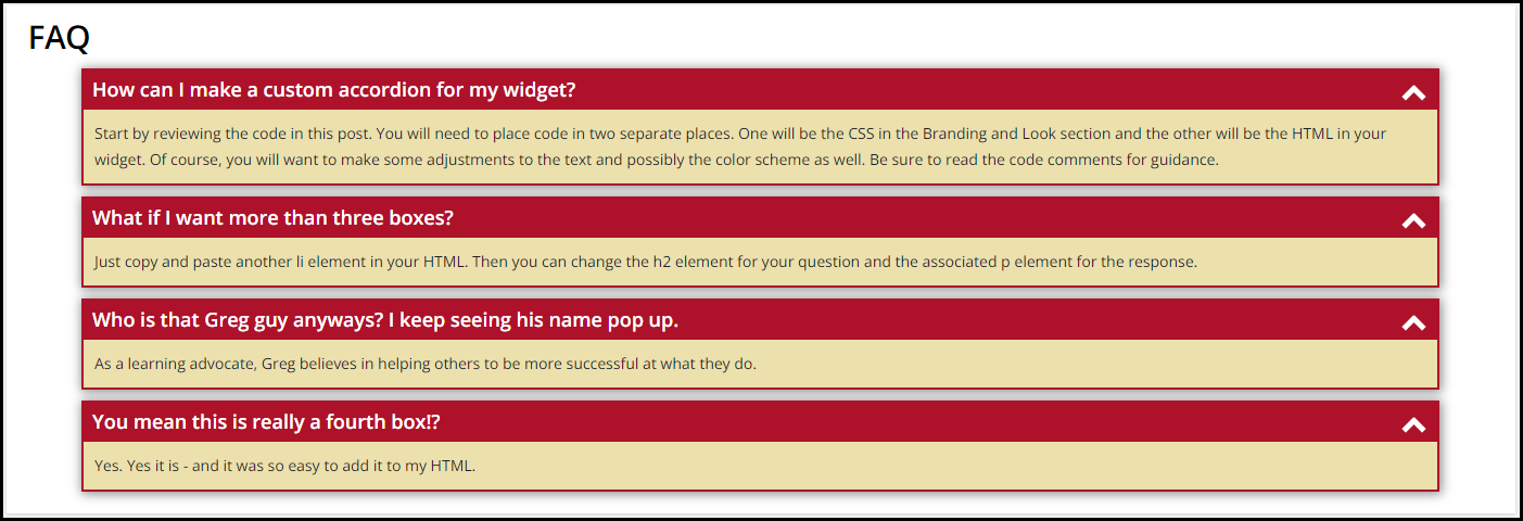
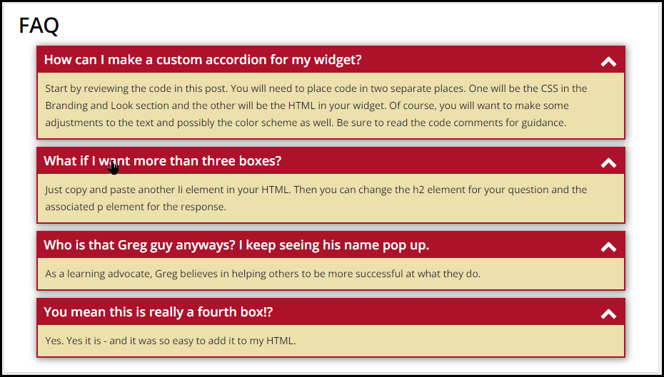
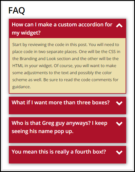
Here is a picture in full, 2/3, and 1/3 size widgets.


Here is the CSS for your Branding and Look section

/** Sticky Accordion **/

/** Removes the little icon and positions your title for the box **/

#accord ul {
list-style: none;
padding: 0px;
margin: 0px;
}

/** Set background color as desired for the overall box and popout border **/
/** Set box-shadow as desired or remove **/
/** Width will be total amount of widget taken up - 90% looked good to me **/

#accord ul li {
position: relative;
overflow: hidden;
padding: 0px;
margin: auto;
width: 90%;
background: #AD122A;
box-shadow: 1px 1px 10px 1px #888888;
}

/** Set the spacing between each box **/

#accord ul li + li {
margin-top: 10px;
}

/** Set the spacing between your last box and the bottom of the widget **/

#accord ul li:last-of-type {
margin-bottom: 20px;
}

/** Positions the chevron at the far right of the box **/
/** Tweak the top and right values as desired **/
/** If you adjust the size of the chevron, you'll want to do top and right **/

#accord ul li i {
position: absolute;
transform: translate(-6px, 0);
margin-top: 15px;
right: 20px;
}

/** Sets the color and size of the chevron **/
/** A ratio of 1:3 of width to height works well **/

#accord ul li i:before, ul li i:after {
content: "";
position: absolute;
background-color: #ffffff;
width: 5px;
height: 15px;
}

/** If you adjust the width and height of your chevron, adjust the pixels **/
/** to keep them lined up or else they will look like an X **/
/** These will change the chevron when you open and close the boxes **/

#accord ul li i:before {
transform: translate(-4px, 0) rotate(45deg);
}
#accord ul li i:after {
transform: translate(4px, 0) rotate(-45deg);
}
#accord ul li input[type=checkbox]:checked ~ i:before {
transform: translate(4px, 0) rotate(45deg);
}
#accord ul li input[type=checkbox]:checked ~ i:after {
transform: translate(-4px, 0) rotate(-45deg);
}

/** This removes the checkbox and makes the entire box clickable **/
/** This also sets the cursor to be a pointy hand on hover **/

#accord ul li input[type=checkbox] {
position: absolute;
cursor: pointer;
width: 100%;
height: 100%;
z-index: 1;
opacity: 0;
}

/** Sets the border width of the dropdown - adjust as desired **/
/** Sets the background color of the dropdown area - adjust as desired **/
/** padding should be adjusted based on margin width as desired **/

#accord ul li p {
margin: 2px;
background: #ece0ad;
padding: 10px;
}

/** This corrects the breadcrumb bar chevron malfunction caused by accordion **/

doc-layout-breadcrumbs .hierarchical-breadcrumbs ui-icon {
margin-right:10px;
}

/** Sets the title text color when the box is closed **/
/** Adjust this value as desired **/

#accord ul li input[type=checkbox]:checked ~ h2 {
color: #ffffff;
}

/** Sets the title text color when the box is open **/
/** Sets positioning of the text in the box **/
/** Adjust values as desired **/

h2 {
margin: 5px 10px;
color: #ffffff;
}

/** Hides the dropdown text when box is closed **/
/** Transition gives a little time for the fade out - adjust as desired **/

#accord ul li input[type=checkbox]:checked ~ p {
max-height: 0px;
transition: .5s;
opacity: 0;
}

/** This gives a little time for the fade in - adjust as desired **/

#accord ul li input[type=checkbox] ~ p {
transition: .5s;
}

/** This styles the main title of the accordion - FAQ in this example **/
/** Adjust as desired **/

h1 {
margin: 5px 20px;
color: #000000;
}


Here is the HTML for your widget.

<div id="accord">
<h1>FAQ</h1>
<ul><li>
<input type="checkbox" checked="checked" value="" /><i></i>
<h2>How can I make a custom accordion for my widget?</h2>
<p>Start by reviewing the code in this post. You will need to place code in two separate places. One will be the CSS in the Branding and Look section and the other will be the HTML in your widget. Of course, you will want to make some adjustments to the text and possibly the color scheme as well. Be sure to read the code comments for guidance.</p>
</li>
<li>
<input type="checkbox" checked="checked" value="" /><i></i>
<h2>What if I want more than three boxes?</h2>
<p>Just copy and paste another li element in your HTML. Then you can change the h2 element for your question and the associated p element for the response.</p>
</li>
<li>
<input type="checkbox" checked="checked" value="" /><i></i>
<h2>Who is that Greg guy anyways? I keep seeing his name pop up.</h2>
<p>As a learning advocate, Greg believes in helping others to be more successful at what they do.</p>
</li>
<li>
<input type="checkbox" checked="checked" value="" /><i></i>
<h2>You mean this is really a fourth box!?</h2>
<p>Yes. Yes it is - and it was so easy to add it to my HTML.</p>
</li>
</ul>
</div>

Hopefully this is useful for someone.

Have a great day!


46 replies

Userlevel 7
Badge +5

@Bfarkas - Yeah, that was the point of having everything in a parent div with the ID  #accord. I only wanted to target objects inside that div. I may not have been unique enough.

I could test the same code and change the ID and make it more quirky to see if that helps but I honestly like the use of the font-awesome chevron better anyways. 

Userlevel 7
Badge +3

Yup, accord I wouldn’t consider unique enough cuz people will do similar, I’d start with it, agree with the font awesome as well. Thinking about others coming and adding to platform too in multi-admin environments. 

Userlevel 4

@gstager The update worked like a charm! Thanks.

Userlevel 7
Badge +5

The update worked like a charm! Thanks.

Awesome!

Thanks for confirming.

Userlevel 7
Badge +5

@lrodman My hamburger menu looks like that as well.


It was something subtle that I didn’t notice for some time. I posted some updated code in a pdf that will take care of that.

Fixed!


I was also having the issue that this made all my h2 forced white text, which was undesirable in some widgets.


Does this problem persist? Or is it fixed.

Userlevel 7
Badge +5

I was also having the issue that this made all my h2 forced white text, which was undesirable in some widgets.

Does this problem persist? Or is it fixed.

In my post I described all the updates taken care of in the new code.

It does include the h2 tag


Userlevel 7
Badge +5

Fabulous! You’re the best!

@gstager : I am trying to add hyperlinks to the text in accordion but I cannot click on it. Is it possible to do the expand/contract just by click on heading or on the drop down button on right?

Userlevel 7
Badge +5

@hsingh - This request was actually brought up earlier in the thread.

Take a peek at the first page of comments and look for the post from @Allan who had done a little digging into exactly what you are asking for.


Userlevel 4

I copied and pasted exactly what was provided to test, and it did not work at all? Any suggestions?


Userlevel 7
Badge +5

@Scott Foster - My code assumes placing the CSS in the custom styles area and the HTML in an HTML/WYSIWYG widget for a page.

If you are trying to go with training materials - you would need to put the CSS in the course player area. I have not tried that so I am not 100% sure of the result at this point. 

Looks like you have volunteered to be the guinea pig on that.

Let me know how that plays out.


Userlevel 4

@Scott Foster - My code assumes placing the CSS in the custom styles area and the HTML in an HTML/WYSIWYG widget for a page.

If you are trying to go with training materials - you would need to put the CSS in the course player area. I have not tried that so I am not 100% sure of the result at this point. 

Looks like you have volunteered to be the guinea pig on that.

Let me know how that plays out.


It looks/functions correctly in the Course Description area but in the User view it doesn’t? Any ideas why the difference?

Looks perfect here.


But not in the ‘real world’…


Userlevel 4

Would you be able to re-upload that update PDF? it seems to be expired? THAnk you!!

Userlevel 7
Badge +5

Would you be able to re-upload that update PDF? it seems to be expired? THAnk you!!

Hmm… I didn’t realize that our uploads expired but here it is.

As for the differences above - I am not sure. It makes me think of areas like certificates or email notifications where it seems rules are a bit different and so not everything works or works as expected.

Does anyone know how to add a responsive background image to the accordion?

Thanks 

Userlevel 4

Would you be able to re-upload that update PDF? it seems to be expired? THAnk you!!

Hmm… I didn’t realize that our uploads expired but here it is.


Thank you! I will review and compare with my existing code. 🤞🏻

Userlevel 4

I still can’t get this to work in User View. Has any one else had luck with this?

Userlevel 7
Badge +5

I still can’t get this to work in User View. Has any one else had luck with this?

I finally have an opportunity to use this in our site!  It works BEAUTIFULLY in our sandbox, but in production I can’t get the chevron to appear. 

I have no idea why either.  Both instances have the same exact CSS.  @gstager, have you encountered CSS working perfectly in the sandbox and not in production? You have any recommendations for troubleshooting?

Userlevel 7
Badge +5

@Annarose.Peterson - Hmm… We don’t have a sandbox to play with so I cannot speak from XP there.

As for the chevron… I think the first place I would look is for any other CSS in production that might be interfering.

Beyond that - it gets a bit more challenging.

Like do we have a missing angle bracket somewhere that is breaking things?

You might copy/paste all the production CSS into VS Code or something and try a search for rules that touch the chevrons.

Maybe try adding some page or widget specific ID/classes to the CSS to isolate it better.

Just some quick rambling thoughts.

Thank you so much @gstager!  You are a rock star!  Went through all the codes and it looked great and there was nothing else that I could see that would impact the chevron.  It was totally in my HTML code.  I was missing a class. 🤦🏻🤣

Thank you so much made my day. @gstager 

Reply