Can anyone tell me where you can edit and rename these widget headings? e.g. instead of ILT I would want something like ‘Upcoming courses’
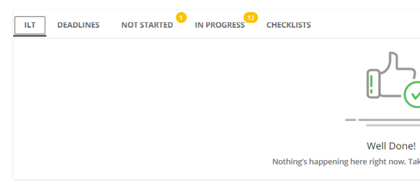
Can anyone tell me where you can edit and rename these widget headings? e.g. instead of ILT I would want something like ‘Upcoming courses’

Hi
You should be able to change all instances of this in the Localization Tool.
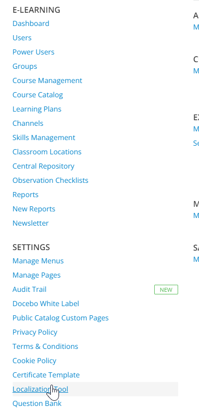

Hope this helps.
Just be aware, this will change it in a lot of places if not careful, so if you make it generic like courses, it may get confusing in areas where the types are distinguished like in this spot, since iLT are a special kind of course.
So our goal would be to target just this widget on this page.
That may be a harder than it seems -
Using CSS for modification of anchor tag text… ugh
I’d prefer a different tool that is not at Docebo user disposal.
You’re looking for something like below - correct..?
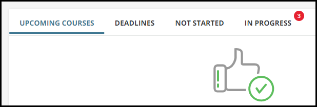
Remember if done with CSS instead of through the system in this case, since it is a nav based item, if using the app, they would see iLT still, so would need to educate on the difference and why….
Remember if done with CSS instead of through the system in this case, since it is a nav based item, if using the app, they would see iLT still, so would need to educate on the difference and why….
Yeah - a CSS solution in this instance is really not recommended.
Kinda like using a putty knife to open a jar of pickles
Might be able to get it open… but it may likely make a mess.
I imagine the CSS for those tabs is numbered too right? And since you can adjust which and how many tabs appear, adds another potential whoopsie?
I imagine the CSS for those tabs is numbered too right? And since you can adjust which and how many tabs appear, adds another potential whoopsie?
Yes - I did some quick tests to see if they would change. They do.
Some menus seem to have numbers but are fixed where others will change dynamically making them difficult to target.
I have exhausted my limit of toying with this one.
I will leave it to an expert.
Sorry
find the labels and add a letter or number without changing the text. Then browse the site to where the changes appear. This should help you locate the proper label + see if there are any other spots where that change would also take place.
this excercise will show you if it’s just one change or whether the change affects several spots you may want to adjust the text to accommodate, etc.
Love this idea
Thx
forgot to also mention that I find it critical to maintain a change log for all label changes. Makes it easier to revert or update them in the future
100%
Thx
forgot to also mention that I find it critical to maintain a change log for all label changes. Makes it easier to revert or update them in the future
Yes - I also keep a log of localization changes
Thx
forgot to also mention that I find it critical to maintain a change log for all label changes. Makes it easier to revert or update them in the future
Yes - I also keep a log of localization changes
Literally just finished writing a paragraph on the importance of tracking changes for a thing I’m working on...
Thanks all for your comprehensive answers. I did go into the localisation tool before posting but i couldn’t find which one related to that tab (i couldn’t find any instance of just ILT)
can anyone give me a screenshot of where in the localisation tool i could change it?
Ultimately i just want a quick ‘at a glance’ way of showing what courses are coming up for our staff. The ‘my courses’ area bundles everything together (including e-learning) and its not in date order so sometimes people get a bit confused.
They prefer this widget over the calendar for that? Just curious as from conversations have typically found the reverse to be true so intrigued.
They prefer this widget over the calendar for that? Just curious as from conversations have typically found the reverse to be true so intrigued.
I also have another question about something else I'd like on the home page. The learning plan widget would work really well but for one flaw - it only lets you see ‘not started’ or ‘in progress’ but not the 2 together. Is there a way of getting both or would i need 2 widgets.

Ha, this is like the single thing eveyrone runs into at somepoint when designing homepages. There’s a bunch of ideas/votes for it around. It is so surprising because they do the demo of having the ‘not started’ ‘in progress’ ‘completed’ buckets everywhere, which look cool, but aren’t very practical in real use.
Long story short, the answer is not possible currently out of the box, solve ½ today, sorry.
Here’s the idea:
Although, this should be added in a number of places, like reports too, right now run multiple reports and merge them for this daily.
thanks. i almost thought i could get away with 2 widgets but unfortunately if one of the widgets contains nothing it shows this obnoxious picture which pushes everything else down the page.
last question today i promise. can we supress this image and show nothing instead?
I think most end up doing columns next to each other so that there is usually one that has content.
To hide that entire message:
.ui-blank-slate {
    display: none;
}
If just image and leave text:
.ui-blank-slate ui-illustration {
    display: none;
}
gold star for you today. that worked like a charm!
Hi
You should be able to change all instances of this in the Localization Tool.


Hope this helps.
Hi. When I click on this, all I see is language options and nothing else. What am I missing?
You gotta select the hamburger next to one of the languages and it will bring you into the details more.
Enter your email address or username and password below to log in to Docebo Community. No account yet? Create an account
Enter your E-mail address. We'll send you an e-mail with instructions to reset your password.