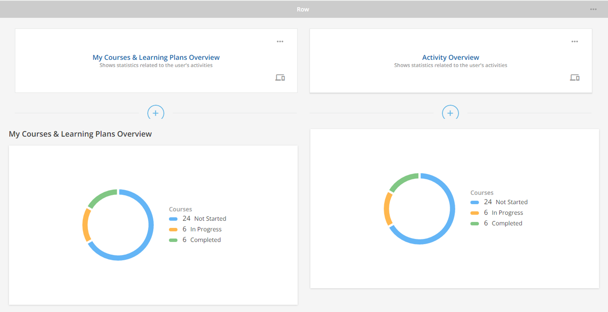
Also i feel, it would be nice to make that pie chart clickable to view the courses under different statuses.
THIS! Super nice. Would actually be nice to then be able to click into the course too.
Yeah the KPI widget is “meh” as is. Nothing but a pretty visual. Drilling into what courses were taken or a view of the built in catalog page to a cooked view? Begins to add some practical value and it would make that much more sense to have on a page for people.
From what I can tell, your image might be showing the same widget side by side (showing the Activity Overview widget twice)?
The “Activity Overview” widget shows a chart with the stats of courses in Not Started, In Progress, and Completed. It doesn’t have any courses or learning plans to click on.
The “Courses and Learning Plan” widget is a card or a list showing rows or boxes of the learner’s courses and/or learning plans by status. There are options to display a certain status or all statuses, if you want to see it as a card or list, can hide the courses inside the learning plan not to display, etc.


