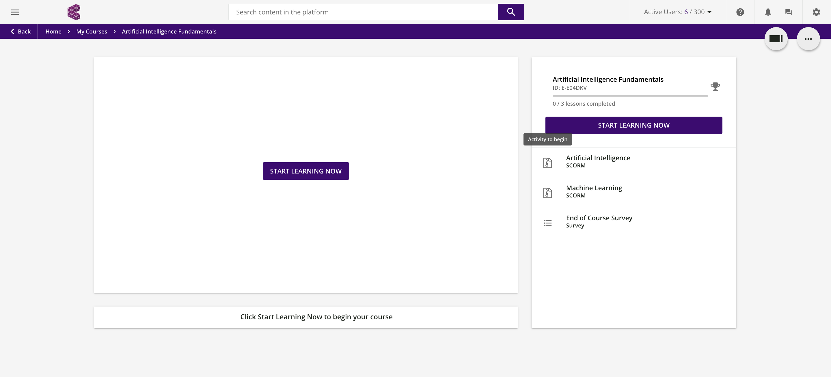
When a user opens a course they see the following screen. The biggest area of the screen is the big white box with a “START LEARNING NOW” button in the middle. Is there a way to make better use of this part of the screen? Ideally we would like to have a description of the course in this big white box.


