Question

Help Please - clickable HTML Widget with text


Userlevel 3
  • Influencer I
  • 42 replies

Hi there,

Can anyone help me with some HTLM code please?

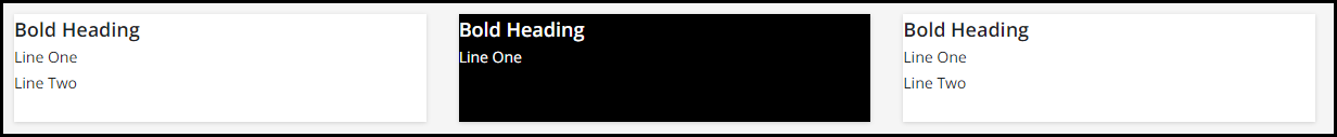
I’m trying to create an HTML / WYSIWYG widget looking similar to the one below:

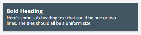
I want to have a series of these (in the 3 across formation), in different colours, on a page that can be clicked to go to another page in Docebo.  I am struggling to get it to format properly and stay a uniform size (when the sub-heading text is only one line for example).

I don’t want to use a Custom Content widget as these are too big and taking up too much screen room.

Can anyone offer me some guidance, or direct me to some online learning resource where I can figure it out for myself?

Thanks very much (and Happy Friday!)

Sean


14 replies

Userlevel 7
Badge +5

Have you tried setting the height? Pick a value that works for you on the widget height.

I think this is what you were driving at.

Before

After


Userlevel 7
Badge +5

Sometimes when I’m struggling with keeping things uniform, I create images of my text using like powerpoint or photoshop.  Then I pop the images into a table. This way everything stays uniform, and I can keep the block size the same no matter the amount of text.  Also, the images resize appropriately when you re-size the browser.

Userlevel 4

@Annarose.Peterson Can you share a little more about this? Do you put the table into the custom content box or something different? 

Thanks!

Userlevel 7
Badge +5

@Annarose.Peterson Can you share a little more about this? Do you put the table into the custom content box or something different? 

Thanks!

@dandrews, I use the HTML/WYSIWYG widget.  I start by putting the code for my table under the HTML code option:

Then, I move to the WYSIWYG option and add my images using the WYSIWYG tools:

Here is is the blank table code for that I used above:

<table width="100%" border="1" cellpadding="3">
<tbody>
<tr>
<td>&nbsp;</td>
<td>&nbsp;</td>
<td>&nbsp;</td>
</tr>
<tr>
<td>&nbsp;</td>
<td>&nbsp;</td>
<td>&nbsp;</td>
</tr>
<tr>
<td>&nbsp;</td>
<td>&nbsp;</td>
<td>&nbsp;</td>
</tr>
</tbody>
</table>

I keep the width at 100% so that the table takes up the entire HTML widget space, and it will resize everything appropriately.

Userlevel 3

Thanks @gstager, I have been trying the height option.  But because I wanted a background colour to my tile, when the contents are smaller, I end up with a white strip at the bottom of the tile, not the colour of the background.

Userlevel 3

Thanks @Annarose.Peterson.  I have played around with making images of my tile and uploading them, but again I found the sizing an issue - getting them to be a small enough, but clear enough tile.

For context, at some point I anticipate having something like 12-15 tiles, so I don’t want them taking up too much depth.

The Table idea might be an option… that might help me position things appropriately.  As long as I’m able to apply clickable link to each image in the table, that could be a solution for me. 

Thanks!

Userlevel 7
Badge +5

Thanks @gstager, I have been trying the height option.  But because I wanted a background colour to my tile, when the contents are smaller, I end up with a white strip at the bottom of the tile, not the colour of the background.

Perhaps a little CSS to target your boxes..?

#doc-widget-263 .htmlwidget {
background: black;
color: #fff;
}

In this case, I targeted the middle one which would have the white line.

Of course - your ID would need to match the boxes on your platform.

Userlevel 7
Badge +3

@Annarose.Peterson Can you share a little more about this? Do you put the table into the custom content box or something different? 

Thanks!

@dandrews, I use the HTML/WYSIWYG widget.  I start by putting the code for my table under the HTML code option:

Then, I move to the WYSIWYG option and add my images using the WYSIWYG tools:

Here is is the blank table code for that I used above:

<table width="100%" border="1" cellpadding="3">
<tbody>
<tr>
<td>&nbsp;</td>
<td>&nbsp;</td>
<td>&nbsp;</td>
</tr>
<tr>
<td>&nbsp;</td>
<td>&nbsp;</td>
<td>&nbsp;</td>
</tr>
<tr>
<td>&nbsp;</td>
<td>&nbsp;</td>
<td>&nbsp;</td>
</tr>
</tbody>
</table>

I keep the width at 100% so that the table takes up the entire HTML widget space, and it will resize everything appropriately.

If going this route, please make sure to at least add alt text and descriptions to the images, this is a very bad technique for many accessibility reasons but also for making things easily responsive since it is all an image and locked. Anyone who can’t interact the traditional way or prefers to interact with the page in a non-traditional way will be out of luck. Tables and image text were the way in early days of the web, but there are almost always better more accessible and responsive ways to do it now a days. PSA over. 

Userlevel 7
Badge +3

Thanks @gstager, I have been trying the height option.  But because I wanted a background colour to my tile, when the contents are smaller, I end up with a white strip at the bottom of the tile, not the colour of the background.

Perhaps a little CSS to target your boxes..?

#doc-widget-263 .htmlwidget {
background: black;
color: #fff;
}

In this case, I targeted the middle one which would have the white line.

Of course - your ID would need to match the boxes on your platform.

Can’t you just do some inline style (then works in mobile app too) of something like wrap all your content in a div or p and give it a height of 100% (assuming you are setting the widget height as described) and define the background color?

Alternatively you could also wrap it and give it a unique class name and then define that class centrally, although won’t apply on mobile app, but then don’t need to hunt for specific widget ID which doesn’t seem right path for these use cases. Remember widget IDs change easily (moving them around) so tend to use as a last resort. 

Userlevel 3

Thanks very much @Bfarkas.  I hear what you are saying regarding accessibility and using a more up-to-date approach.  Trouble is, I am a real novice with HTML and CSS goes beyond my understanding, seems to make it a whole lot more complicated.  Especially as I want different colours etc.

Another thing to consider, I am probably going to want something in the range of 12-15 tiles (potentially more), and there’s a limit of 20 widgets on a page.  So, taking into consideration things like a banner, intro text, other buttons etc I am really limiting myself to available widgets.  Going the table route sounds like a less complex solution for me to fathom out.

Appreciated your thoughts on this.

Userlevel 7
Badge +5

@Sean -

Unfortunately, I don’t have the time to build out an example at the moment but I have a thought to overcome the 20 tile limit - or at least to allow you more box links.

I am thinking along the lines of a single HTML / WYSIWYG widget that you simply add boxes to with your links.

Another option would be to only add like 4 or 5 links to a widget before adding a new widget - then you could have 12-15 links with just three widgets.

Not sure if that would work for your use case but it is a thought.

Userlevel 7
Badge +3

Thanks very much @Bfarkas.  I hear what you are saying regarding accessibility and using a more up-to-date approach.  Trouble is, I am a real novice with HTML and CSS goes beyond my understanding, seems to make it a whole lot more complicated.  Especially as I want different colours etc.

Another thing to consider, I am probably going to want something in the range of 12-15 tiles (potentially more), and there’s a limit of 20 widgets on a page.  So, taking into consideration things like a banner, intro text, other buttons etc I am really limiting myself to available widgets.  Going the table route sounds like a less complex solution for me to fathom out.

Appreciated your thoughts on this.

I simultaneously understand, but almost use your reasoning as an excuse not to do it more :) Basically you are saying, not having a skill is a reason to hurt your users, to me, that’s just not acceptable. 

What i think Greg is going for and I described quick from my phone on friday is that you can get the table feel by using few wdigets and just some wrappers. For instance this took about two minutes to make as an example:


Each column shown is 1 HTML/WYSIWYG widget. Inside each widget are a series of div’s defining basically each of your content boxes. For instance, here is Widget 1:

<div style="height:33%;background-color:#ff0000;">
Insert content here.
</div>

I am doing the height as a percentage because I set a widget height, you could alternatively, not set a widget height and change the height in the above to something firmly defined, i.e. 500px.

The background-color will change out the background color, and you can add more styles inline there, i.e. color to change the font, to impact the div only.

Here is the Widget 2 example:

<div style="height:33%;background-color:#0000ff;">
Insert content here.
</div>
<div style="height:33%;background-color:#000000;">
Insert content here.
</div>
<div style="height:33%;background-color:#00ff00;">
Insert content here.
</div>

Now. Is this one page or repeated a lot? If one or a handful of instances and doing just simple styling, I would reccomend going the inline style route as shown here, it will then work on all instances of the app and be easier for you to update and know what you are updating. If you are doing these across a lot of pages, I would move to a classes route. The end product will look the same, except you only have to update the style in one spot. SO for example here is Widget 2 again using classes:

<div class="example1">
Insert content here.
</div>
<div class="example2">
Insert content here.
</div>
<div class="example2">
Insert content here.
</div>

and you would define the classes called above in the central CSS area of the admin section of your platform by putting this in:
 

.example1 {
height:33%;
background-color:#0000ff;
}

.example2 {
height:33%;
background-color:#000000;
}

.example3 {
height:33%;
background-color:#00ff00;
}

Now you can add items with these classes to as many widgets and pages as you want, and the style is defined centrally and managed by you. You can lookup common styles to add/edit to any of these to better fit your need.

If you did not have a widget restriction, you could do the same with 1 div per widget and set the height to 100% to always be full, I started combining to help deal with your potential requirements. I often do this with 1 widget for the vertical and the columns, but then you need to be good with floats and clears, a more advanced skill, but want to point it out as you might investigate and grow your skills here.

To circle back to the original point, if you are going to be as specific as your wants here and outside of direct Docebo created items, I would take the time to take a couple of html/css 101 youtube/linkedin learning/etc. courses. You will get the knowledge needed for this in about the time it would take you to make one round of the images and tables and then be set for longer :)

Userlevel 3

Thanks very much for the advice and guidence @Bfarkas, and the comprehensive information.
I have studied some basic HTLM and started some CSS training, but the CSS was going into much too much detail that was not relevant for my requirements in Docebo.

I will hopefully have some time soon to review your suggestions more thoroughly and play around a little.

Thanks again.  All the best.

Userlevel 7
Badge +3

Thanks very much for the advice and guidence @Bfarkas, and the comprehensive information.
I have studied some basic HTLM and started some CSS training, but the CSS was going into much too much detail that was not relevant for my requirements in Docebo.

I will hopefully have some time soon to review your suggestions more thoroughly and play around a little.

Thanks again.  All the best.

Excellent! Good luck on the journey! 

Reply