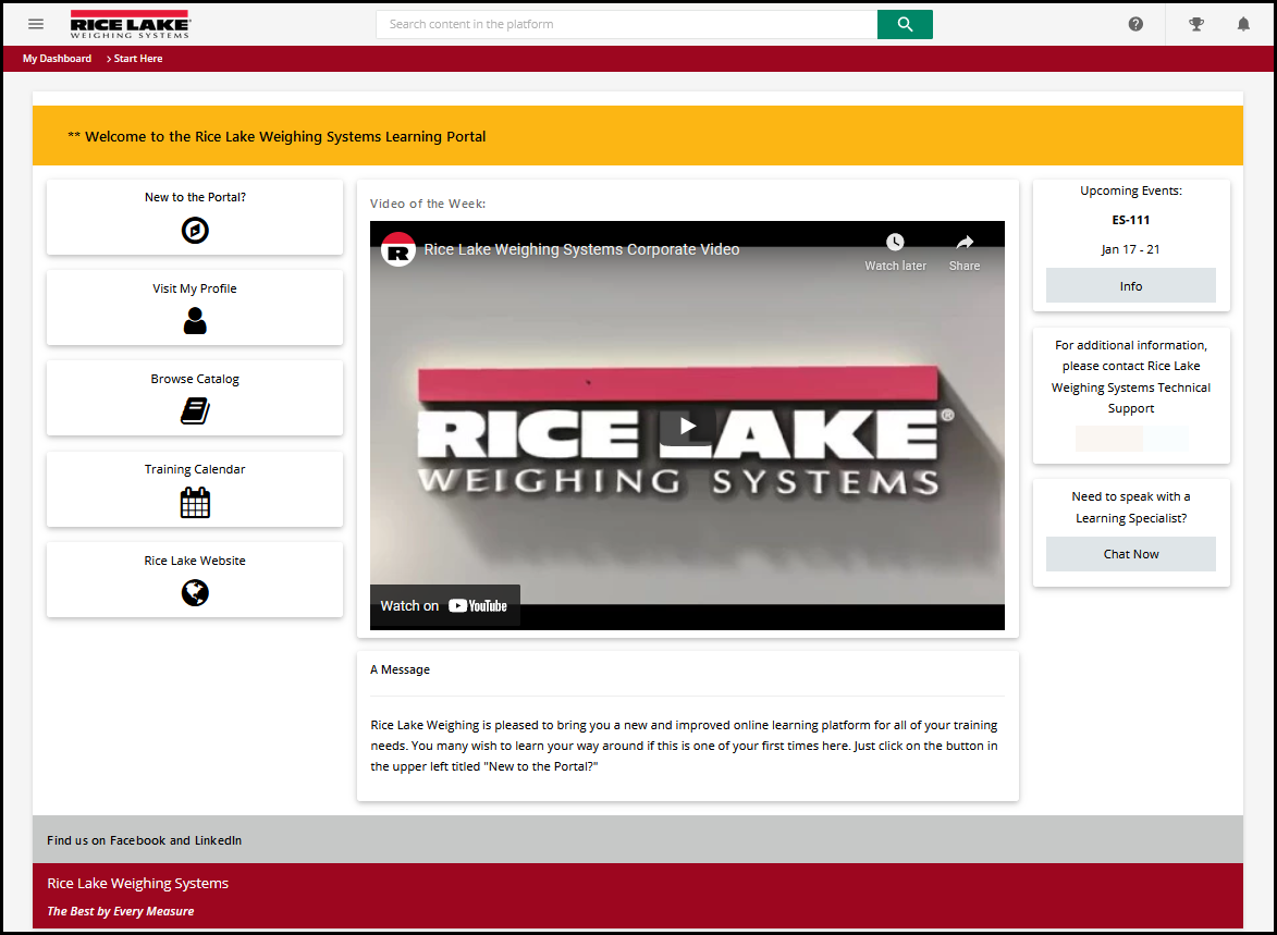
We are about a month into our onboarding now so I am having a fair amount of fun tinkering around with some custom pages and thought I would share as others have here. While this is not yet our final product, I think it will do a nice job of providing a look at what is possible. What you see below is with a single HTML/WYSIWYG Widget
Some features:
We’ve hidden the native header and footer.
A space for an “Announcement Banner”
Both Docebo internal and external links along the left
Embedded YouTube
A place for longer messages or articles
General information panels on the right side
Custom footers
gstager2 years ago
For the CSS - I leveraged the power of the w3.css library to do the heavy lifting which comes at the right cost (FREE) and is well documented and relatively simple to work with. I did throw in a little of my own to clean up some conflicts but it wasn’t too bad.
You can look into it here → https://www.w3schools.com/w3css/default.asp ← if you are not already familiar with it. **Is it OK to share that…?** Sorry if that violates something.
It started out as a “I wonder how well this would work - experiment” and turned into something that I thought looked pretty decent. At least - I thought it was good enough to share with the marketing/design team as an example of what could be done - they will end up making the ultimate decisions on how they want to lay things out.
Looks great! What does the ‘New To The Portal?’ button take you to?
New to the Portal? would be a new page where they can find information about how to navigate, how to enroll in a course, where to find help, FAQs, etc.
Very nice! Are you doing these locally or in the site wide CSS setup for the most part? Wondering how you are handling having it so customized with mobile app if you are not using locally?
@Bfarkas - CSS was placed in the Branding and Look area and then using an HTML/WYSIWYG widget in the Manage Pages area made the page.
That’s what I thought, so none of it really goes through to the mobile app experience then correct? So you essentially have two different user expereinces?
@Bfarkas - our learners are primarily desktop-based - we would potentially look at doing a custom mobile app in the future if there is enough demand.
Until then, we will be recommending tablet or larger.
That being said - the above example is not our final branded look but something I put together to show our marketing team some things that are possible with CSS.
I told them to tell me how they want it to look and I will take care of making it look that way. They’re still working on some design components.