
🚀 Feedback Wanted: New Content Center Home & Upload Flow v1 in Sandboxes!

  • November 11, 2025
  • 35 replies
  • 500 views

Hi everyone in the Product Design Group!

We're excited to announce that we are rolling out two major updates to Sandbox environments over the next few days. These represent the first building blocks of our new Content Center vision:

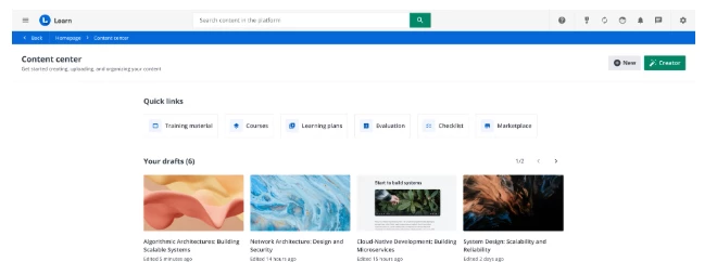
  1. The New Content Center Home Page

  2. The Upload Flow v1 (Step 1 of 3)


What’s new?


Here’s a quick overview of what you'll find.


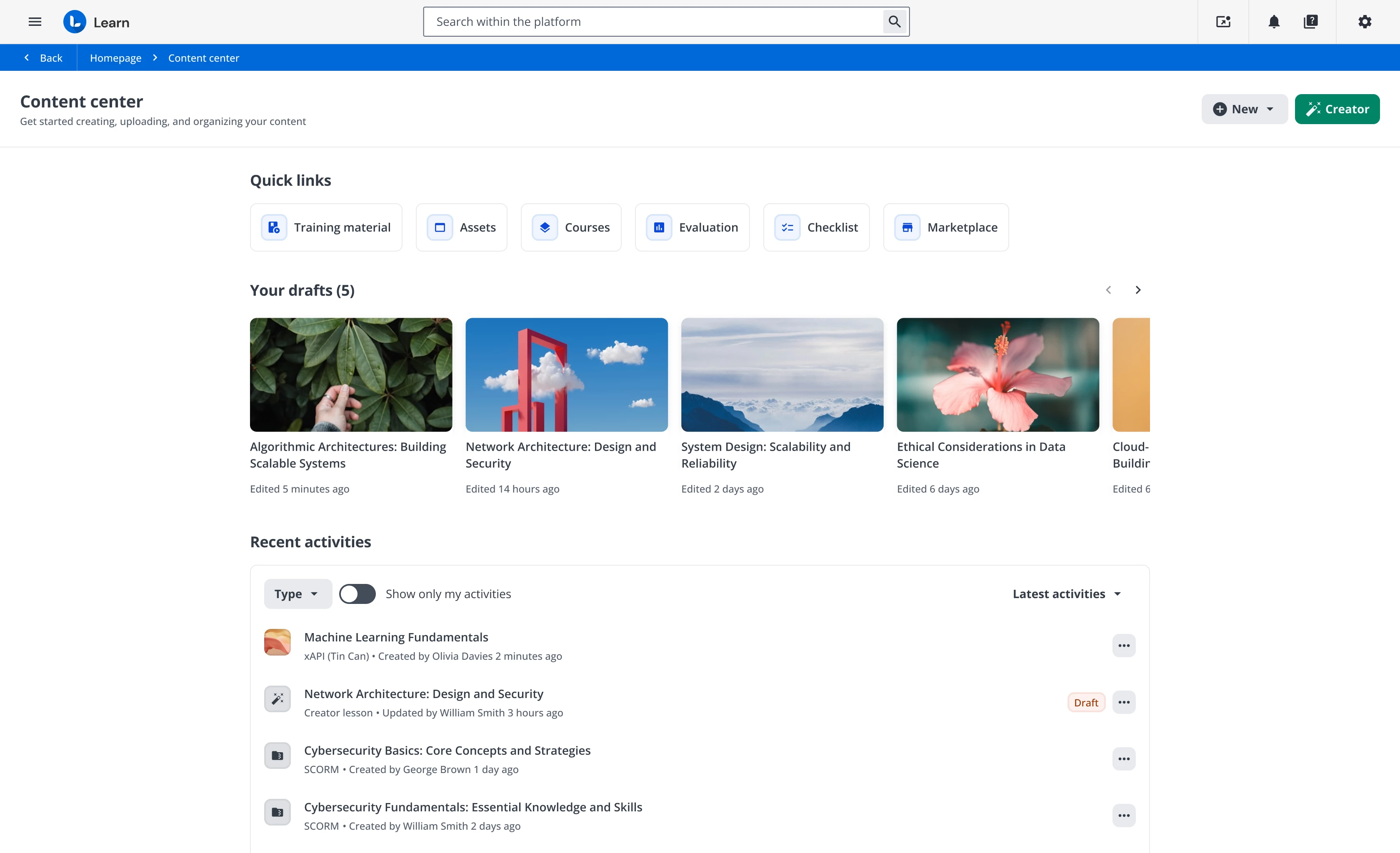
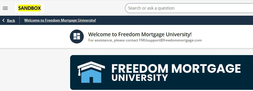
1. Content Center Home


The new main page is designed to give you immediate control and oversight. You will find:

  • An Overview of recent content activities, so you can immediately see who did what and when.

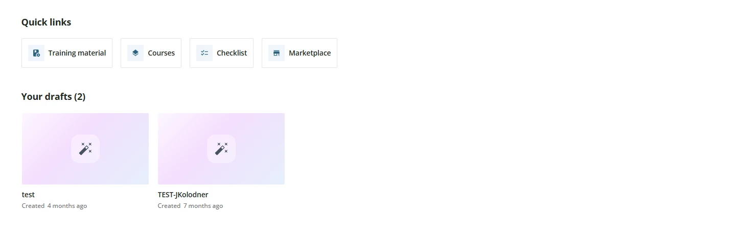
  • A Drafts section dedicated to Creator content (and lessons) that you are still building and have not yet published.

  • A Quick Links section to help you navigate faster to the different content areas of the LMS.


2. New Upload Flow v1

This first release (Step 1 of 3) is a simple reorganization of some steps in the existing user flow.

Important Note: The heavy lifting in this v1 is infrastructural and not yet visible to the user. We are paving the way for v2 (which we expect in February/March), which will bring much more impactful updates, like the long-awaited massive upload.


A step towards the Vision


These first two releases don't stand alone: they represent the foundations we are laying to build the product Vision we shared during our recent live meetings.


What’s Next?


Over the next few weeks, we will be pushing minor follow-up releases to refine the experience and fix any small issues that emerge.


💡 Your feedback is crucial


We would love to get your first impressions on these two releases. Please, when you have time, take a look in your Sandboxes and let us know what you think.

  • Does the new Home help you get a clearer picture?

  • Are there any quick links missing?

  • Even though it's a simple reshuffle, does the Upload Flow v1 feel more logical?

We're looking forward to your comments below! 👇

Thanks all!

35 replies

Forum|alt.badge.img+4
  • Helper III
  • November 13, 2025

When i click on the Content Center:

  • Under Quick link - I do not see the files we have in the File Repository of a course.
  • Under Recent activities - I see a SCORM content at the top, but when I click on it, it does not show me how many courses this content is assigned to. And when I click on the 3 dots to the right it still does not show me what course it is assigned to. This is important to us. Instead, I click on Training Material under Quick Links and it takes me to the Central Repository to see this after I search for the content.
  • Under Quick links - I click on training material, assets, courses, checklist and marketplace and was not sure on how to get back.  I guess I click on the Back key and it worked. I thought there would be something on the screen to take me back. However, I do like the quick links.


  • Author
  • Former Docebian
  • November 14, 2025

When i click on the Content Center:

  • Under Quick link - I do not see the files we have in the File Repository of a course.
  • Under Recent activities - I see a SCORM content at the top, but when I click on it, it does not show me how many courses this content is assigned to. And when I click on the 3 dots to the right it still does not show me what course it is assigned to. This is important to us. Instead, I click on Training Material under Quick Links and it takes me to the Central Repository to see this after I search for the content.
  • Under Quick links - I click on training material, assets, courses, checklist and marketplace and was not sure on how to get back.  I guess I click on the Back key and it worked. I thought there would be something on the screen to take me back. However, I do like the quick links.


Thank you for this detailed feedback and these questions.

The new Content Center page is the first version of an area that will evolve significantly. For now, it includes three main sections:

  1. Quick Links: These links are designed to give you fast access to the main content-related areas of the LMS. As you'll notice, we've renamed the "Central Repository" to "Training Material".

  2. Your Drafts: This section is visible only to those who use our authoring tool (Creator). This is because the "Draft" status applies exclusively to "Creator Lessons." If you do not use Creator, this section will not appear.

  3. Recent Activities: This table lists a maximum of 20 recently created or updated Training Materials. It shows who did what and when, providing a quick overview of your and your team's work. For each TM, the action menu allows you to edit, assign to courses, preview, or move the file. These features will be improved in future releases, in parallel with the redesign of the individual TM editing pages (planned for 2026).

To answer your remaining points:

  • Clicking a TM: If you click a TM from the "Recent Activities" list, you go to its edit page, just as it currently works from the Central Repository. The specific information you are looking for will become available with the release of the new TM editing pages during 2026. We will start with TinCan, then move on to SCORM and the other formats.

  • Navigation ("Back" Button): When you land on a page from a Quick Link (e.g., the "Training Material" list or the Course page), you will find a "Back" button in the header breadcrumb. This takes you back to the Content Center (or your previous page). We added this to ensure stable navigation behavior, which the browser's "back" button doesn't always provide consistently.

Thank you again for your valuable observations.

I want to confirm to everyone that many steps in these flows will be optimized over the coming months.

Finally, let's not forget that we have started rolling out the first version of the new upload flow. While it doesn't bring many apparent improvements right now, it lays the essential foundation for the second step, planned for Q1. With that release, multiple upload and other exciting features will become available.

Thanks again for the support.
Stay tuned!


Forum|alt.badge.img+2
  • Helper I
  • November 14, 2025

The new Content Center looks great! Here’s my feedback on some things as a Superadmin:

  1. For Docebo customers that are on the old pricing model without Discover, Coach & Share, and without Assets, you’re still showing the Assets button under Quick links. When clicking this link, we’re being redirected to an empty page without an option to upload/view Assets (I assume this is expected since we don’t have this feature). However, we should not see the Assets button if this feature is not available in our environment. Power Users don’t see this button.
     
    The page that we’re seeing after clicking on Assets
  2. Quick Links - We have a button for Courses, but we don’t have a button for Learning Plans. I’d love to see it there too!

Thanks!


Forum|alt.badge.img+4
  • Helper III
  • November 17, 2025

Hi ​@giulio.latorre,

Question: Quick Links - Will there be a button for File Repository that we use to put in a course? I’d like to see it there too!


Forum|alt.badge.img+2
  • Helper II
  • November 17, 2025

Agree with ​@Ziv The New Content Center looks great and is organized well. 

  1. I’d love to see “Learning Plans” after “Courses” in the quick links.
  2. Love being able to filter the recent activities. When I click the three dots for the SCORM files in the Latest Activity column, and select “Assign to courses” it would be a dream come true to have a way to see all the courses it is already (previous version) assigned to and a way to select all those courses and assign the latest version. For example, if a new version of training material is assigned to courses A, B, and C. Instead of having to go look up the names of all the courses, they would automatically be there and have a button to assign to all existing courses associated with previous version - courses A, B, and C. 

ecc22
Novice III
Forum|alt.badge.img
  • Novice III
  • November 17, 2025

For how we currently use the repository, the current page doesn’t offer us much benefit and in fact only adds an additional click to getting to the searchable content list I usually need to access. It would be rare that I need to touch the 20 most recent files. Instead, I’m usually coming in to update a much older course file. 

In terms of the upload process, the steps did look the same, but it seemed to move faster than usual, which is a bonus. I’ll definitely be looking forward to the future updates on this process and flow. 

Additionally, it seems like the buttons to add new content directly within the repository has disappeared from our sandbox entirely, but I don’t know if that has anything to do with this specific update. 


Forum|alt.badge.img+2
  • Helper II
  • November 18, 2025

I do like the Content Center concept -- especially for our power users that we call “Course Managers” This gives me one page I can send them that makes it easier for them to understand how all the pieces fit together and I love how the quick link says “Training Materials” instead of Central Repository which confuses our power users. 


JKolodner
Helper III
Forum|alt.badge.img+6
  • Helper III
  • November 19, 2025

In the Product Update for the January Sandbox release, I see the New and Creator buttons in the upper right corner.


However, in my Sandbox, I don’t see those buttons. Any thoughts?


Jason Kocur
Helper I
Forum|alt.badge.img+1
  • Helper I
  • November 20, 2025

I agree with ​@ecc22 

If this is set to replace the Central Repository, which is looks like it does, its a downgrade from what we currently have available. The CR is currently organized well and offers much more flexibility to see whats available right away particularly with type, creation date, active status Versions and # of courses appearing right away. This gives us a quick visual, the Content Center page does not do this. 

While valuable to have the quick links, there is no direct path to the Content Center. I have also noticed the Power Users can still see Evaluation, which does not apply to them. While a modern page, it does not hold up against the current central repository.

The need for such a new feature does not appear readily available to me, given the current model work better. This page also lacks search functionality??? All of these features of the CR need to be available on this page prior to launch, otherwise its simply a bust. 


  • Novice III
  • November 20, 2025

In the Product Update for the January Sandbox release, I see the New and Creator buttons in the upper right corner.


However, in my Sandbox, I don’t see those buttons. Any thoughts?


We had the same issue, so I sent a ticket into the Help Desk. They told me it was due to some Custom CSS we have. I don't know much about that, so I haven't made any change/deletion just yet to see if what I’ve been told is accurate. I am referring it over to our HTML/CSS experts since it could potentially affect all of our pages. 

If you aren't seeing it on your screen, then I suggest sending a ticket in and see what they find and let us know.


-John


  • Author
  • Former Docebian
  • November 21, 2025

The new Content Center looks great! Here’s my feedback on some things as a Superadmin:

  1. For Docebo customers that are on the old pricing model without Discover, Coach & Share, and without Assets, you’re still showing the Assets button under Quick links. When clicking this link, we’re being redirected to an empty page without an option to upload/view Assets (I assume this is expected since we don’t have this feature). However, we should not see the Assets button if this feature is not available in our environment. Power Users don’t see this button.
     
    The page that we’re seeing after clicking on Assets
  2. Quick Links - We have a button for Courses, but we don’t have a button for Learning Plans. I’d love to see it there too!

Thanks!


Hi ​@Ziv 

1. Assets Button Visibility:

We confirm that the 'Assets' button will be hidden in upcoming releases for all instances where, due to specific pricing configurations or permissions, it should not be displayed. Thank you for reporting this.

2. Quick Links (Learning Plans):

The 'Quick Links' section is scheduled for expansion with the release of the new navigation system. In the meantime, we are happy to register your specific interest in including the Learning Plan among the quick links.


Thank you for the suggestion!


  • Author
  • Former Docebian
  • November 21, 2025

Hi ​@giulio.latorre,

Question: Quick Links - Will there be a button for File Repository that we use to put in a course? I’d like to see it there too!


Hi ​@Swatson 
 

1. Clarification Question:

Could you please clarify what you mean by "file repository"? Are you referring to the "Training Material" tab within the individual course management?

2. Constraint Explanation:

If so, the direct implementation is not feasible because that section is contextualized and specific to a single course. Consequently, we adopted the solution of redirecting the user directly to the main courses page.


  • Author
  • Former Docebian
  • November 21, 2025

Agree with ​@Ziv The New Content Center looks great and is organized well. 

  1. I’d love to see “Learning Plans” after “Courses” in the quick links.
  2. Love being able to filter the recent activities. When I click the three dots for the SCORM files in the Latest Activity column, and select “Assign to courses” it would be a dream come true to have a way to see all the courses it is already (previous version) assigned to and a way to select all those courses and assign the latest version. For example, if a new version of training material is assigned to courses A, B, and C. Instead of having to go look up the names of all the courses, they would automatically be there and have a button to assign to all existing courses associated with previous version - courses A, B, and C. 

Ciao ​@Sdinnoce 

We fully share the desire to implement this functionality for mass assignment and version management. However, at the moment, technical limitations prevent us from doing so immediately.

Nevertheless, we have great news: in Q1 '26 we will release the first new Training Material edit page, xAPI. This new Element will include a dedicated section where you will be able to immediately see which courses/version it has already been assigned to.

We eagerly await your feedback on that release!


  • Author
  • Former Docebian
  • November 21, 2025

For how we currently use the repository, the current page doesn’t offer us much benefit and in fact only adds an additional click to getting to the searchable content list I usually need to access. It would be rare that I need to touch the 20 most recent files. Instead, I’m usually coming in to update a much older course file. 

In terms of the upload process, the steps did look the same, but it seemed to move faster than usual, which is a bonus. I’ll definitely be looking forward to the future updates on this process and flow. 

Additionally, it seems like the buttons to add new content directly within the repository has disappeared from our sandbox entirely, but I don’t know if that has anything to do with this specific update. 


Ciao ​@ecc22 

Thank you for the feedback and for sharing your specific use case regarding this area. We also appreciate the positive note about the upload speed!

1. Navigation and Access to Full List:

We understand that the new landing page reduces efficiency for those who need to access the full searchable list. To address this, we are reintroducing the 'Training Material (ex Central Repository)' entry in the Admin menu. The goal is to allow you to go directly to the section you use frequently. This menu item will be available when we go live.

2. Missing Buttons (Header):

Regarding the disappearance of the buttons to add new content: I would ask you to check if your platform uses customized CSS. We have found that, in some cases of CSS customization, the header bar containing these buttons may be hidden. If this is the case, we recommend contacting our Professional Service team to modify the CSS code and make the header visible again.


Thanks


  • Author
  • Former Docebian
  • November 21, 2025

In the Product Update for the January Sandbox release, I see the New and Creator buttons in the upper right corner.


However, in my Sandbox, I don’t see those buttons. Any thoughts?


Hi ​@JKolodner 

Missing Buttons (Header):

Regarding the disappearance of the buttons to add new content: I would ask you to check if your platform uses customized CSS. We have found that, in some cases of CSS customization, the header bar containing these buttons may be hidden. If this is the case, we recommend contacting our Professional Service team to modify the CSS code and make the header visible again.

Let me know


  • Author
  • Former Docebian
  • November 21, 2025

I agree with ​@ecc22 

If this is set to replace the Central Repository, which is looks like it does, its a downgrade from what we currently have available. The CR is currently organized well and offers much more flexibility to see whats available right away particularly with type, creation date, active status Versions and # of courses appearing right away. This gives us a quick visual, the Content Center page does not do this. 

While valuable to have the quick links, there is no direct path to the Content Center. I have also noticed the Power Users can still see Evaluation, which does not apply to them. While a modern page, it does not hold up against the current central repository.

The need for such a new feature does not appear readily available to me, given the current model work better. This page also lacks search functionality??? All of these features of the CR need to be available on this page prior to launch, otherwise its simply a bust. 


Ciao ​@Jason Kocur 

thank you for the highly detailed feedback and for voicing your concerns so clearly.

1. Clarification on the Content Center (CC) Role:

We want to clarify that the Content Center (CC) page was not designed to replace the Central Repository (CR), but rather to complement it. The intention is to provide a different, more operationally overview in the content created/edited.

Current Status and Future Roadmap: This is the first release, and it is intended as an overview page with basic functionalities (quick links, your draft, recent activities with quick actions) to make navigation/edit and access more operational.

I fully agree with your suggestions: essential functionalities like search, filters, will be integrated. I confirm that the goal is not to replace the CR, but release by release, to create an area (and more pages) that helps you improve your individual and team productivity and accelerates the content creation-to-distribution process.


Thank you


  • Author
  • Former Docebian
  • November 21, 2025

In the Product Update for the January Sandbox release, I see the New and Creator buttons in the upper right corner.


However, in my Sandbox, I don’t see those buttons. Any thoughts?


We had the same issue, so I sent a ticket into the Help Desk. They told me it was due to some Custom CSS we have. I don't know much about that, so I haven't made any change/deletion just yet to see if what I’ve been told is accurate. I am referring it over to our HTML/CSS experts since it could potentially affect all of our pages. 

If you aren't seeing it on your screen, then I suggest sending a ticket in and see what they find and let us know.


-John

Thank you ​@John Sager! I can confirm what you said. 


  • Author
  • Former Docebian
  • November 21, 2025

I agree with ​@ecc22 

If this is set to replace the Central Repository, which is looks like it does, its a downgrade from what we currently have available. The CR is currently organized well and offers much more flexibility to see whats available right away particularly with type, creation date, active status Versions and # of courses appearing right away. This gives us a quick visual, the Content Center page does not do this. 

While valuable to have the quick links, there is no direct path to the Content Center. I have also noticed the Power Users can still see Evaluation, which does not apply to them. While a modern page, it does not hold up against the current central repository.

The need for such a new feature does not appear readily available to me, given the current model work better. This page also lacks search functionality??? All of these features of the CR need to be available on this page prior to launch, otherwise its simply a bust. 


Ciao ​@Jason Kocur 

thank you for the highly detailed feedback and for voicing your concerns so clearly.

1. Clarification on the Content Center (CC) Role:

We want to clarify that the Content Center (CC) page was not designed to replace the Central Repository (CR), but rather to complement it. The intention is to provide a different, more operationally overview in the content created/edited.

Current Status and Future Roadmap: This is the first release, and it is intended as an overview page with basic functionalities (quick links, your draft, recent activities with quick actions) to make navigation/edit and access more operational.

I fully agree with your suggestions: essential functionalities like search, filters, will be integrated. I confirm that the goal is not to replace the CR, but release by release, to create an area (and more pages) that helps you improve your individual and team productivity and accelerates the content creation-to-distribution process.


Thank you


@Jason Kocur regarding Evaluation: If your PU can see the "Learning Evaluation" (Apps & Feature) item in the admin menu, then it's correct that the related quick link appears on the CC page.

Let me know


JKolodner
Helper III
Forum|alt.badge.img+6
  • Helper III
  • November 21, 2025

In the Product Update for the January Sandbox release, I see the New and Creator buttons in the upper right corner.


However, in my Sandbox, I don’t see those buttons. Any thoughts?


Hi ​@JKolodner 

Missing Buttons (Header):

Regarding the disappearance of the buttons to add new content: I would ask you to check if your platform uses customized CSS. We have found that, in some cases of CSS customization, the header bar containing these buttons may be hidden. If this is the case, we recommend contacting our Professional Service team to modify the CSS code and make the header visible again.

Let me know


Yes, that was it. I removed the CSS (see below) and the buttons now appear again. HOWEVER, now I’m stuck with the super-repetitive header bar which I REALLY wanted to be able to hide. We need to have a banner image per leadership, but now there is the black bar and the header bar above it, both of which say the same thing. This isn’t great:


Here’s the CSS I was using. Maybe I could adjust it to just hide the header on the home page? Any suggestions?


/** Hide the Header Bar **/

#doc-layout-title-bar {

    display: none;

}


  • Author
  • Former Docebian
  • November 21, 2025

In the Product Update for the January Sandbox release, I see the New and Creator buttons in the upper right corner.


However, in my Sandbox, I don’t see those buttons. Any thoughts?


Hi ​@JKolodner 

Missing Buttons (Header):

Regarding the disappearance of the buttons to add new content: I would ask you to check if your platform uses customized CSS. We have found that, in some cases of CSS customization, the header bar containing these buttons may be hidden. If this is the case, we recommend contacting our Professional Service team to modify the CSS code and make the header visible again.

Let me know


Yes, that was it. I removed the CSS (see below) and the buttons now appear again. HOWEVER, now I’m stuck with the super-repetitive header bar which I REALLY wanted to be able to hide. We need to have a banner image per leadership, but now there is the black bar and the header bar above it, both of which say the same thing. This isn’t great:


Here’s the CSS I was using. Maybe I could adjust it to just hide the header on the home page? Any suggestions?


/** Hide the Header Bar **/

#doc-layout-title-bar {

    display: none;

}


I strongly suggest to ask the support of your CSM or Professional Service.


ecc22
Novice III
Forum|alt.badge.img
  • Novice III
  • November 21, 2025

I just saw a post in the community that raises a new concern about the issue with the buttons within CR and CC and the CSS. If there is any way to address this issue so that we can still hide some of those other elements without impacting buttons at the top of the screen, that would be an incredibly helpful change. It does seem as though the CSS to hide that part of the page is in widespread use, so this shift is likely going to have large impacts across numerous instances and companies. 


JKolodner
Helper III
Forum|alt.badge.img+6
  • Helper III
  • November 21, 2025

I just saw a post in the community that raises a new concern about the issue with the buttons within CR and CC and the CSS. If there is any way to address this issue so that we can still hide some of those other elements without impacting buttons at the top of the screen, that would be an incredibly helpful change. It does seem as though the CSS to hide that part of the page is in widespread use, so this shift is likely going to have large impacts across numerous instances and companies. 


I agree! I would like to see the NEW and CREATE buttons directly on the Content Center page, instead of in the Header area, requiring us to expose this redundant space-waster.


Jason Kocur
Helper I
Forum|alt.badge.img+1
  • Helper I
  • November 21, 2025

I agree with ​@ecc22 

If this is set to replace the Central Repository, which is looks like it does, its a downgrade from what we currently have available. The CR is currently organized well and offers much more flexibility to see whats available right away particularly with type, creation date, active status Versions and # of courses appearing right away. This gives us a quick visual, the Content Center page does not do this. 

While valuable to have the quick links, there is no direct path to the Content Center. I have also noticed the Power Users can still see Evaluation, which does not apply to them. While a modern page, it does not hold up against the current central repository.

The need for such a new feature does not appear readily available to me, given the current model work better. This page also lacks search functionality??? All of these features of the CR need to be available on this page prior to launch, otherwise its simply a bust. 


Ciao ​@Jason Kocur 

thank you for the highly detailed feedback and for voicing your concerns so clearly.

1. Clarification on the Content Center (CC) Role:

We want to clarify that the Content Center (CC) page was not designed to replace the Central Repository (CR), but rather to complement it. The intention is to provide a different, more operationally overview in the content created/edited.

Current Status and Future Roadmap: This is the first release, and it is intended as an overview page with basic functionalities (quick links, your draft, recent activities with quick actions) to make navigation/edit and access more operational.

I fully agree with your suggestions: essential functionalities like search, filters, will be integrated. I confirm that the goal is not to replace the CR, but release by release, to create an area (and more pages) that helps you improve your individual and team productivity and accelerates the content creation-to-distribution process.


Thank you


@Jason Kocur regarding Evaluation: If your PU can see the "Learning Evaluation" (Apps & Feature) item in the admin menu, then it's correct that the related quick link appears on the CC page.

Let me know


@giulio.latorre Thank you for the update! I definitely understand that this new feature will be coming along over time. I would like to request, if its not going to replace the central repository, then to keep the central repository link available in the Admin Menu. It has been replaced by the content center in our sandbox. It would be ideal to have both, just like the other quick links are available at the top of the page in the content center and in the admin menu. Extra clicks to get to a feature you need to use is bad design.


Thank You! 
Jason


Forum|alt.badge.img+2
  • Helper II
  • November 22, 2025

@giulio.latorre Quick update - yesterday I showed the new Content Center to one of my newer power users who LOVED this and thought it was much easier to use as a starting point. Thought you might like to know how someone who is not in the system day in and day out experienced it in a very positive way. 


  • Author
  • Former Docebian
  • November 24, 2025

I agree with ​@ecc22 

If this is set to replace the Central Repository, which is looks like it does, its a downgrade from what we currently have available. The CR is currently organized well and offers much more flexibility to see whats available right away particularly with type, creation date, active status Versions and # of courses appearing right away. This gives us a quick visual, the Content Center page does not do this. 

While valuable to have the quick links, there is no direct path to the Content Center. I have also noticed the Power Users can still see Evaluation, which does not apply to them. While a modern page, it does not hold up against the current central repository.

The need for such a new feature does not appear readily available to me, given the current model work better. This page also lacks search functionality??? All of these features of the CR need to be available on this page prior to launch, otherwise its simply a bust. 


Ciao ​@Jason Kocur 

thank you for the highly detailed feedback and for voicing your concerns so clearly.

1. Clarification on the Content Center (CC) Role:

We want to clarify that the Content Center (CC) page was not designed to replace the Central Repository (CR), but rather to complement it. The intention is to provide a different, more operationally overview in the content created/edited.

Current Status and Future Roadmap: This is the first release, and it is intended as an overview page with basic functionalities (quick links, your draft, recent activities with quick actions) to make navigation/edit and access more operational.

I fully agree with your suggestions: essential functionalities like search, filters, will be integrated. I confirm that the goal is not to replace the CR, but release by release, to create an area (and more pages) that helps you improve your individual and team productivity and accelerates the content creation-to-distribution process.


Thank you


@Jason Kocur regarding Evaluation: If your PU can see the "Learning Evaluation" (Apps & Feature) item in the admin menu, then it's correct that the related quick link appears on the CC page.

Let me know


@giulio.latorre Thank you for the update! I definitely understand that this new feature will be coming along over time. I would like to request, if its not going to replace the central repository, then to keep the central repository link available in the Admin Menu. It has been replaced by the content center in our sandbox. It would be ideal to have both, just like the other quick links are available at the top of the page in the content center and in the admin menu. Extra clicks to get to a feature you need to use is bad design.


Thank You! 
Jason

Yeah, it will be! In the GA release there will be the dedicated link in the admin menu.
TY