
Quick Survey: Your Ideal Content Card Layout

  • December 11, 2025
  • 6 replies
  • 160 views

Hi,
The Docebo design team is exploring ways to make Content library cards clearer, faster to browse, and easier to understand and we’d love your input!

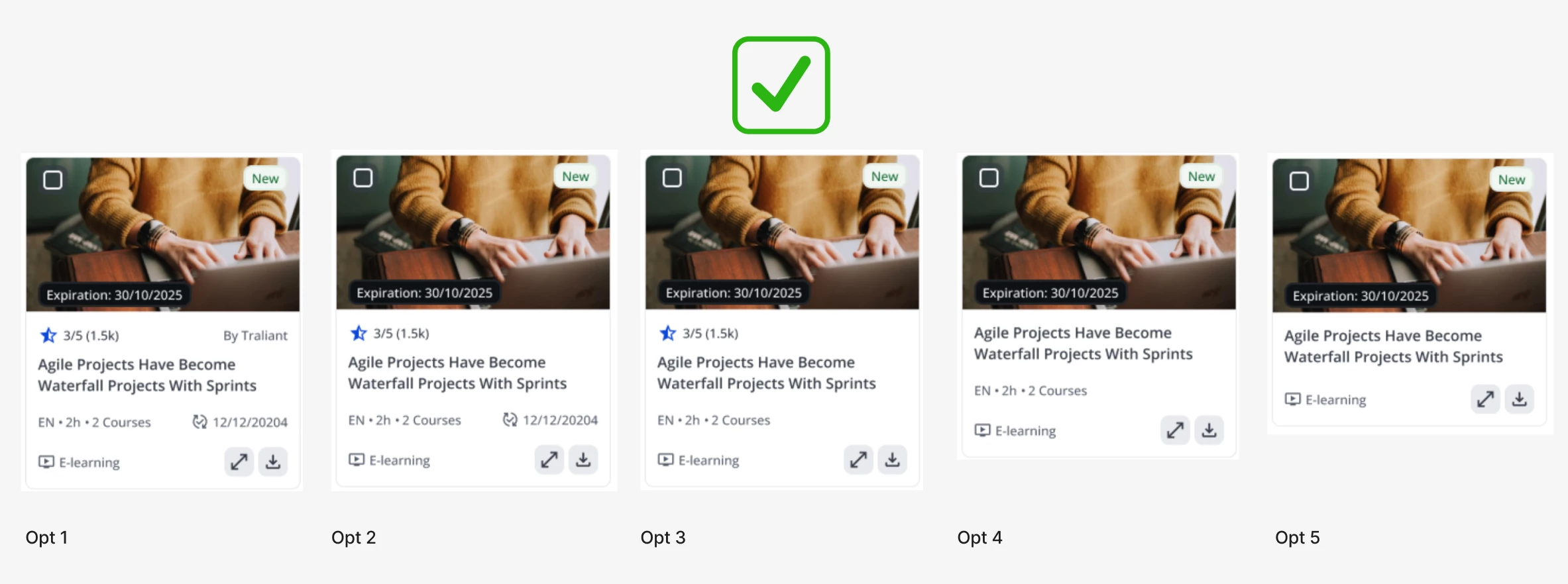
We’re running a quick survey to learn what information density you prefer on content cards (more details at a glance vs. a simpler, lighter layout).


It only takes a minute, and the result is a better, more intuitive Content Library for you.

👉 Take the short survey


Thank you for helping us build an experience that works better for you!

6 replies

lrnlab
Hero III
Forum|alt.badge.img+10
  • Hero III
  • December 11, 2025

Great little survey, thank you.


truffino
Novice III
Forum|alt.badge.img+1
  • Novice III
  • December 11, 2025

Great survey - I absolutely like the idea of having more information on the cards for when you first look at it.

Things we typically look for first are completion time/number of courses, publisher (there are some publishers we really like and others we don’t), and what style the learning is (I think it’s called features - things like animations, games, audio narration, etc). I know everyone is a little different for what they are looking for - is there the possibility that each organization could customize what appears on the cards?


  • Author
  • Former Docebian
  • December 12, 2025

@truffino thanks for taking the time to take the survey.
I love the idea of having customizable cards, everyone scans a page in their own way plus orgs may focus on other “features”. Good we have this idea recorded in this thread and the product manager has visibility on.


cwaters
Novice II
Forum|alt.badge.img
  • Novice II
  • December 26, 2025

I was too late to take the survey, but I would add a descriptor of the type of content that is held within a course. Our organization has struggled big time this past year determining what the course is because in our prior LMS platforms that was clearly stated on search results. Documents, eLearning, videos, PPTs, and other types were clearly labeled upon initial view. Ever since moving to Docebo last year our employees and clients struggle knowing what something is as everything is listed as “eLearning” which is unclear to end users. 


Forum|alt.badge.img
  • Influencer I
  • December 31, 2025

Feature Suggestion: Single Tile Display for Imported Collections (Catalogs)

Although I missed the survey window, I wanted to share a feature suggestion related to content cards that would significantly improve usability and reduce administrative overhead.

It would be highly beneficial to allow imported Docebo Content collections to be displayed as a single, clickable tile, mirroring the existing “collection” visual treatment in the admin content marketplace. Currently, the only way to achieve a similar experience is by creating individual pages and widgets for each collection, which does not scale well and quickly becomes difficult to manage.


Proposed functionality:

  • Enable administrators to import or create collections that appear as one tile within catalog views.

  • When selected, the tile opens to a view where learners can browse and enroll in all courses within the collection.

  • Maintain visual consistency with the tile-based collection representation already used in the Docebo Content admin experience.

This enhancement would provide a cleaner, more intuitive learner experience while significantly reducing page and widget sprawl for administrators.


  • Author
  • Former Docebian
  • January 8, 2026

📊 Survey Results

Participants reviewed five card variations and evaluated how well each one communicated the content at a glance from “too little information” to “overwhelming,” with the goal of finding just the right amount.

🏆 Option 3 emerged as the clear winner, receiving the highest number of “Just the right amount” ratings.

A key takeaway from the responses:
Users preferred having more information rather than less, as long as it remained scannable and easy to digest. Option 2 followed closely as the second choice, slightly richer information density is more helpful than minimal cards when making content decisions.


Thanks again for helping us shape a better browsing experience, your feedback directly informs our design decisions!