Change color of new Course and Learning Plan Player (CSS) - Light Mode


Userlevel 7
Badge +2
  • Docebian
  • 196 replies

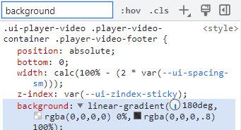
Here’s some CSS that will adjust the new course player to “light mode” if you don’t like the default look and feel. 

Insert the following into the CSS editor:

/* Light Theme */
lrn-course-player-play-area {
--ui-color-layout-contrast: rgba(255, 255, 255, 1);
--ui-color-typography-negative: rgba(33, 39, 33, 1);
--ui-color-border-accessibility-default: rgba(228, 230, 229, 1);
--ui-color-layout-overlay-dark: rgba(255, 255, 255, 1);
}
lrn-training-material-header,
.lrn-course-player-table-of-contents-header,
.lrn-course-player-training-material-idle-view-content {
--ui-color-icon-negative: rgb(73, 43, 43);
--ui-color-icon-neutral: rgba(255, 255, 255, 1);
}
lrn-training-material-header button,
.lrn-course-player-table-of-contents-header button,
dcb-ui-list-item-training-material-content,
.lrn-course-player-training-material-idle-view-content {
--ui-color-border-accessibility-negative: rgba(102, 102, 102, 1);
--ui-color-interaction-ripple-light: rgba(0, 0, 0, 0.08);
--ui-color-interaction-hover-light: rgba(0, 0, 0, 0.08);
--ui-color-button-label-negative: rgba(51, 51, 51, 1);
}


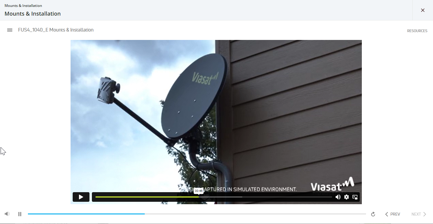
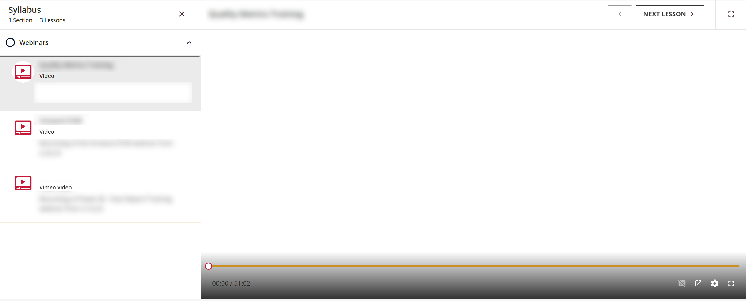
And it will update your course player to look like this (not currently live in DU at this moment)


40 replies

Userlevel 7
Badge +2

Morning, all,

@pmo thanks for this CSS to help us create a light version for the new course player. 

We’ve tried it on our LMS and did like it, however, ran into an issue with the folder icons not showing up; folders end up looking like titles and it’s not clear that you have to click them to expand it to show learning assets:

I tried tagging the icon colour to change only it and make it darker but that didn’t work with the green/blue learning assets. 

In the end, the best I’ve come up with is:

  1. I’ve adjusted the “Main” platform colour from our dark blue to a lighter blue which is what populates the Assessment icon
  2. I’ve changed the shade of green for the “confirmation message” colour which controls the green “completed” circle
  3. Then I’ve added code a line of code to the “lrn-course-player-play-area” section of your code to darken the icon to a grey --ui-color-icon-negative: rgb(216, 216, 216,1);

This has brought us to:


It’s not ideal, but it’s the best we’ve been able to come up with since the Learning asset icons are controled by our main brand colours. This will, however, be very problematic when we work with our clients who have branded instances. 

We’re going to have to custom code each instance and with some brand colours we’re going to struggle to get an icon colour that works across all of the current icons (i.e., yellow/orange, etc.)

Thanks,

Fiona


Can you try this piece of css? It should target the circle and chevron to whatever color you’d like: 

lrn-course-player-play-area dcb-ui-accordion dcb-ui-icon span.color-negative svg {
fill: #00112c;
}

Userlevel 3

Morning, @pmo ,

You are a star! :) That worked perfectly, and now we’ve got our light player working the way we need.

Thank you so much for helping us out! 

Fiona

Userlevel 4
Badge

Here’s another one, we just realized that with the light mode CSS, the video player icons are invisible since they’re white. Is there a way to change the color of those??

Light mode, video player controls are “invisible” because they are white by default
Whereas in “dark mode” the buttons stand out clearly


Userlevel 3

Hi @JEntis,

That’s interesting, our course player using the light player CSS (with the additional code provided by @pmo for the folder colour) has a black gradient overlay so all the player icons show up, except for the time which is still black and we’re working on finding the right tags to make the time white as well:


The background gradient sits under this CSS section and must be default to the platform because we didn’t set that up anywhere:


I’m not sure if that helps at all, and I wanted to ask, is this happening if you use a YouTube/Vimeo link too? We noticed for the video player time colour, it’s white for our YouTube videos and black for our uploaded videos.

We have discovered it sits with this section of CSS:

ui-color-typography-negative player-video-footer-controls-slot-progression-time ng-star-inserted

But if I change the “ui-color-typography-negative” to white it makes the whole table of contents text white so I just need to figure out how to add the “progression time” bit into our CSS area.

Thanks,

Fiona

Userlevel 7
Badge +5

@JEntisThe situation with the video controls may be due to how the video sits in the LMS. We embedd our videos from Vimeo into Articulate (usually Storyline) to host our content, and I dont’ seem to have any issue while using a modified light theme.

Thanks for alerting me to go check my videos 😃


Userlevel 4
Badge

We have the folder color code in there too, but for whatever reason whether I am using a Docebo-loaded video or linked from Vimeo, none of the controls are visible. We don’t use Youtube items right now:

Video uploaded into the CLOR. Some items are visible under the black gradient, but not the controls higher up in the window.
Video linked from Vimeo...appears completely white.

I’m going to have to move my users to the new course player in a couple weeks for internal reasons (we can’t wait for October) so I guess I’ll have to implement the default dark mode, at least at first. Really hoping Docebo will give us either a light mode option toggle, or CCS code to do a complete job of switching colors so all elements work.

Userlevel 7
Badge +5

We have the folder color code in there too, but for whatever reason whether I am using a Docebo-loaded video or linked from Vimeo, none of the controls are visible. We don’t use Youtube items right now:

Video uploaded into the CLOR. Some items are visible under the black gradient, but not the controls higher up in the window.
Video linked from Vimeo...appears completely white.

I’m going to have to move my users to the new course player in a couple weeks for internal reasons (we can’t wait for October) so I guess I’ll have to implement the default dark mode, at least at first. Really hoping Docebo will give us either a light mode option toggle, or CCS code to do a complete job of switching colors so all elements work.

@JEntis Are you having issues with your e-learning courses as well? The gradient (to my observation) seems to be assigned to the ILT courses only. Knowing how extensively you are having an issue could be helpful, and I’m thinking that you might want to get in touch with Support...just in case it’s a bug :-)

Userlevel 4
Badge

We have the folder color code in there too, but for whatever reason whether I am using a Docebo-loaded video or linked from Vimeo, none of the controls are visible. We don’t use Youtube items right now:

Video uploaded into the CLOR. Some items are visible under the black gradient, but not the controls higher up in the window.


Hi @JEntis, apologies for the tangent, your bottom left video screen is what I get. @FionaR sees the volume play/pause, jump forward and back buttons (Fiona’s image is a few posts up) but I’ve never seen it, even when in the default dark theme. Is that the same for you? I’ve cleared cookies, cache, uninstalled and reinstalled and used different browsers. The player controls behave on my desktop, but not on my laptop which makes me think it’s a driver or something else.

Back to your comment, when it’s a white background I also get the same and have to guess where the buttons are, which is no good for our learners.

I see this in elearning and ILT courses.


Userlevel 5
Badge +2

That’s interesting, our course player using the light player CSS (with the additional code provided by @pmo for the folder colour) has a black gradient overlay so all the player icons show up, except for the time which is still black and we’re working on finding the right tags to make the time white as well:


Hi Fiona, did you end up finding the tags to target the time in the video player?

Userlevel 4

Hello! Novice CSS here. I tried adding this to our sandbox with the below steps but not seeing it updated. I’m on Extended Enterprise and wondering if I’m not doing it in the right spot.

  1. Go to Admin Menu > Configure Branding and Look
  2. Custom Styles > Enter in the CSS to the 7.0 Custom CSS 
  3. Click Save 

Any ideas what I’m doing wrong?

Thanks!

It didn’t work for me either. Did nothing :(


Userlevel 5
Badge +2

It didn’t work for me either. Did nothing :(

I got it working on the root domain of our production site, so those would be my first two questions for you.

  • Do you have the extended enterprise app?
  • Did you apply your CSS to the root domain?
Userlevel 3

Hi @IanMonk,

Sorry for the delay in responding, I got pulled away from testing the course player for a bit but no, so far I’ve not had any luck tagging the time in the new course player to adjust the colour. I’ll post it here if I do. 


Hello,

If you have problem with invisible button in slide converter material, you can use this: 

lrn-course-player-play-area ui-icon span.color-negative svg {

    fill: #00112c;

}

From an accessability stand point, does anyone know if learners are able to change between light and dark mode themselves or will this change affect all learners no matter what?

Userlevel 7
Badge +2

From an accessability stand point, does anyone know if learners are able to change between light and dark mode themselves or will this change affect all learners no matter what?

This change would impact the entire platform. Users would not have the option to toggle. 

Reply