Hi @brandonq, hope you’re doing well!
I feel the need to state here that I am not a CSS expert, and I have only been able to test this in a testing environment. If you choose to apply this CSS code to your LMS through the Branding > Custom Styles area, note that it is not guaranteed to be the best possible CSS solution, nor is it guaranteed to reflect across all browsers and browser versions. Please apply this CSS code at your discretion.
Okay, with that out of the way, here is the css you’re looking for:
.ui-card-header-badges {
display: none;

}
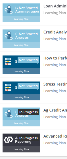
This should get rid of all labels that take up that space on course cards. If you want to only eliminate the “New” and “In Progress” labels, I’m not sure that is possible. It is possible to eliminate all “New” labels with the code below, but “In Progress” labels would remain:
.ui-badge-status-wrapper.ui-typography-subtitle.ui-badge-status-success {
display: none;
} Hope this helps!