Those of you who attended this month’s DU Live may remember Greg Wlasiuk from Tripadvisor (Learning Technologist). With some help from Docebo’s own Ryan Woods (Senior Course Developer), Greg has put together some tips and tricks for you to use when building custom widget pages in Docebo.
March’s DU Live is now available on-demand.
Guide Table of Contents
Custom widget pages are key when it comes to directing and informing users on your platform, but building a page that engages users can feel challenging when you’re getting started. Here are a few CSS tips to add to your Docebo page design toolbox.
Background images for pages

Adding a background image using CSS is a great way to bring some uniqueness to your platform. It’s also a great way to differentiate pages within a specific theme.
For example, maybe all pages within a learning program have the same background image. Or if you segment users and assign them different pages, you can apply background to the page for each user group to give each section a unique feel. This can prevent users from feeling lost on your platform.
If you want to add a background image to your custom widget page, it’s fairly easy to do so. All you need is a page with at least one widget, as the background image will only appear in the area where widgets are placed.
To add a background image, go to the Configure Branding and Look area and select the Custom Styles section.
CSS
#doc-page-PAGE_NUMBER{

    margin: 0;

    padding: 0;

    background-image: url(YOUR-IMAGE.jpg);

    background-size: cover;

    background-position: center;

    background-repeat: no-repeat;

}
Enter the code above in the Custom Styles text box, then make the following adjustments:
- In the first line, replace PAGE_NUMBER with the number of the page you want to apply the background to. You can find this in the URL of the page.
- In the fourth line, replace YOUR-IMAGE.jpg with the URL of your preferred background image.
Note: If you want to host your image in Docebo, one option is to upload an image in Docebo in the HTML widget. You can then find the URL and plug it into the code above.
You can adjust the CSS to change the positioning of the background image, or if it repeats as you scroll. Make sure to have a large enough image depending on your page’s dimensions.
Flipcard Buttons
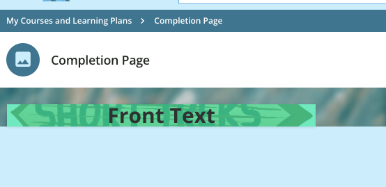
Flipcards are engaging and lets you fit a lot more information onto a custom page without sacrificing a clean look and feel. The ones you’ll create from the code below are probably best used for main menu navigation links that might require a little extra information or context.
A quick note: This code was sourced from the materials provided alongside “Road to Inspire | Building a tailored learning experience” from November 2020, which is available on-demand on Docebo University.
To start making your flipcards, go to the Configure Branding and Look area of your platform and open the Custom Styles section. Paste the following code in the text box there.
CSS
/*CUSTOM FLIPCARD - START*/

#custom_flipcard {height: 100%; transform-style: preserve-3d; perspective: 600px; transition:

0.5s; overflow: hidden;}

#custom_flipcard:hover .card-front {transform: rotateY(-180deg);}

#custom_flipcard:hover .card-back {transform: rotateY(0deg);}

.card-front {height: 100%; width: 100%; background-position: 50% 50%; background-size: cover;

position: absolute; top: 0; left: 0; backface-visibility: hidden; transition: 0.5s; }

.card-back {height: 100%; width: 100%; position: absolute; top: 0; left: 0; background-color:

#00AA6C; backface-visibility: hidden; transform: rotateY(180deg); transition: 0.5s; color:

#ffffff; text-align: center; margin: 0 auto; display: flex; justify-content: center;

align-items: center;}

.card_back_text a {padding: 8px 8px; border-radius: 2px; line-height: 20px; font-size: 16px;

font-weight: 700; color: #000000; background: #00aa6c00; text-transform: uppercase;

text-decoration: none;}

.card_back_text a:hover { color: #ffffff; background-color: #00aa6c00;}

.card_front_title {font-size: 30px; line-height: 34px; font-weight: 700; color:#303030;

text-align: center; margin:25px; z-index: 1;}

.card_back_text {font-size: 16px;line-height: 22px; font-weight: 600; text-align: center;

margin:25px; color:#ffffff;}

.flipcard_overlay {width:100%;height:100%; display: flex; justify-content: center; align-items:

center;}

/*CUSTOM FLIPCARD - END*/
Once you’ve done this, you can go to Manage Pages, click on the page you want to add a flipcard to, and go to the composer tab.
HTML
<div id="custom_flipcard">

<div class="card-front" style="background-image:url(YOUR-IMAGE.jpg);">

<div class="flipcard_overlay" style="background:rgba(52,224,161,0.7);">

<div class="card_front_title">Front Text</div>

</div>

</div>

<div class="card-back">

<div class="card_back_text">Back Text.<br /><br /><a href="https://your-link.com">Link Text</a></div>

</div></div>
In the composer, create a new HTML widget and apply the code above with a few alterations:
- Replace YOUR-IMAGE.jpg with URL of your image. Find this after uploading an image in Docebo in the HTML widget.
- Replace Front Text and Back Text with the text you want to appear on the respective front and back of the flipcard.
- Replace https://YOUR-LINK.com with the URL of the page you want the flipcard to link out to, and replace Link Text with the text you want as a hyperlink.
Note: You can also customize each widget by changing the “background: rbga” value (color).
Hover-over Buttons
Hover-over buttons give pages a responsive, lively feel that breaks away from the static menus of courses / resources. Applying them to your custom pages can be a great way to engage users during their learning journey.
To start, go to the Configure Branding and Look area and select the Custom Styles section.
CSS
/*CUSTOM HOVEROVER - START*/

#hoverover_image {width: 100%;height: auto;transition: transform 0.5s ease;}

#hoverover_image:hover {transform: translateY(-40px);}
Once you’ve added this code to the Custom Styles section, you can change “-40px” to the amount of pixels you want the hover effect to cover. A larger number = more movement.
Now, go to the composer for the custom page you want to work on.
HTML
<div id="hoverover_image"><a href="https://YOUR-PAGE.com"><img src="https://YOUR IMAGE.png" alt="Your Image" /></a></div>
Create an HTML widget on that page and use the above HTML to add the hover-over button with a few adjustments:
- Replace https://YOUR-PAGE with page you want to link out to, and replace https://YOUR-IMAGE.png with the image you want to use for the button.
- Replace Your Image with any alt text you would like to add.
Note: The change that occurs when the mouse hovers over the widget can be totally customized. You can have it change color with an overlay, increase in size, or even animate it! Try playing around with the CSS to get your desired outcome.
These are just a few ideas for you to try out while making custom pages, and hopefully they not only offer valuable tools for your design arsenal, but also provide inspiration for your own CSS solutions.
How do you see yourself using these tips? Do you have your own CSS tricks to share? Comment below! ⬇️
