Hi Docebo Community,
Great seeing many of you at the conference this week. I tried out that great tip of using AI to help write CSS code, but I am getting stuck.
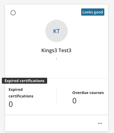
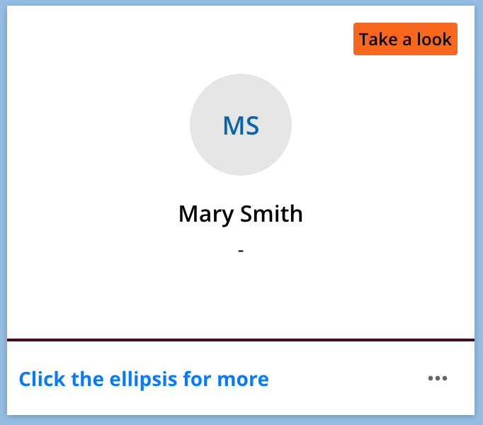
On the MyTeam page there are two elements of the UI that really are just cluttering up the interface, and I would like to remove them.
- Expired Certifications
- Overdue courses.
Please see screenshot below for reference.
On the Expired Certifications, this what i am seeing when i “Inspect” with DevTools
<section class="team-member-card__kpi kpi-wrapper"><a class="kpi-counter ng-star-inserted"><span class="kpi-counter__value"> 0 </span><span class="kpi-counter__label"> Expired certifications </span></a><!----><!----><span class="kpi-divider ng-star-inserted"></span><!----><a class="kpi-counter ng-star-inserted"><span class="kpi-counter__label"> Overdue courses </span><span class="kpi-counter__value"> 0 </span></a><!----><!----><!----><!----><!----><!----></section>
i’ve tried various combinations of CSS hiding these sections & classes, saved, reloaded - and these UI elements are still showing.
I must be missing something pretty basic.


