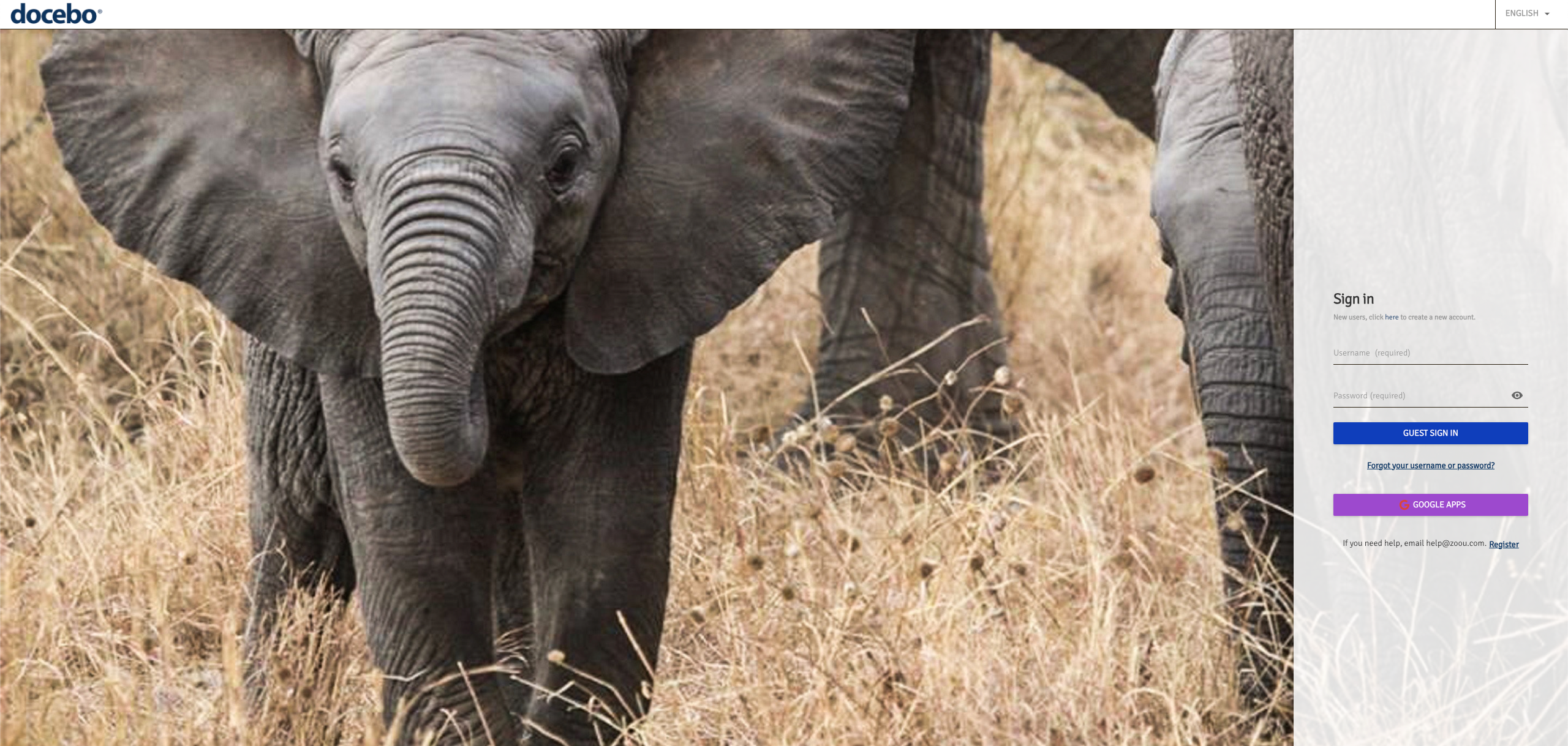
I am a CSS newbie, and I’m finding so many good CSS code ideas here in the community. I’m wondering if anyone has code examples for the following Login page adjustments I’m trying to make. Any tips would be greatly appreciated.


I’m trying to accomplish two things: 


First, I’d like to change the wording on the SSO Login Button to say something similar to what it says on the Docebo University Login page. See screenshot. I would like our button to say Onna Employee Login. 
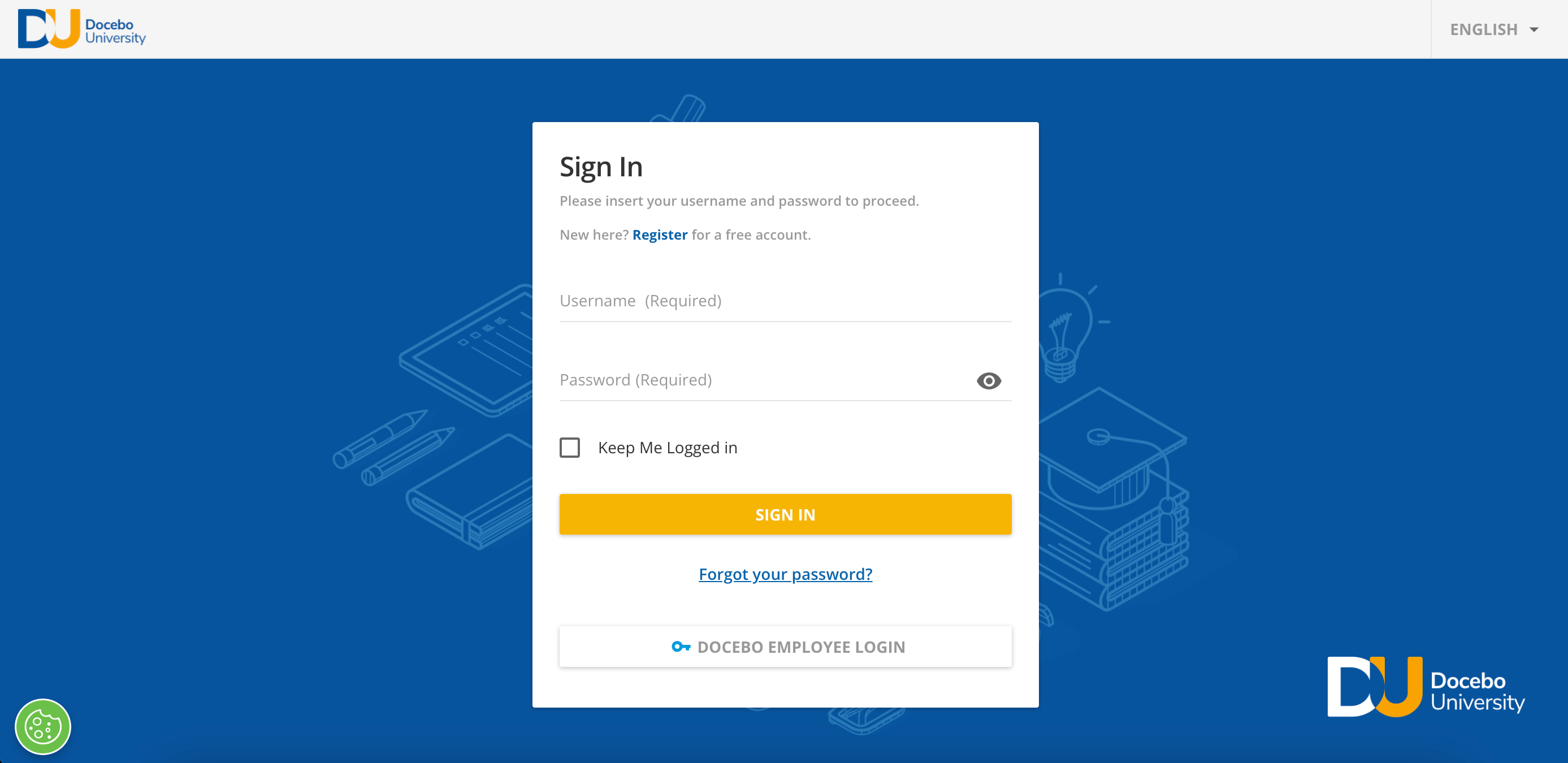
 

The second thing I’d like to accomplish is changing the header background color. I’ve figured out how to do this on all pages once you’re logged in, but the changes are not reflecting on the Login page. 


Thanks so much for any and all tips! 


Update: I discovered how to change the wording on the SAML SSO button on the login page. You can do this in the Localization tool. I typed in SAML SSO in the search and was able to change it that way. 


Has anyone else discovered how we can modify the login page via CSS? I want to change its look and feel as much as possible, so it comes closer to my companies brand.


@klewis there are lots of things that could be done to re-style the login page depending on what you’re trying to do. The main limitation is that we can’t really add content to the page, we can just modify what’s already there.


Here’s what I’ve done with mine:


And here’s the CSS if you want to try it out:

/* Login edits-  Transparent background, aligned right, full screen */
.external-simple-signin {
display: flex;
flex-direction: column;
max-height: 2000px;
position: fixed;
height: 100%;
top: 0;
right: 0;
margin-top: 52px !important;
align-items: center;
justify-content: center;
background-color: rgba(255, 255, 255, 0.85) !important;
}

.external-simple-signin inputptype="text"], .external-simple-signin inputptype="password"] {
background: transparent;
}


Reply