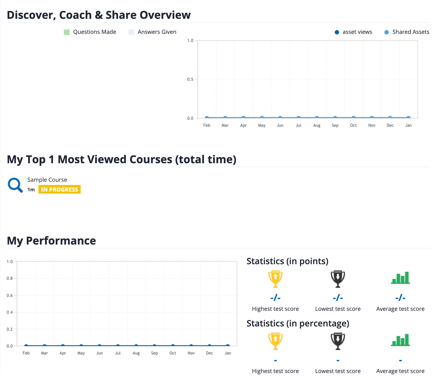
I need to isolate and hide these three areas of the My Activities page:
Discover Coach & Share Overview
Top Most Viewed Courses
My Performance
I have been right clicking and inspecting, but I can’t seem to isolate the elements and hide them with CSS. Anyone have any CSS for me?
Page 1 / 1
This should get you there, I added the second level of the class .new-user-summary to reduce likelihood of impacting other areas, but should still be checked:
@Bfarkas … a follow up question for you if you have a moment. I have been beating my head on my desk trying to figure out how to isolate and hide these two elements in the “Report New Training Activity” area in My Activities. I know it is possible, I just can’t quite figure it out. Any pointers?
So I thought I was nuts for a second cuz I thought this exact thing had just been asked last week, but different fields:
anyways, did not actually test as the same theory should holdup:
kept them separated so you can always swap easily.
AH! I see the logic now. Thank you so much, @Bfarkas!
This should get you there, I added the second level of the class .new-user-summary to reduce likelihood of impacting other areas, but should still be checked:
Hi there, I’ve tried this and it’s not working. Any ideas of what I could be doing wrong?
This should get you there, I added the second level of the class .new-user-summary to reduce likelihood of impacting other areas, but should still be checked: