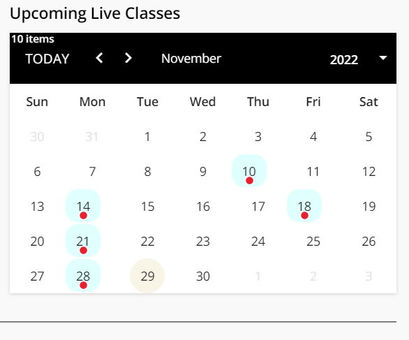
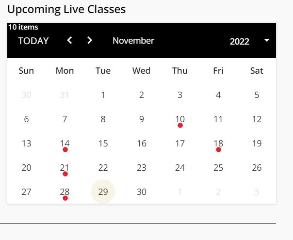
span.cal-event-balloon {
background-color: var(--ui-color-button-label-error) !important;
transform: scale(1.5);
}/*bigger red dots*/
before:
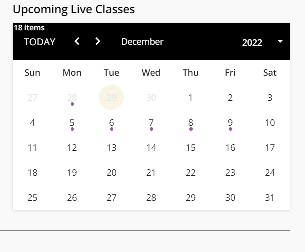
after:

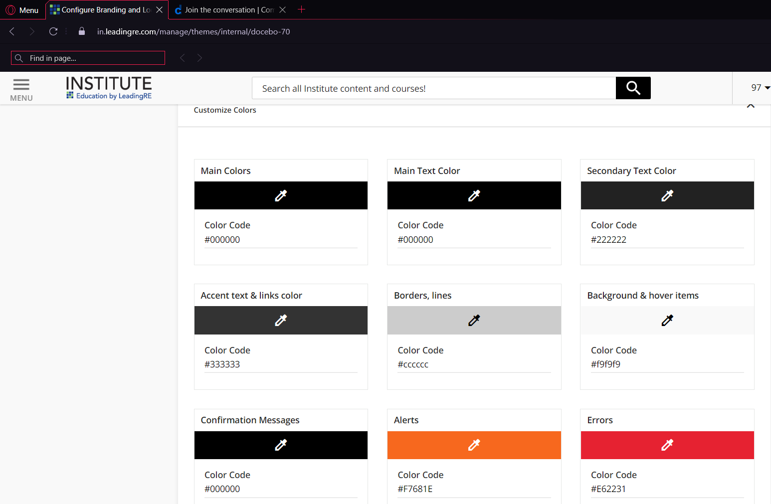
 +6
+6span.cal-event-balloon {
background-color: var(--ui-color-button-label-error) !important;
transform: scale(1.5);
}/*bigger red dots*/
before:
after:
Enter your email address or username and password below to log in to Docebo Community. No account yet? Create an account
Enter your E-mail address. We'll send you an e-mail with instructions to reset your password.