span.cal-event-balloon {
background-color: var(--ui-color-button-label-error) !important;
transform: scale(1.5);
}/*bigger red dots*/
before:
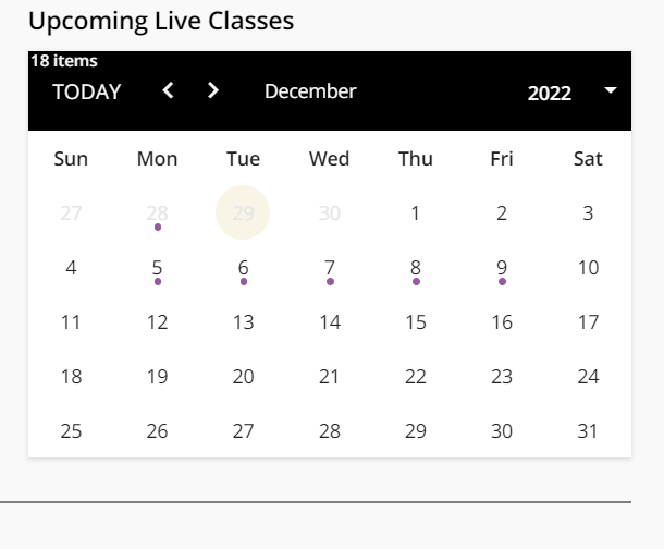
after:
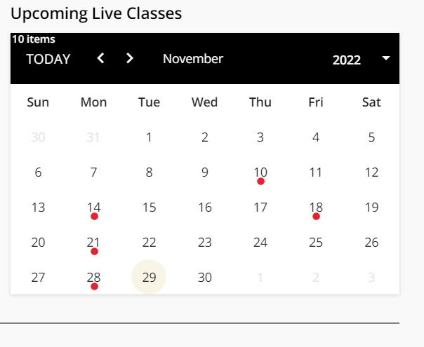
span.cal-event-balloon {
background-color: var(--ui-color-button-label-error) !important;
transform: scale(1.5);
}/*bigger red dots*/
before:

after:

Note I did color based on your platform alert color - red in mine.
v2
not 1000% on the colors but I want them to be bold and noticable
span.cal-event-balloon {
	background-color: var(--ui-color-button-label-error) !important;
	transform: scale(1.5);
}/*bigger red dots*/
span.cal-day-number.cell-has-events {
	background-color: lightcyan;
    border-radius: 1em;
	margin:1px !important;
}/*rounded boxes*/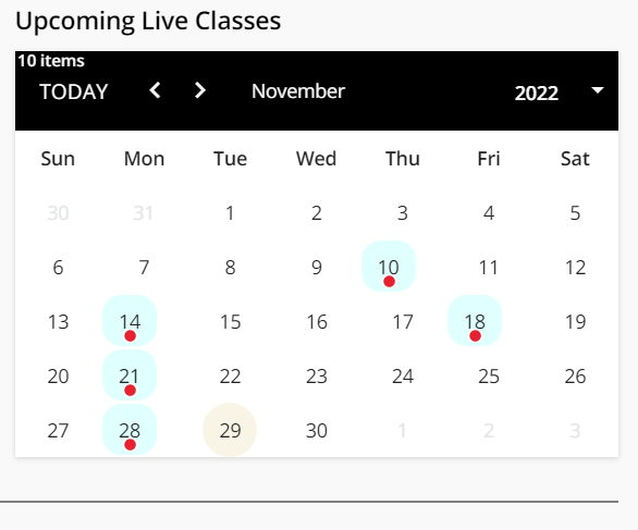
Be careful with using the color variables just based on their color settings. Down the line it can get confusing/sticky to change a color because they are being used for things not intended, i.e. the var here is for a label error, which these really are not, so down the line if someone decides to update the error states, it would seem unlikely that this would be impacted, when in fact it is.
Ah - my thinking was that since we are going extended enterprise, I should start using “appropriate” var colors.
In this instance label error color would be a good color regardless of branding - I would think. I’m still trying to figure all that out.
See
I’m trying to use the user-selectable var colors to the extent possible. I haven’t found them all - yet.
Also: don’t use the “margin:1px !important;” in the above CSS. It screws up horizontal spacing in the calendar.
v3
span.cal-event-balloon {
	background-color: red !important;
	transform: scale(1.5);
}/*bigger red dots*/
span.cal-day-number.cell-has-events {
	background-color: lightcyan;
    border-radius: 1em;
}/*rounded boxes*/
See
I’m trying to use the user-selectable var colors to the extent possible. I haven’t found them all - yet.
I know and saw, and agree when applicable it makes sense to use variables, just folks tend to fall into the trap of choosing variables to use based on the end result of color vs. what the variable is designed for. The variable doesn’t change, the end result can, so it causes a long term maintenance problem too, I wouldn’t have thought the concept of ‘label error’ makes sense for a marking icon essentially, its not an error of any sorts. Just be careful, you can still run into maintenance issues you are trying to avoid by thinking which color applies instead of which variable applies to each situation. See it happen all the time.
(Its a lot like the old web developer bit of, make specific meaningful class and ID names, don’t base them on things like color. Colors change over time, names don’t. You can find a lot of websites with classes like .BigBlueHeader, which at their creation were probably big text in a shade of blue, and now are tiny text and green due to a redesign  )
)
Well, thinking extended enterprise, I do want to start using things other than “background color” - but don’t know how to reference them yet. Presumably the top 6 items are good ones to use?
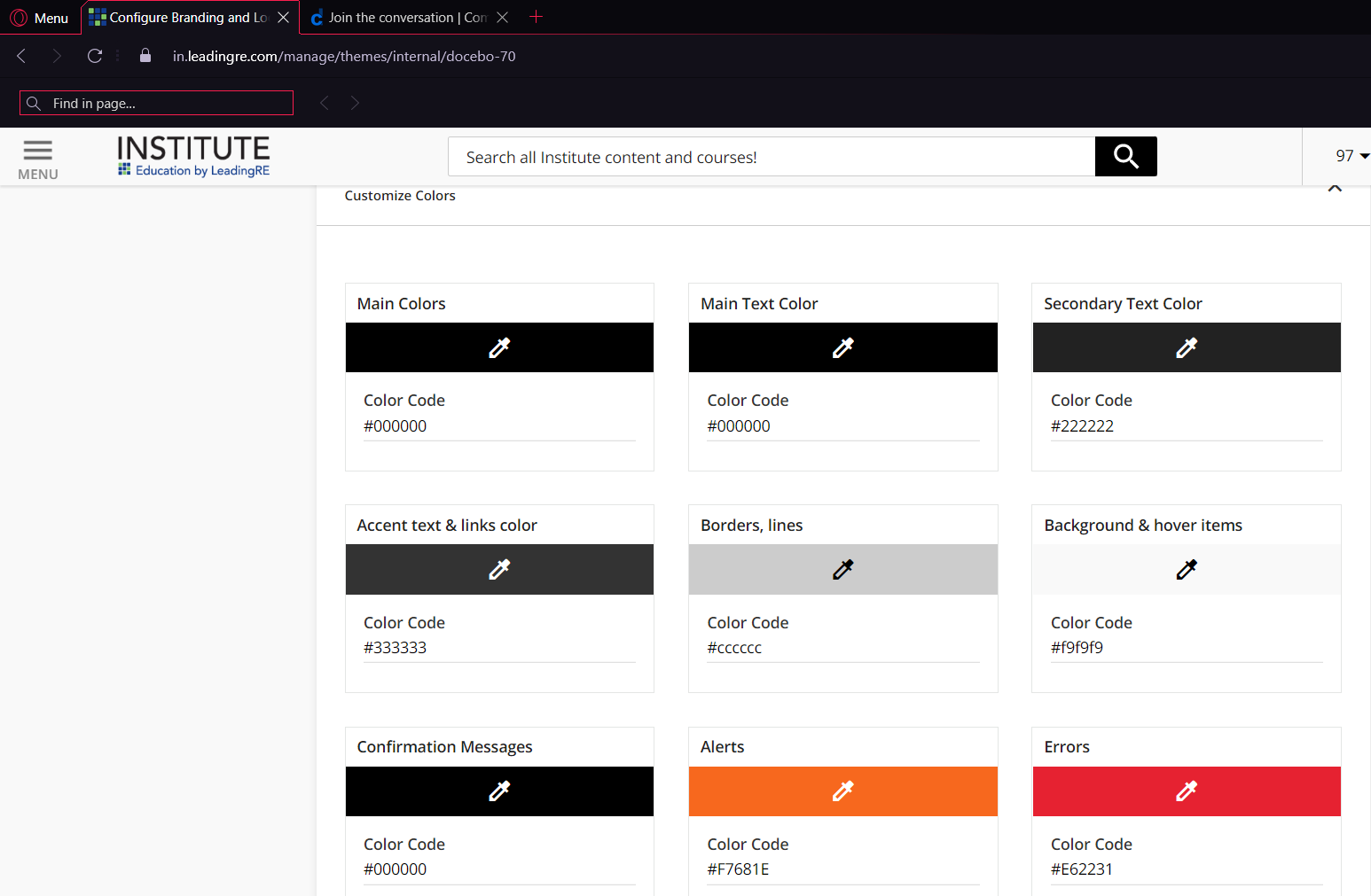
All the variables are good to use, just align them to their descriptive, intended use is all I am trying to say.
Do you know the vars for main color, accent text, main text?
Enter your email address or username and password below to log in to Docebo Community. No account yet? Create an account
Enter your E-mail address. We'll send you an e-mail with instructions to reset your password.