ui-spinner > div > div.ui-spinner-layer {
/*border-style: hidden !important;*/
border-color:#133D8D !important;
height: 105%;
width: 105%;
background-image: url(https://docebo-institute.s3.us-east-2.amazonaws.com/public/branding_hacks/logo22px.png);
}/*colorize and theme spinner*/

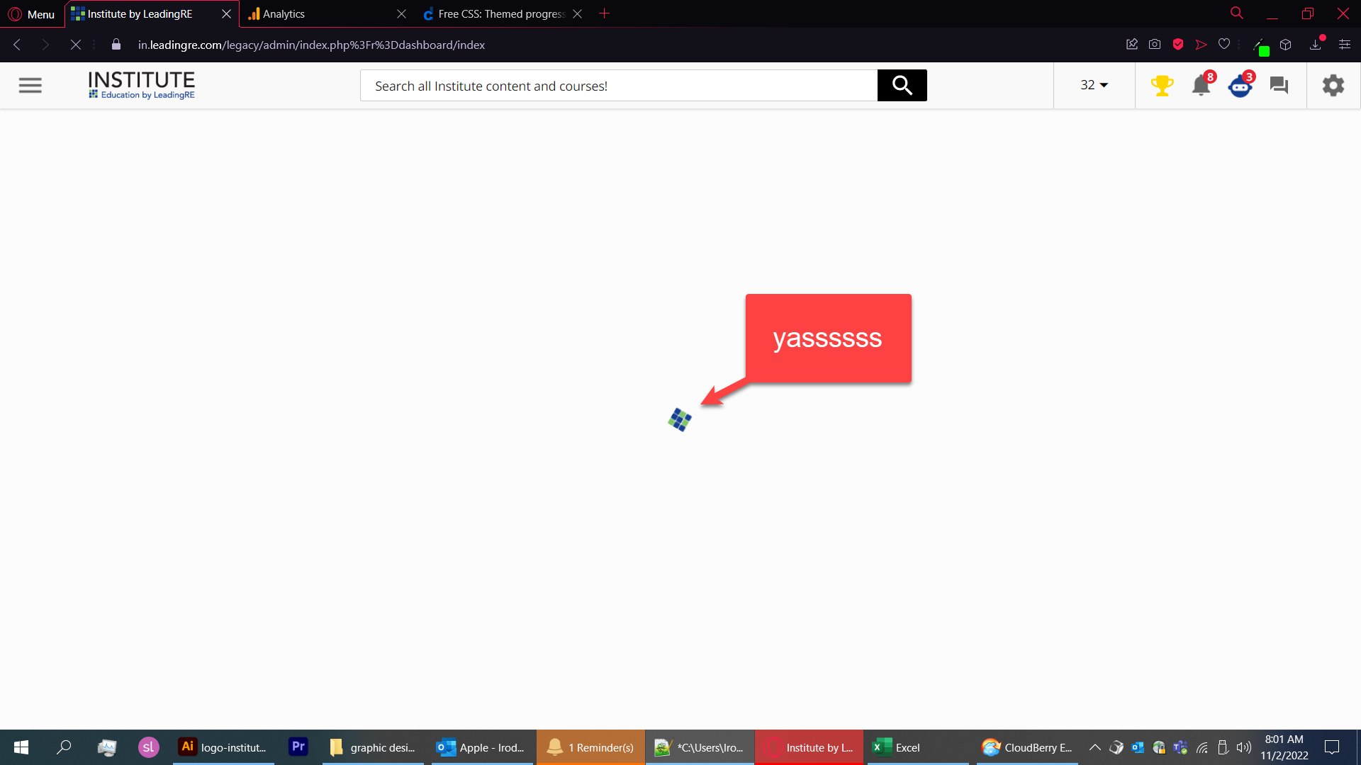
I can’t seem to get the size right. I’ve also tried making it bigger but this makes the spinning look like a spirograph since I’m not sizing some of the transformations used, I guess.


In any case, relatively successful theming of most (but not all) spinners. Not sure if I broke anything but it seems fine. I can’t seem to hide the spinning wheel thingy.


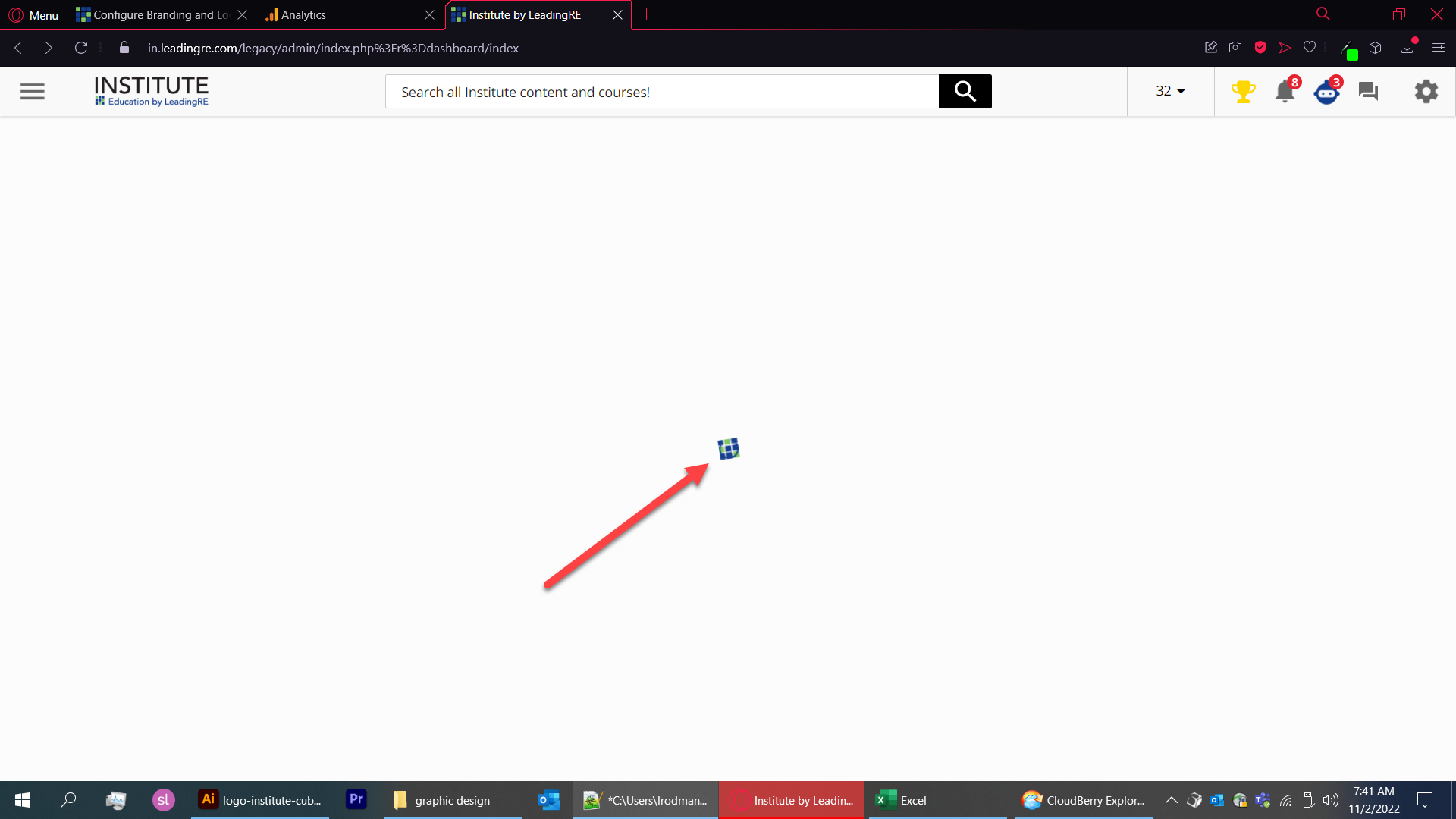
The admin dashboard is a good testing page since it is so slow for me 🙂 finally got a chance to have at that spinner!


Updated CSS

/*#doc-layout-page-content > doc-layout-legacy-wrapper > div > */ ui-spinner > div > div.ui-spinner-layer, div.hyd-spinner-layer {     /*border-style: hidden !important;*/     border-color: transparent !important;/*hide spinner to show image*/     background-size: cover !important;     background-image: url(https://docebo-institute.s3.us-east-2.amazonaws.com/public/branding_hacks/logo40px.png); }/*colorize and theme spinner*/ ui-spinner > div > div.ui-spinner-layer > ui-spinner-circle-clipper, div.hyd-spinner-circle-clipper {     border-color: transparent; }/*hide spinner to show image*/


Success! Figured out how to hide the spinner itself (so you only see my logo)

ui-spinner > div > div.ui-spinner-layer {
/*border-style: hidden !important;*/
border-color: transparent !important;/*hide spinner to show image*/
height: 105%;
width: 105%;
background-image: url(https://docebo-institute.s3.us-east-2.amazonaws.com/public/branding_hacks/logo22px.png);
}/*colorize and theme spinner*/
ui-spinner > div > div.ui-spinner-layer > ui-spinner-circle-clipper {
border-color: transparent;
}/*hide spinner to show image*/

the first !important is important.


I like this a lot! I’ll give this a try on our instance. 


I had to make the image 21px square but put it in the top left corner of a 22px square image, and used the ridiculous percentage size increases you see to make it fit right. No-repeat and center didn’t work for me as desired. Would love to see an improved version @billso


@lrodman Q: does the spinner image need to be loaded into Docebo S3 or can it be on any public web server? Asking for a friend… er, me. I’m asking for me. 😎


That’s actually my personal s3 (well, work, but “owned” by me). I just called it Docebo-Institute. 


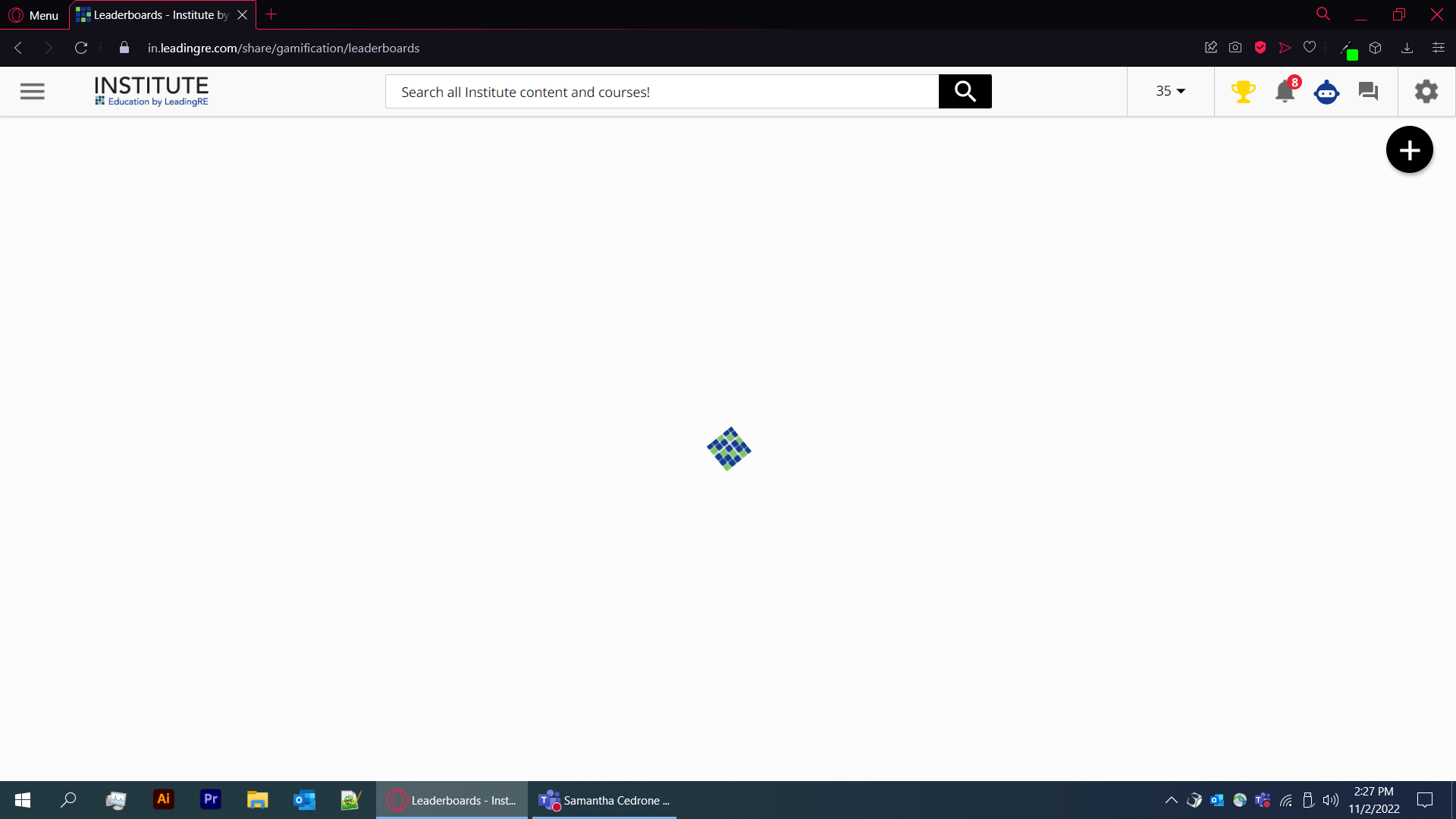
So it does this on the leaderboards page… and only that page from what I can see

Doesn’t look awful with my logo. Still, undesirable.

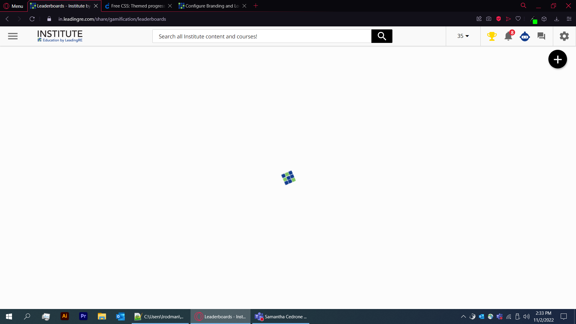
fixed!

ui-spinner > div > div.ui-spinner-layer {
/*border-style: hidden !important;*/
border-color: transparent !important;/*hide spinner to show image*/
background-size: cover !important;
background-image: url(https://docebo-institute.s3.us-east-2.amazonaws.com/public/branding_hacks/logo40px.png);
}/*colorize and theme spinner*/
ui-spinner > div > div.ui-spinner-layer > ui-spinner-circle-clipper {
border-color: transparent;
}/*hide spinner to show image*/

this also fixes it on the gamification panel. and is 40px square, higher res.


/*#doc-layout-page-content > doc-layout-legacy-wrapper > div > */
ui-spinner > div > div.ui-spinner-layer, div.hyd-spinner-layer {
    /*border-style: hidden !important;*/
    border-color: transparent !important;/*hide spinner to show image*/
    background-size: cover !important;
    background-image: url(https://docebo-institute.s3.us-east-2.amazonaws.com/public/branding_hacks/logo40px.png);
}/*colorize and theme spinner*/
ui-spinner > div > div.ui-spinner-layer > ui-spinner-circle-clipper, div.hyd-spinner-circle-clipper {
    border-color: transparent;
}/*hide spinner to show image*/

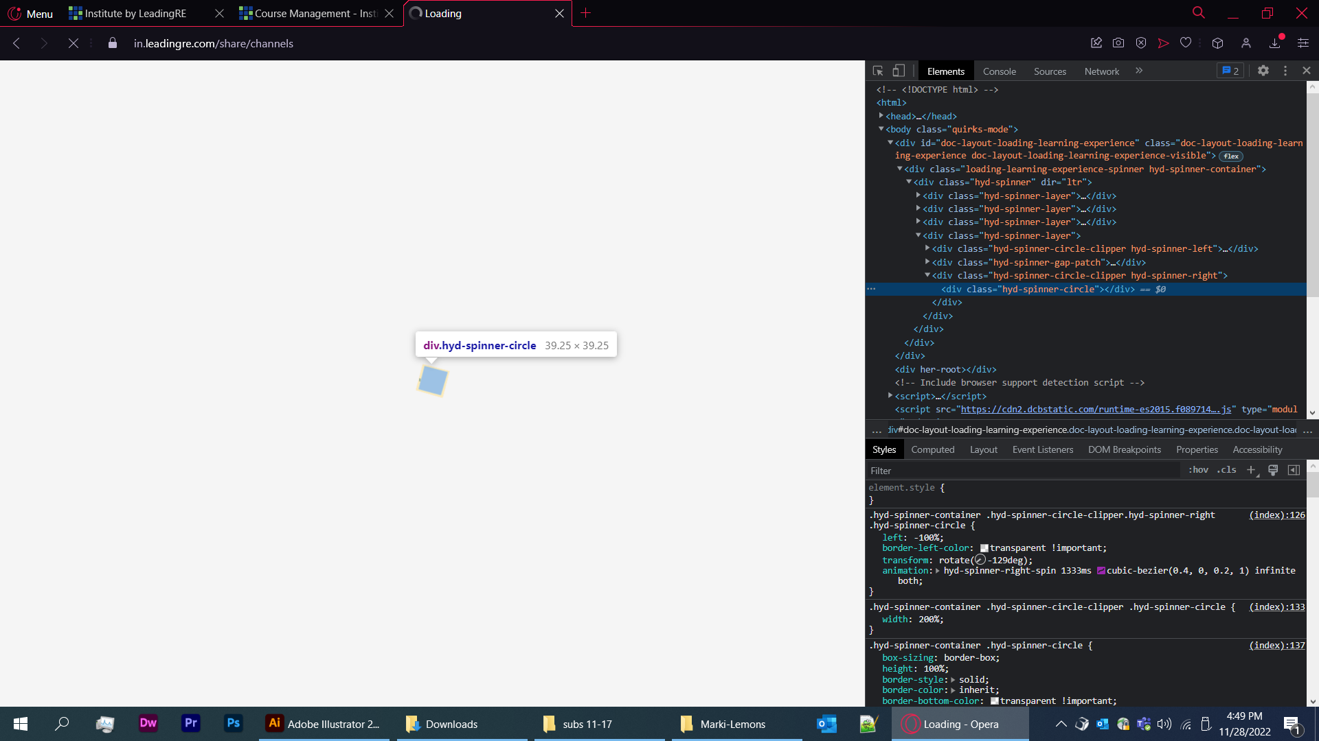
I think this will affect the OTHER spinner in the platform. It has been hard to catch. The hyd-spinner.

Anyone know the differences?


Reply