Hello,

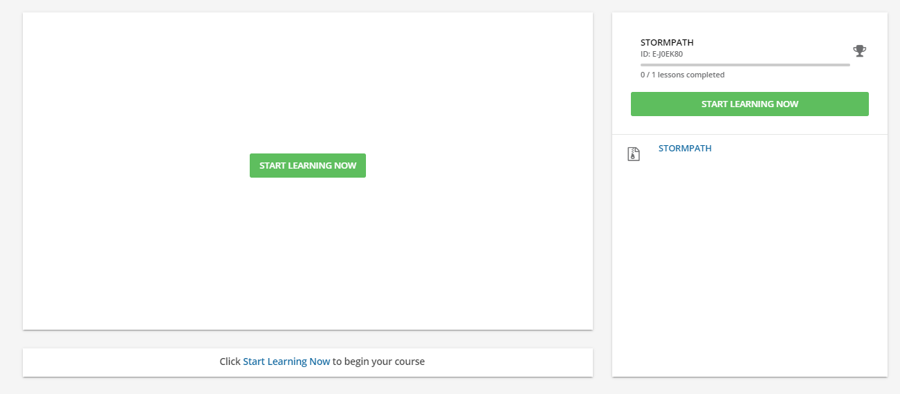
Is there a way to hide the “Start Learning Now” button on the course player once they have begun their course? Having both buttons is very confusing for our users and hiding it would help with the number of help tickets we receive from users thinking their course wasn’t saved because the “Start Learning Now” button brought them back to the beginning of the course. 

Any advice is appreciated!
Nicole - hi - can you take this through a little more? Are you leveraging that you can take a course to a full screen or modal view? That start learning now becomes a non-issue once you leverage that. You can use it to kick off the course, or you can set the course to autoplay and then (I believe) there is no click necessary.


Nicole - hi - can you take this through a little more? Are you leveraging that you can take a course to a full screen or modal view? That start learning now becomes a non-issue once you leverage that. You can use it to kick off the course, or you can set the course to autoplay and then (I believe) there is no click necessary.

By the way? I am suggesting this? But in full disclosure? we are a shop that leverages SCORM alot.

Hi @dklinger! Thank you for your response! We leverage SCORM a lot as well and we have the courses open in modal view. Would having the course be taken in full screen change that?


I am sorry for clarity? I am using the lightbox view. Take a look? The button is not available using that approach until a person closes the light box window.


Hi,

It is technically possible to hide this button with CSS. However, this might not be the ideal option, as it will be applied to all courses across the platform, including some where it might actually be useful! 

The approach we have taken is to rename the buttons using the Localization tool. In our case, we have renamed it to “Start tutorial from the beginning”, and the “Resume” button to “Next”.  This works in our context, but alternative wording might be needed for yours.

Hope this helps!

Alan


Ok - so follow the screenshots because they may speak a thousand words….

Before the course is active????


Now the course is active….

Start Learning Now is gone.


Nicole - as I get closer to your question? I think I am now closer to the problem you are calling out.
What I am finding? Because bookmarking is enabled? The link brings them back to the same spot in the SCO….it has the same action as clicking on Resume…actually all of the links are doing it…:grinning:

So it may be an export by export and authoring tool by authoring tool kind of basis that will really help to determine the behaviors of those links.

In Storyline for example - I know you can set the SCO to always ask the learner if they want to resume where they left off…but call out if I am going down a tangent that doesnt make sense...

@dklinger I totally get what you are saying and appreciate your help! The problem is that when users return to their course they end up clicking the wrong button and we want to avoid that. We may end up changing the language on the button.


Hi,

It is technically possible to hide this button with CSS. However, this might not be the ideal option, as it will be applied to all courses across the platform, including some where it might actually be useful! 

The approach we have taken is to rename the buttons using the Localization tool. In our case, we have renamed it to “Start tutorial from the beginning”, and the “Resume” button to “Next”.  This works in our context, but alternative wording might be needed for yours.

Hope this helps!

Alan

@Alan Thank you so much for the suggestion! Changing the wording would definitely help! I see that there are several options to change the language. Would I change all of them? Or is just changing the “course” module necessary?


Hi Nicole

This is the entry we changed:


Generally it is often tricky to identify the specific entry that needs amending. Pretty much trial and error in my experience :-)   

If you have a sandbox, I would recommend amending each entry one at a time and testing the result until you find the one that applies the change where it’s needed. You can also do this in PROD of course, but just means anyone using the system at that moment might see a strange result. 

Another thing I’d recommend is to keep an external log of the localization changes you make, for future reference. 

Alan


I love all of the helpful info in this thread! Building on @Alan’s recommendation to track localization changes, @lrnlab shared a really helpful post with some inspiration and best practices for logging changes like these. 


We are experiencing the same issue with users being confused about which button to click!  I’m so happy someone posted about this!

Thank you @Alan for suggesting this workaround. 


Reply