Hi all, I’m hoping the CSS geniuses in the audience here can help me with this one. We are switching from an Auth0 to SSO and OpenID login process in phases, and I need to relabel the button to make it crystal clear to our learners which one they need to click on depending on their role. Here is our login page with the new Open ID button turned on (our field and corporate users have been using only Auth0 up until now): 
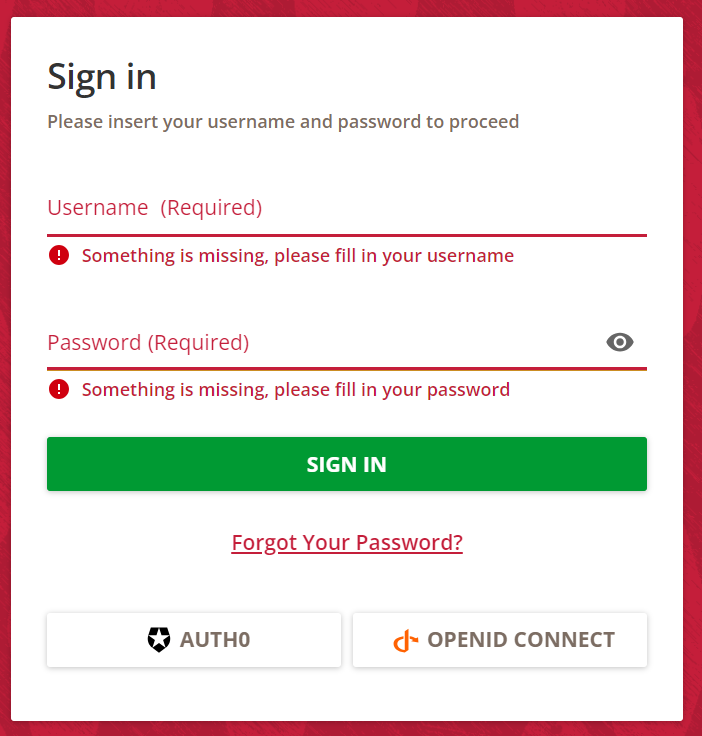
 

Our IT team was assured by Docebo’s IT team that it is possible to “reskin” the button using CSS but don’t have an established process as to how so they pointed me here to the Community. How can I achieve this? I have only a baseline knowledge of CSS and don’t know where to start.

Hi @JEntis, one thing I’d consider using is the ::after pseudo-element to kind of “inject” a bit of HTML at the end of the div containing each button.

It might be a bit fiddly, I’m afraid, especially if you want it to look nice… but I would suggest using the Chrome Dev Tools to experiment before you take your winning CSS update and deploy it across the platform. I’d recommend both of these resources:

  1. View and Change CSS in the Chrome Dev Tools
  2. Stack Overflow on how to use the ::after pseudo-element in Chrome Dev Tools (I was struggling with this myself)

Thank you @Ian! On another thread I commented on, a different user recommended using the Localization Tool to change the text on the button. That had never occurred to me, and it worked perfectly! So thankfully I don’t think I’ll need to mess around with CSS after all, but I will look at the resources you provided because it’s always helpful to learn more :)


Of course, Localization! I shoulda thought of that. 😅


Reply