Can someone help me with inline CSS?

Most of the style tags just get deleted once I save the HTML training material and I’m a little desperate already. We are offering some pictures to download on our LMS through HTML pages. We show the pictures with a hover effect. When you click on the picture it opens in a new tab where you can download it. On the browser everything is working fine, since I can use custom CSS. However, this custom CSS is not working on the Go.Learn App (only the design).

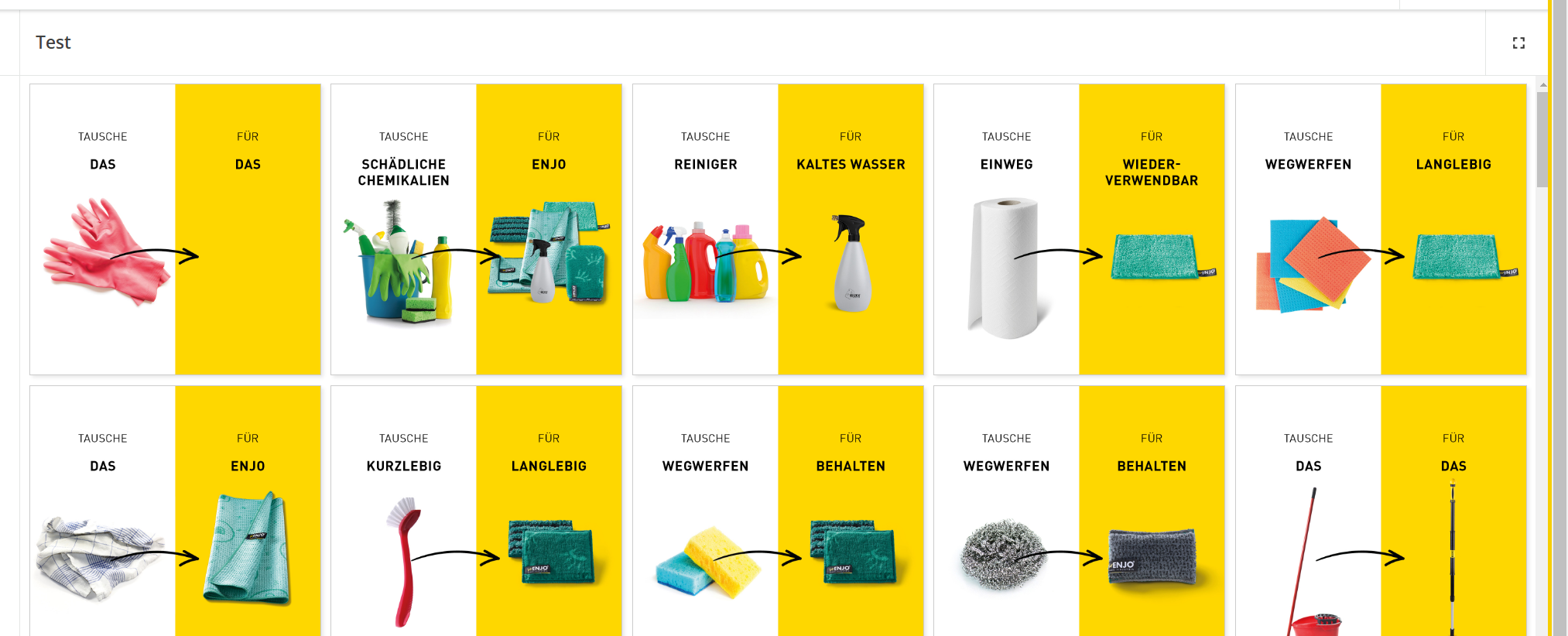
This is how it looks on my browser:
This is how it looks on the App:
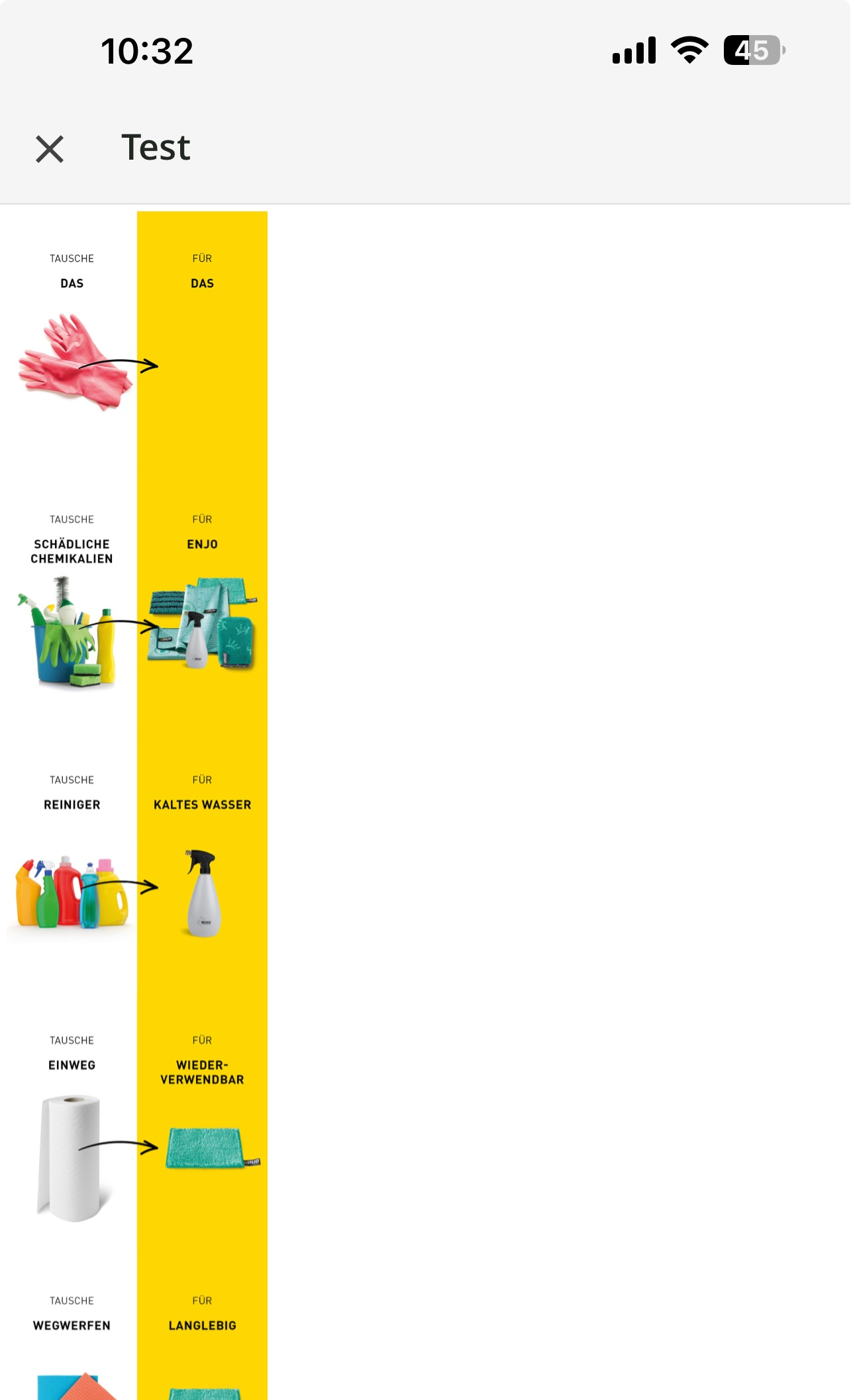
 

So my problem is that I tried to use some inline CSS to make them look a bit better on the smartphone app (I don’t need any of the effects). But all inline codes were deleted (style=”display:inline-flex;” and the like). Every picture is showing in one column instead of using the whole space (for example if 3 pictures fit in the first line show 3 pictures in each line etc.). Can anyone help me out with this?

This is an example of the html code I’m using on the training material (please be aware that I got many of these pages and I need to do this several pictures/links):

<div class="enjo-gallery">
    <div>
        <a href="link1" target="_blank" rel="noreferrer" download>
        <img src="link1" alt="Image1" width="300" /></a>
    </div>
   <div>
        <a href="link2" target="_blank" rel="noreferrer" download>
        <img src="link2" alt="Image2" width="300" /></a>
    </div>
    <div>
        <a href="link3" target="_blank" rel="noreferrer" download>
        <img src="link3" alt="Image3" width="300" /></a>
    </div>
</div>


This is the custom CSS:

.enjo-gallery {
    display: inline-flex;
    display: -webkit-inline-flex;
    display: -ms-inline-flexbox;
    grid-gap: 10px;
    justify-content: center;
    gap: 10px;
    flex-direction: row;
    flex-wrap: wrap;
    align-items: center;
}

.enjo-gallery img {
        max-width: 300px;
        height: auto;
        border: 1px solid #ccc;
        box-shadow: 2px 2px 4px rgba(0, 0, 0, 0.1);
        transition: transform .2s;
}

.enjo-gallery img:hover {
        transform: scale(1.1);
}

.enjo-gallery div {
        text-align: center;
}

@media screen and (max-width: 767px) {
    .enjo-gallery img{
           max-width:  150px;
     }
}


I really would appreciate the help!!

@Bfarkas ???


So as you ran into, custom CSS is great but you need a “graceful fallback” if a mobile app user as it is not applied there at all  

The WYSIWYG editor for inline styling does not support a lot of common tags as well as common structure, things like nesting divs often falls apart. It is often a need of just of almost simplifying and even though perfectly valid HTML is in use, do things more manually, for instance I see you wrap the image and text for each link inside a single a tag, normally fine, often have to segment these out otherwise the editor reorders and inserts stuff that messes with you. The styles allowable and not is a lot of trial and error and working through different types, again older, more established methods over newer ones typically work much better. 


@Bfarkas unfortunately your answer wasn’t pretty much of a help, but I figured it out myself.

Just if anyone wants to know how I fixed it. Removing some of the divs did the trick:

So the divs in between did not work on the go.learn app:

<div class="enjo-gallery">
    <div>
        <a href="link1" target="_blank" rel="noreferrer" download>
        <img src="link1" alt="Image1" width="300" /></a>
    </div>
   <div>

        <a href="link2" target="_blank" rel="noreferrer" download>
        <img src="link2" alt="Image2" width="300" /></a>
    </div>
    <div>

        <a href="link3" target="_blank" rel="noreferrer" download>
        <img src="link3" alt="Image3" width="300" /></a>
    </div>
</div>

I changed it to this:

<div class="enjo-gallery">
    <div>
        <a href="link1" target="_blank" rel="noreferrer" download>
        <img src="link1" alt="Image1" width="300" /></a>
        <a href="link2" target="_blank" rel="noreferrer" download>
        <img src="link2" alt="Image2" width="300" /></a>
        <a href="link3" target="_blank" rel="noreferrer" download>
        <img src="link3" alt="Image3" width="300" /></a>
    </div>
</div>

And now everything is showing as expected on both, the smartphone app and the browser.


Thanks for sharing back @juergen.hanke , so that would be exactly what I was saying, you had extra structure (tags, divs in your case) and you have to simplify them down, a lot of standard html practices like that don’t work here.


Reply