

We are looking to use channels to present learning plans in segments to users on custom pages. However, we really wanted to use the list view which is not available on course/LP widget or channel widget, just the catalogs widget, which would not work for this. Decided to do some CSS styling to try to imitate, and go a few steps further to allow users to clearly know where they are at with each course and when complete, let it be not as important and take up significant less space. Heres a quick before/after of what we went for:
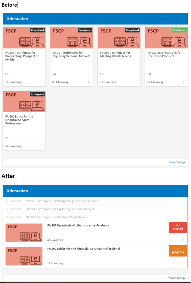
Obviously this was quite a bit of CSS, but feedback has been positive. Note, we tend to cap all the widgets, we find it makes the page cleaner and easier to understand. See the css below:
/* Add border to wrap list */
#doc-page-61 .channels-content-wrapper { border: 1px solid #0078c2;
}
/* This controls the size and positioning of the image in the header */
#doc-page-61 .channels-content-wrapper .dcb-ui-card-header, #doc-page-61 .channels-content-wrapper .ui-card-header { width: 20%; padding: var(--ui-spacing-xs); float: left;
}
/* Hides the language block, if you want it back remove this, but will need to be configured */
#doc-page-61 .channels-content-wrapper .ui-card-content-colophon { display:none;
}
/* Sets each item to be full width, correct width and removes space inbetween each */
#doc-page-61 .channels-content-wrapper .ui-cards-grid-slot { width: 100%; padding-left: var(--ui-spacing-xs); padding-right: var(--ui-spacing-xs); padding-top: 0; padding-bottom: 0;
}
/* sets the width and height of the main content, mostly the course title */
#doc-page-61 .channels-content-wrapper .ui-card-content { height: var(--ui-spacing-xl); width: 60%;
}
/* Removes the dividing line and sets space between the footer block and the main content */
#doc-page-61 .channels-content-wrapper .ui-card-footer { border-top: none; padding-top: var(--ui-spacing-lg);
}
/* Resets standard size and location for the status tag */
#doc-page-61 .channels-content-wrapper .ui-badge-status-wrapper { height: var(--ui-spacing-xl); width: var(--ui-spacing-huge); font-size: 1em; padding: var(--ui-spacing-xxs); text-align: center;
}
/* Sets specifics for Completed status tag which is almost never shown */
#doc-page-61 .channels-content-wrapper .ui-card-status-done .ui-badge-status-wrapper { font-size: 0.85em; padding-bottom: var(--ui-spacing-xxs); padding-top: var(--ui-spacing-md); padding-right: var(--ui-spacing-xs); padding-left: var(--ui-spacing-xxs); text-align: center; height: var(--ui-spacing-lg);
}
/* Sets style of the In Progress status tag */
#doc-page-61 .channels-content-wrapper .ui-card-status-in_progress .ui-badge-status-wrapper { background-color: #e67e22; text-transform: capitalize;
}
/* Sets style of the Not Started status tag */
#doc-page-61 .channels-content-wrapper .ui-card-status-subscribed .ui-badge-status-wrapper { background-color: #e74c3c;
}
/* Positions the status tag */
#doc-page-61 .channels-content-wrapper .ui-card-header-badge-primary { right: var(--ui-spacing-sm);
}
/* Bolds course title */
#doc-page-61 .channels-content-wrapper .ui-typography-heading-5 { font-weight: bold;
}
/* Sets the light gray background on hover over an item */
#doc-page-61 .channels-content-wrapper .ui-card-wrapper:hover { background-color: #f5f5f5 !important; }
/* ---These setup the resizing of completed courses--- */
/* hide the header completely, removes the image and the status tag */
#doc-page-61 .channels-content-wrapper .ui-card-status-done .ui-card-header { display: none;
}
/* Hides the footer completely, removes course type and menu button */
#doc-page-61 .channels-content-wrapper .ui-card-status-done .ui-card-footer { display: none;
}
/* Adjusts the background color of these items */
#doc-page-61 .channels-content-wrapper .ui-card-status-done { background-color: #e4e6e5
}
/* Adjusts the font color and weight */
#doc-page-61 .channels-content-wrapper .ui-card-status-done .ui-typography-heading-5 { font-weight: normal; color: #999999
}
/* Adds a before element to hold the checkmark and Complete text in faded green */
#doc-page-61 .channels-content-wrapper .ui-card-status-done .ui-card-title:before { content: " Complete"; float: left; margin-right: var(--ui-spacing-md); color: #5ebe5eb0; font-family: "Open Sans", sans-serif;
}

