Currently, when you add a widget, it is automatically added to the mobile view with the option to hide and or not visible at all if not supported. Can this "hidden" function can also be added when working with desktop view?
One possible use case is when a widget is unsupported in mobile, we can load another widget to its place.
Sample:
Desktop view
iframe (visible)
html widget (set as not visible)
Mobile View
iframe (not supported)
html widget (visible - this will act as the iframe's substitute)
Is there any way to manually configure this via CSS?
Best answer by Adam Ballhaussen
Hey there @abarrios!
Your idea to select which widgets are visible on a desktop page is an interesting one. While this could be really useful, I imagine it might introduce a number of technical challenges due to the rigid row/column structure that desktop page designs follow. You would have to figure out a way to have other widgets on the page dynamically adjust their position/size to fill the space left by “hidden” widgets.
You could hide specific widgets on a desktop page via CSS by applying display: none or visibility: collapse to the elements, but that might still leave you with awkward, unfilled space on the page as shown below. I don’t know of a way to hide widgets while allowing the rest of the page to adjust to compensate.
Example of a page with a custom content box widget hidden via “visibility: collapse” in CSS
I believe there’s another way that you could achieve a virtually identical result. I recommend following the steps below to see how close that gets you to what you’re looking for.
Create a page with every widget you’d like to display on desktop, including the iFrame widget.
Save this page, adding desktop to the code for the page.
Duplicate the desktop page, removing desktop and adding mobile to the code for the page.
For this mobile page, delete the iFrame widget and replace it with the HTML widget. Leave all other widgets that you’d like to include on this page.
Navigate to Manage Menus.
Select the menu that includes the desktop page with the iFrame widget
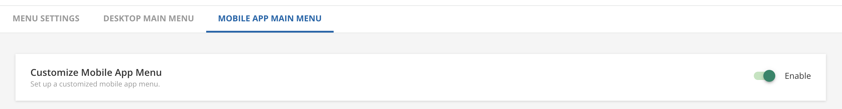
Navigate to the Mobile App Main Menu tab and enable the Customize Mobile App Menu option.
Delete the desktop page and add the mobile page to this mobile menu.
Select Save Changes
Repeat steps 6-10 for any other menus that you’d like to include these pages.
Enabling the Customize Mobile App Menu option allows you to create unique menus for mobile users
I hope these tips help you out! Please let me know if you have any questions, and I’d love to see the final result if this ends up working for you!
Here are a few resources that might help you navigate this process:
Your idea to select which widgets are visible on a desktop page is an interesting one. While this could be really useful, I imagine it might introduce a number of technical challenges due to the rigid row/column structure that desktop page designs follow. You would have to figure out a way to have other widgets on the page dynamically adjust their position/size to fill the space left by “hidden” widgets.
You could hide specific widgets on a desktop page via CSS by applying display: none or visibility: collapse to the elements, but that might still leave you with awkward, unfilled space on the page as shown below. I don’t know of a way to hide widgets while allowing the rest of the page to adjust to compensate.
Example of a page with a custom content box widget hidden via “visibility: collapse” in CSS
I believe there’s another way that you could achieve a virtually identical result. I recommend following the steps below to see how close that gets you to what you’re looking for.
Create a page with every widget you’d like to display on desktop, including the iFrame widget.
Save this page, adding desktop to the code for the page.
Duplicate the desktop page, removing desktop and adding mobile to the code for the page.
For this mobile page, delete the iFrame widget and replace it with the HTML widget. Leave all other widgets that you’d like to include on this page.
Navigate to Manage Menus.
Select the menu that includes the desktop page with the iFrame widget
Navigate to the Mobile App Main Menu tab and enable the Customize Mobile App Menu option.
Delete the desktop page and add the mobile page to this mobile menu.
Select Save Changes
Repeat steps 6-10 for any other menus that you’d like to include these pages.
Enabling the Customize Mobile App Menu option allows you to create unique menus for mobile users
I hope these tips help you out! Please let me know if you have any questions, and I’d love to see the final result if this ends up working for you!
Here are a few resources that might help you navigate this process:
This is a nice solution using the existing framework if you do not have many menus, but if you do this essentially doubles it which doubles the management effort. I need to go search the suggestions area and upvote things but I would think there should be a way in the future to add a ‘replacement’ widget if it is unsupported on mobile rather than just hiding, this could at least allow the user to insert a message explaining why they cannot do the action and how they can achieve it.
I’d also love a move towards an access based model by widget rather than page and menu exclusively, so that you can have one page have multiple widgets that only show to specfic users based on their branches or groups would be insanely useful and lower the backend management.
@Bfarkas I really love your idea for setting visibility per widget on a page. In theory I imagine it could really help cut down on admin work for customized use cases like the one you described. I could imagine this would be highly technical and complex to build, but then again we have some incredible developers so who knows what they might be able to achieve.
Idea LMS-I-1887 in the Ideas Portal, Customize page widget visibility by branch/group, seems to cover the use case you described. I recommend searching for it and upvoting.
I hope this post was at least able to help you for now! I’d love to see what you’ve been able to achieve with dynamic desktop & mobile experiences. It’s always great to see how people translate a desktop experience to mobile.


