Why This Post?
It seems the flip tile has made a resurgence in popularity of late and having been asked about how to rotate something and defaulting to the Z-axis which was not the desired effect but rather to rotate along the Y-axis - I decided to spend a little time playing with this and offer some code.
Also because a common question I have seen is how to get the code from the Docebo Inspire session a couple years ago. My hope is that this post will help make the process of implementing some flip tiles in your platforms a little bit easier by finding it here directly without downloading and digging it out of another document.
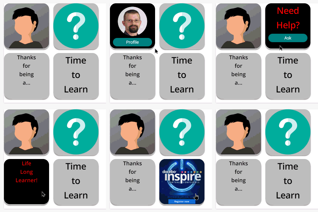
Lets start with the end result of my playing around. I made four tiles that were slightly different.
**NOTE**
These are tiles which are all placed inside of an HTML/WYSIWYG widget.
These are not widgets themselves that are flipping.
Tiles Explained
- The first tile (upper left) is an image for the front and an image for the back along with a button that links to somewhere else.
- The second tile (upper right) is an image for the front and text with a button that links to somewhere else.
- The third tile (lower left) is simply text on both sides - no links
- The fourth tile (lower right) is Text on the front with an image on the back. In this case, the entire image is a link to somewhere else.
The Code
Here is the CSS - again - I heavily commented this in an effort to help you make changes to your own use case a little easier.
/** Flip Tiles **/

/** General style for the Tile **/
/** Adjust dimensions and padding as desired **/

.myTile {
  background-color: transparent;
  width: 150px;
  height: 150px;
  perspective: 500px;
  display: inline-block;
  padding-bottom: 15px;
  padding-right: 10px;
}

/** This is a wrapper for the effect **/
/** The wrapper will contain both the front and back divs **/
/** Adjust the timing of the flip as desired - I liked 1.5 **/
/** I used the box shadow to provide a sort of thickness to the tile **/
/** Adjust the box shadow or remove as desired **/
/** I also added a little border-radius to round the corners **/
/** If you choose to adjust the radius - there are three spots **/

.myTileWrap {
  position: relative;
  width: 100%;
  height: 100%;
  text-align: center;
  transition: transform 1.5s;
  transform-style: preserve-3d;
  box-shadow: 2px 4px 8px 2px rgba(255,255,255,0.8), 1px 5px 2px 0 rgba(0,0,0,0.8);
  border-radius: 20px;
}

/** This block will rotate the tile half way **/
/** No real need to adjust this **/

.myTile:hover .myTileWrap {
  transform: rotateY(180deg);
}

/** This block affects both front and back tiles **/
/** Adjust the border-radius as desired to match above **/

.myTileF, .myTileB {
  position: absolute;
  width: 100%;
  height: 100%;
  -webkit-backface-visibility: hidden;
  backface-visibility: hidden;
  border-radius: 20px;
}

/** This block affects the front face of the tile **/
/** Adjust background and text color as desired **/

.myTileF {
  background-color: #bbb;
  color: black;
}

/** These two blocks will affect the border-radius **/
/** Front and back settings are here separately **/

.myTileF img {
  border-radius: 20px;
}

.myTileB img {
  border-radius: 20px;
}

/** These two blocks will affect the underline of button link **/
/** Front and back settings are here separately **/

.myTileF a {
  text-decoration: none;
}

.myTileB a {
  text-decoration: none;
}

/** This block will affect the back of the tile **/
/** Adjust background and text color as desired **/

.myTileB {
  background-color: #000000;
  color: red;
  transform: rotateY(180deg);
}

/** This block affects the look of the buttons **/
/** Adjust these settings as desired for your call to action **/

.actionBtn {
  width: 80%;
  padding: 5px;
  text-align: center;
  background-color: teal;
  color:white;
  border-radius: 15px;
  margin-top: 5px;
  display:inline-block;
}


/** End Flip Tiles **/
Next we have the HTML component
These are setup so that they will line up horizontally until you use a break tag to drop in another row.
Each block for a tile is essentially the same but for some minor differences. For additional tiles, Copy the desired type of tile and paste it in the desired location for your row. Then modify it as needed.
<!-- For all tiles, change out your image paths and URLs as desired -->

<!-- This is the first tile in the first row -->

<div class="myTile">
  <div class="myTileWrap">
    <div class="myTileF">
      <img src="https://path/to/image.jpg" style="width:150px;height:150px;">
    </div>
    <div class="myTileB">
      <img src="https://path/to/image.jpg" style="width:100px;height:100px; padding-top: 10px;">
      <a class="actionBtn" href="http://community.docebo.com">Profile</a>
    </div>
  </div>
</div>

<!-- This is the second tile in the first row -->

<div class="myTile">
  <div class="myTileWrap">
    <div class="myTileF">
      <img src="https://path/to/image.jpg" style="width:150px;height:150px;">
    </div>
    <div class="myTileB">
      <h1>Need<br>Help?</h1>
      <a class="actionBtn" href="https://help.docebo.com">Ask</a>
    </div>
  </div>
</div>

<!-- This effectively creates the second row -->
<!-- For more tiles in the first row, copy a block -->
<!-- and add it above these comments -->

<br>

<!-- This is the first tile in the second row -->

<div class="myTile">
  <div class="myTileWrap">
    <div class="myTileF">
      <h2>Thanks<br>for<br>being<br>a...</h2>
    </div>
    <div class="myTileB">
      <h2>Life<br>Long<br>Learner!</h2>
    </div>
  </div>
</div>

<!-- This is the second tile in the second row -->

<div class="myTile">
  <div class="myTileWrap">
    <div class="myTileF">
      <h1>Time<br>to<br>Learn</h1>
    </div>
    <div class="myTileB">
      <a href="https://inspire2022.docebo.com/"><img src="https://path/to/image.jpg" style="width:150px;height:150px;"></a>
    </div>
  </div>
</div>
As always, test in your environment and let me know if there are any bugs or questions.
Hopefully this is helpful for someone today.


