Hi everybody,

has anyone ever tried to shorten the number of list items shown in the “Courses and Learning Plans” widget? I would like to have the button “Load More” already appear after one row of list items.
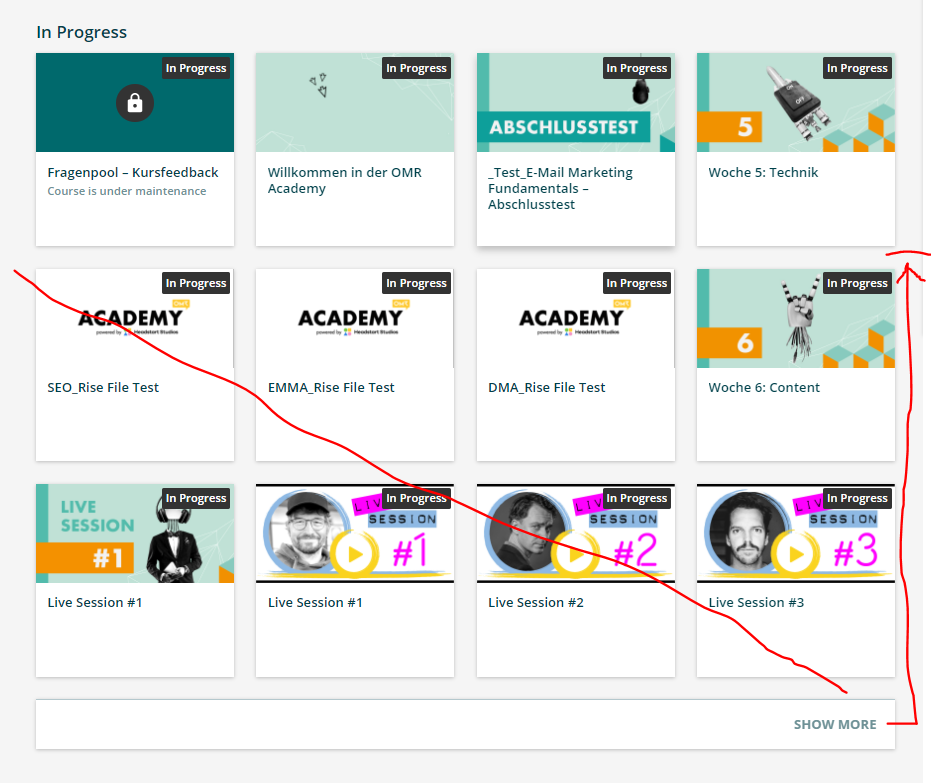
 

@janina.zielecki It shows less if you do 2/3 or 1/3 page width. I like the list view vs. card view for Learning Plan. Especially if I expect them to use the “show more” button. My 1/3 width widget with card view shows 6 courses. 


Agree with the previous, but if you must, here is what I would do. The thing is those elements are already on the page/dom and so can’t just hide them, need to provide a method to get to them, so the easiest is to shrink the surrounding container and then set overflow to scroll so you can still get to them all:

dcb-ui-cards-grid, ui-cards-grid {
max-height: 25%;
overflow: scroll;
}

Now this will impact cards in general, so I would strongly recommend to specify it to a page number or widget specifically to prevent it from applying elsewhere unintendedly. 


Thanks a lot, @dianex.gomez and @Bfarkas ! Both are very good ideas! :thumbsup::relaxed:
I have one problem with the overflow:scroll option. The surrounding container still keeps its height and I cannot find the right one to minimize it. Have you been able to solve this problem @Bfarkas ?


Not sure I follow, the screen shot I had put above had collapsed things down. Can you show your example and the adjustments you added?


The blue container remains the height of the element from before. It leaves a gap to the next widget row. I cannot find the right element to fix it. I only added the code you suggested.


Also interested in this issue. How to limit to only one row of cards?


Reply