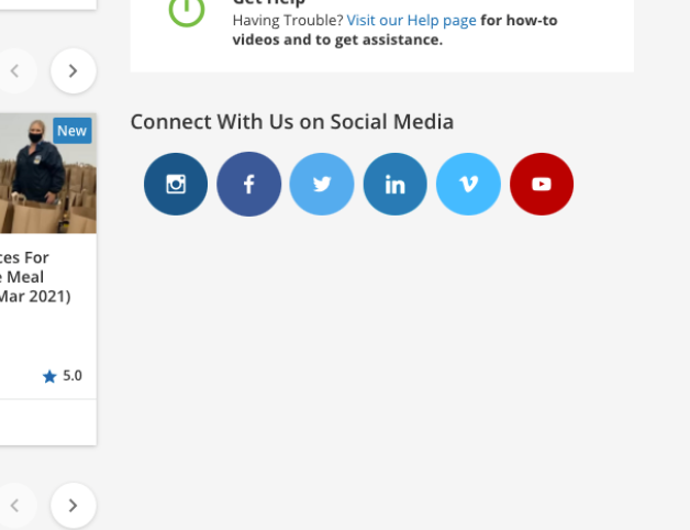
Hello! I thought I’d share a quick HTML/CSS snippet for anyone that wants to include their company social media links on their pages to look something like this:

Here’s the HTML that you would need to paste into a 1/3 column width page widget:
<div style="padding:19px 10px;">
   <div class="social-row">
   	  <!-- Instagram -->
      <a href="https://www.instagram.com/" target="_blank" class="socials" style="background:#125688;color:#FFFFFF;" rel="noreferrer noopener"><i class="zmdi zmdi-instagram"></i></a>
      <!-- Facebook -->
      <a href="https://www.facebook.com/" target="_blank" class="socials" style="background:#3B5998;color:#FFFFFF;padding:15px 24px;" rel="noreferrer noopener"><i class="zmdi zmdi-facebook"></i></a>
      <!-- Twitter -->
      <a href="https://twitter.com/" target="_blank" class="socials" style="background:#55ACEE;color:#FFFFFF;" rel="noreferrer noopener"><i class="zmdi zmdi-twitter"></i></a>
   </div>
   <div class="social-row">
   	  <!-- LinkedIn -->
      <a href="https://www.linkedin.com/" target="_blank" class="socials" style="background:#007bb5;color:#FFFFFF;" rel="noreferrer noopener"><i class="zmdi zmdi-linkedin"></i></a>
      <!-- Vimeo -->
      <a href="https://vimeo.com/" target="_blank" class="socials" style="background:#45bbff;color:#FFFFFF;" rel="noreferrer noopener"><i class="zmdi zmdi-vimeo"></i></a>
      <!-- Youtube -->
      <a href="https://www.youtube.com" target="_blank" class="socials" style="background:#bb0000;color:#FFFFFF;" rel="noreferrer noopener"><i class="zmdi zmdi-youtube-play"></i></a>
   </div>
</div>
You’ll need to update the URLs to each site to use your specific page’s link. The icons used here are from the ZMDI icon library, the same icons that the LMS uses. You can add or replace unique icon classes as needed.
Here’s the CSS that needs to be pasted in the Custom Styles area of the Configure Branding & Look admin menu:
.socials {
  padding: 14px 20px;
  font-size: 20px;
  width: 40px;
  text-align: center;
  text-decoration: none;
  margin: 5px 2px;
  border-radius: 50%;}

.socials:hover {
    opacity: 0.7;
}
.social-row {
    display: inline;
}
@media only screen and (max-width: 1322px) {
    .social-row {
    display: block;
    width: 100%;
    margin: 36px 0px;
    text-align: center;
    }
}
If you want to remove the box shadow that appears around the HTML widget you can hide it by also including this code:
#doc-widget-XX .wrapper-shadow{
   box-shadow: none !important;
   background: none !important;
}
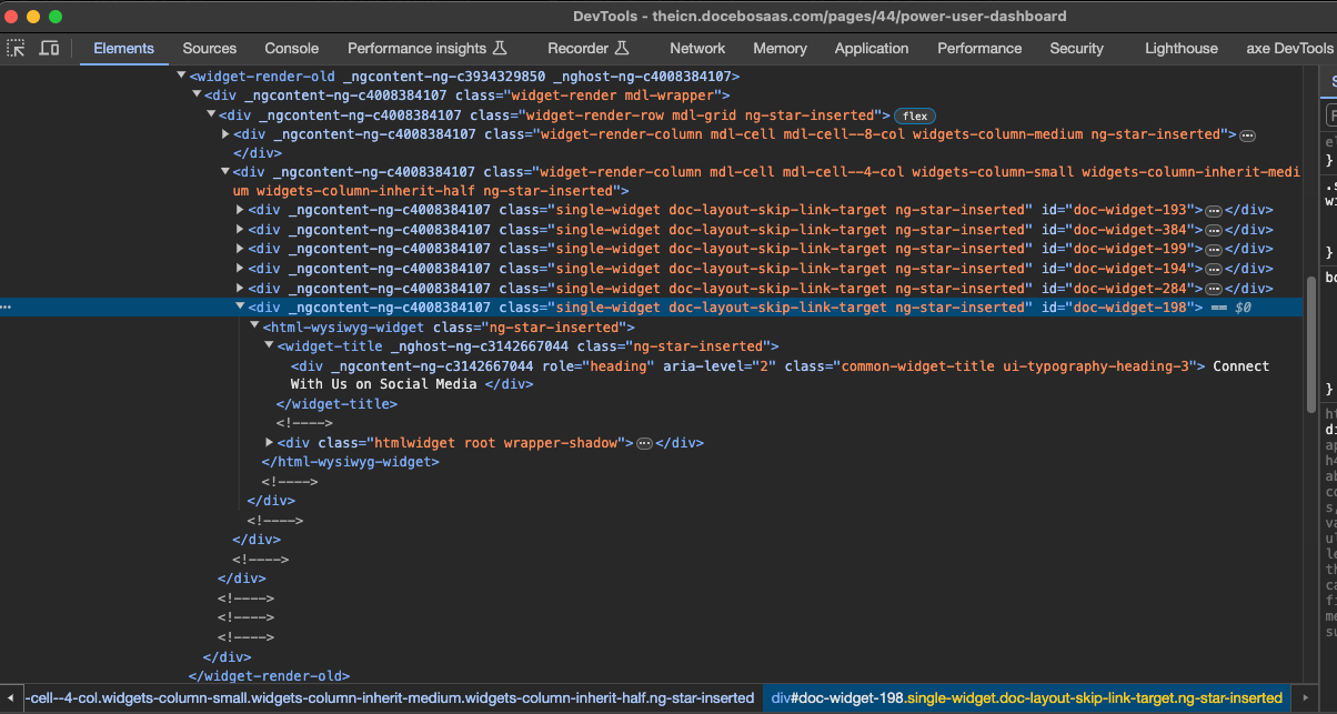
You’ll need to replace XX with the widget ID of the widget you created. This can be found after you save the page then right click > inspect element on the widget you should see something that looks like this:

In my case, the widget ID is 198 so I would use #doc-widget-198 …
Note: I only tested this on a 1/3 column-width widget and it’s not perfect but I think it’s a good starting point! You might need to tweak somethings to make it look good in your own platform.


