Curious if anyone would like to share their experience on how they solved for prioritizing recommended v. required content for learners in the platform.
We have received feedback from groups of more active learners with a large number of cards in their ‘My courses and learning plans’ that it would be nice to have a visual color scheme to differentiate course statuses. Similar to the idea outlined here: Course cards status formats | Community (docebo.com)
In testing, we have found that updating the colors section in advanced settings for ‘Confirmation Messages’ can address this, but also impacts the color of the search bar? We are of the opinion that managing these changes with CSS introduces risk that they will break.
Page 1 / 1
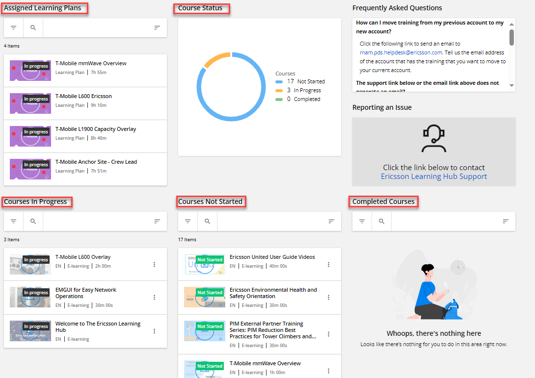
Hi, on our learner’s home page we built some structures with widgets. We drive most of our training with Learning Plans and in the upper left-hand corner the user has a list of assigned Learning Plans. To the right of that a doughnut graph of progress.
On the second row there are stacks of courses In Progress, Not Started and Completed (this user has not completed any).
This helps guide the user with what they need to accomplish. Starting in the upper left and flowing to the lower right.
Thanks for the feedback @dwilburn.
For anyone else interesting in sharing their strategy. I'm thinking of ways we can prioritize learning by who it was assigned by. Drip learning is an effective way to guide users on assigned learning paths and engagement with learning content is usually higher when it was assigned by someone respected/valued in their industry. I’m curious if anyone has leveraged enrollment fields and course additional fields to help users prioritize what is required training, recommended training, recommended by a mentor or enrolled by the system.
We have used course additional fields to indicate who ‘owns’ content but that is more for our reference as admins. But would using channels achieve what you are trying to do? We’re increasing the channels we use and make visible, and have created a whole new page where users can explore available courses by having different channels/topics they can search through. Could you do something similar and have channels for specific people?