This feedback is regarding the new SCORM player.
The new player is too busy. Too many buttons and places to click.
It requires more clicks to start a course. Improvements should make it easier to start a course, not more difficult. After clicking the start eLearning button, the user has to click another start eLearning button. The second click is just wasted time and an extra click. Especially since there is still another start/resume button to click after this!
The learning plan page header is way too big. The main feature of interest on this page is the list of courses, not the header.
The right side of the learning plan page is wasted now. Especially the learning plan details (Does any student need to know the learning plan ID?) The Average time is on the left side above the course list and just duplicated on the right. The “time to complete” information could easily be put on the left above the course list. The progress area takes up too much space and you don’t need a resume training button here. With the addition of the IN PROGRESS, etc markers it is easy to tell where you left off (good job Docebo!).
Regarding the right side of the course start page with the “go to next course” button. The user has just selected the course they want to take, why give them a “go to next course” button? This makes it confusing for the learner.
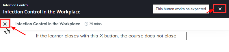
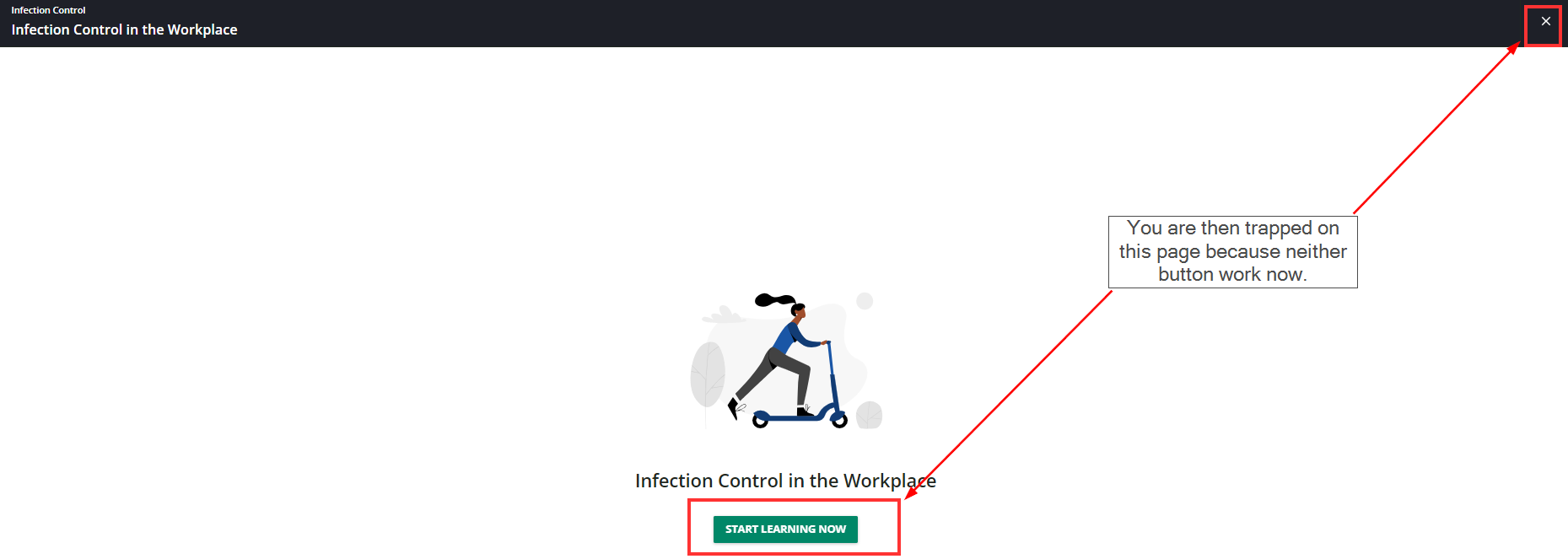
Why is the left panel of the course start page there? What is it’s function? It just tells the user that this is a SCORM course. I don’t think most people care or would even know what SCORM is. If you must have this page it would be more helpful to have the course description there (but the preferred place for the course descriptions is the learning plan page as detailed below). Ideally, since I assume some admins find this area useful, there should be a way to hide it. If there is one, please let me know as I have not found it.
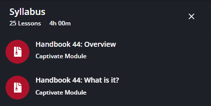
The course description is hidden at the bottom of the page - after you click to take the course. The description should be on the initial learning plan page where you can see all courses in the learning plan and read all the descriptions. We put important information for our learners to know here and now it is hidden and the user has to scroll to see it. Most users will not see it.
We need to be able to turn off all areas of the screen/new features we want to turn off.
We train clients as well as internal employees so we cannot notify all users of these changes and we want our LMS to look good and be easy to use.
I know some of these issues have been mentioned in other posts but wanted to add my thoughts to the growing list.
If anyone in this community has work arounds to these issues or knows ways to turn new features off I have missed please let me know.
Thanks.