How do you manage your pages / Catalogs / Channel within Docebo?
Hi Dear Community,
I want to get some ideas about using the Pages, Catalogs, and Channels within Docebo.
Today, A user can't search for a specific page . In addition, when you want to create a "sub-page" to the main page, the "breadcrumbs" don't show the user the correct hierarchy.
So when you want to create a page that contains a lot of content (LP/Courses Etc.) and create the best UI/UX for the user - It is hard for the user to locate the page if you don't place the link in the homepage.
I added an idea last week (Please vote if you find it relevant) - But if you have a solution that will solve the issue above - it would be much helpful :)
Thank you, Ofer
Page 1 / 1
@oferkenig Where I do think the product stands for some improvement here, Its about leveraging the page codes is how I answer your question.
I have 3 major levels in my catalogs:
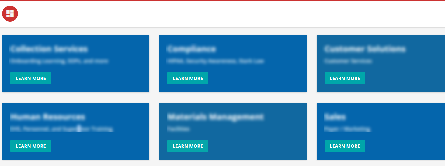
A top level - housing subject matter related to depts. This is my top level catalog and the only one linked to a home page.
A second level for when there are many modes for the single dept (for example, marketing / sales has a lot of stuff)
A third level - where typically a single catalog widget drives what is on the page.
Using codes and company abbreviations: examples - TOP, NODE, COMP1, COMP2, I can zone in pretty quickly through the two levels. The third level I usually add a short name for the dept/subject matter in combination.
You’re right, this is far from perfect.
We have a hierarchical structure as well, but of course it’s not reflected in the breadcrumb navigation in the same way as we guide users from one page to another.
Based on your post I have just posted another idea, related to the breadcrumb navigation:
@oferkenig Where I do think the product stands for some improvement here, Its about leveraging the page codes is how I answer your question.
I have 3 major levels in my catalogs:
A top level - housing subject matter related to depts. This is my top level catalog and the only one linked to a home page.
A second level for when there are many modes for the single dept (for example, marketing / sales has a lot of stuff)
A third level - where typically a single catalog widget drives what is on the page.
Using codes and company abbreviations: examples - TOP, NODE, COMP1, COMP2, I can zone in pretty quickly through the two levels. The third level I usually add a short name for the dept/subject matter in combination.
Hi @dklinger - How the levels you mentioned are reflected in the system from a user Point of view?
Hi@dklinger - How the levels you mentioned are reflected in the system from a user Point of view?
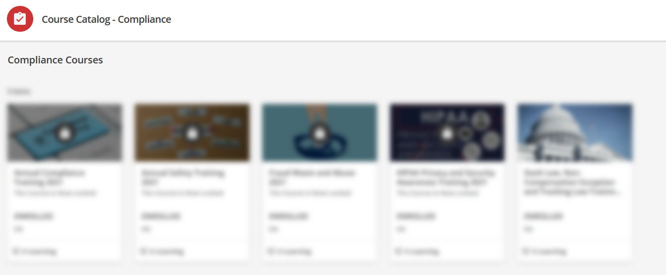
So I cant get too crazy and show you everything….but here is the walk into the levels:
It was really important to stand up something quick and clean with our implementation and call it usable as a version 1. A version 2 will probably involve a little more of a splash of color with background images for the appropriate levels to avoid the “blue block syndrome”. I have also been tinkering with a drop-down / accordion style menu to drive the second level of navigation.
@dklinger Thanks for sharing :) So if there is a necessity for 3 levels? So, the first levels - are all in the home page? Second level - all located in different pages for each and every “first level catalog” from the homePage? and the same goes for the third level ?
If thats the case - how do users can track easily all the content (on high level) that is on the second / third level?
In the meantime, you could create an HTML/CSS drop down that could contain all the links/sub-pages available within the platform
@dklinger Thanks for sharing :) So if there is a necessity for 3 levels? So, the first levels - are all in the home page? Second level - all located in different pages for each and every “first level catalog” from the homePage? and the same goes for the third level ?
If thats the case - how do users can track easily all the content (on high level) that is on the second / third level?
I can’t believe I left this thread high and dry.
Necessity? No. But key to an experience I want to drive home? Yes.
It really depends on how you catalog materials.
I would recommend drawing a site map to help you with deciding what would be appropriate navigation steps.
To lump of to split an experience is a good philosophical one. I am old school and have built deep catalogs. Informative and standardized levels of navigation in the experience is appreciated by learners. You may ask is all of this really relevant with search functions…I would say “yes”.