Has anyone had to update hundreds of icons bc of Docebo's bad UX?

  • 28 June 2023
  • 3 replies
  • 91 views

Userlevel 1

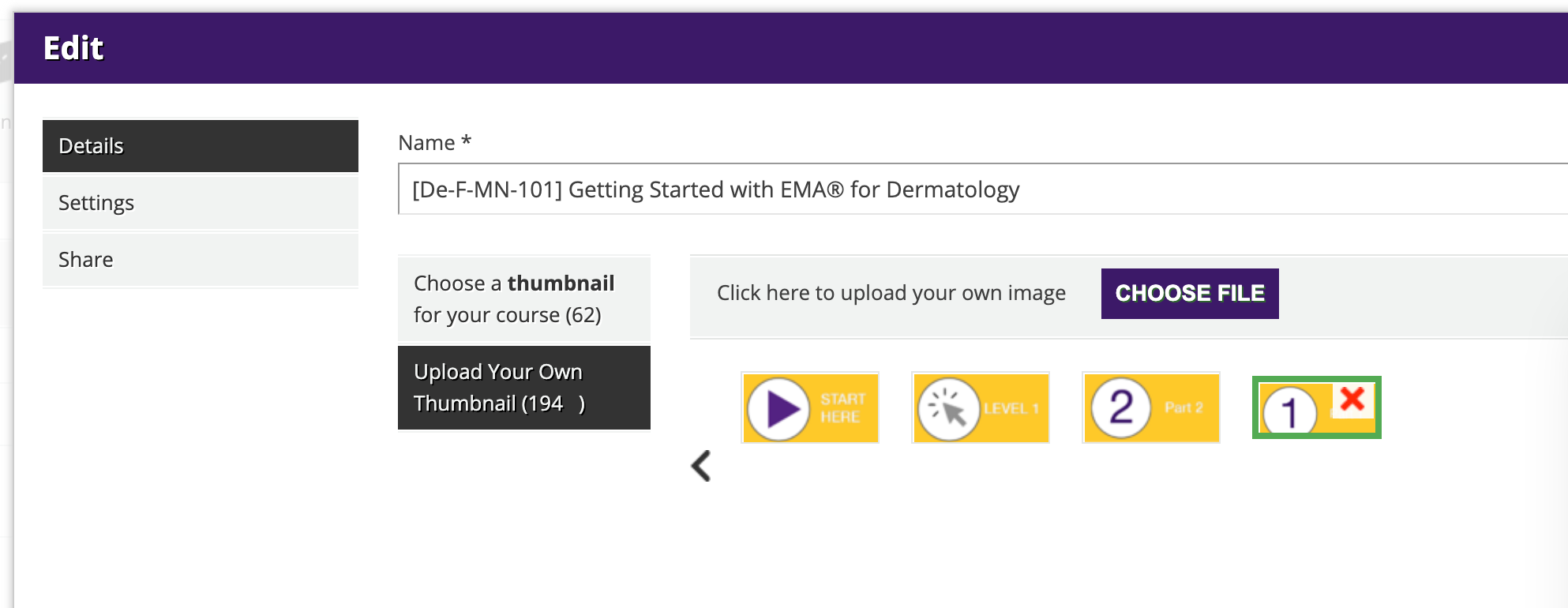
What kind of UX design has a GIANT red X that when clicked has zero warning before unlinking from ALL LPs and courses it is assigned to? Docebo’s response is to send poor UX design to the “Ideas” portal. This is not an idea. This is poor design. I have escalated and requested that someone on their team updates the icons for all the courses and LPs when this happens. I hope other users do the same, so they are forced to push it to the top of the list or at the very least we don’t waste time on their poor UX.


3 replies

Userlevel 7
Badge +3

Hi @vannacampoli I’ve done that before and know how frustrating it can be. In the following post there is some CSS code that can be used to hide the delete icon from all the thumbnails. I agree that it should be fixed in the UX, but for the time being, the CSS can be used as a temporary solution.


Userlevel 7
Badge +3

Also, please consider voting for the following idea to update the UX!


Userlevel 2

Please consider voting for the following idea as I am fed up with having support cases pointed to the ideas portal!


Reply