Question

Can This Be Done?


Userlevel 2

Good Morning!

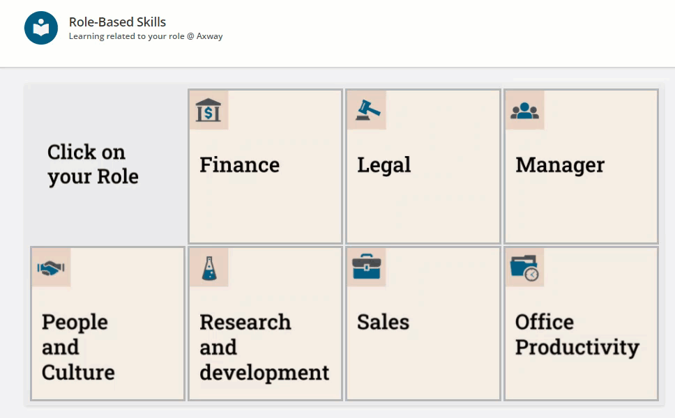
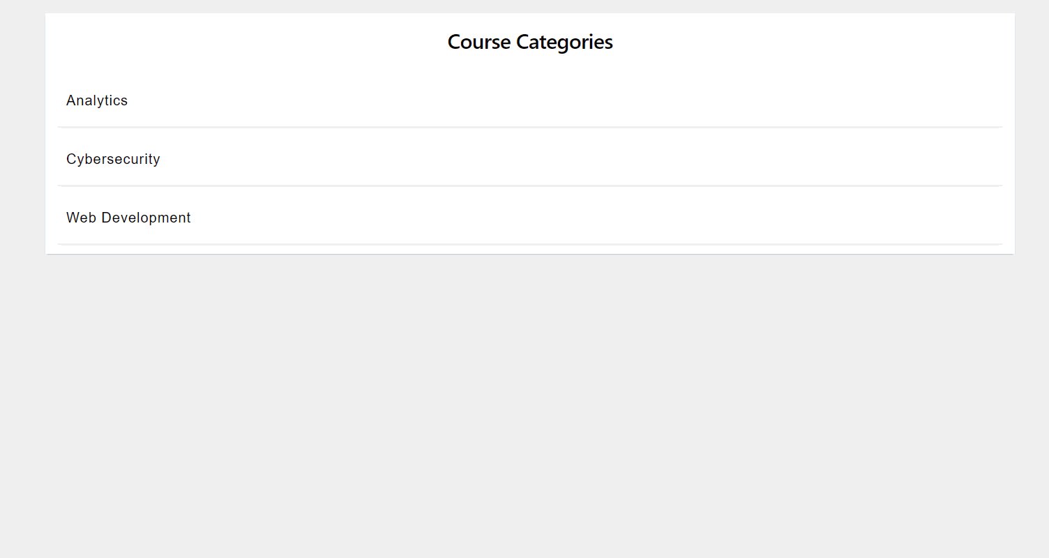
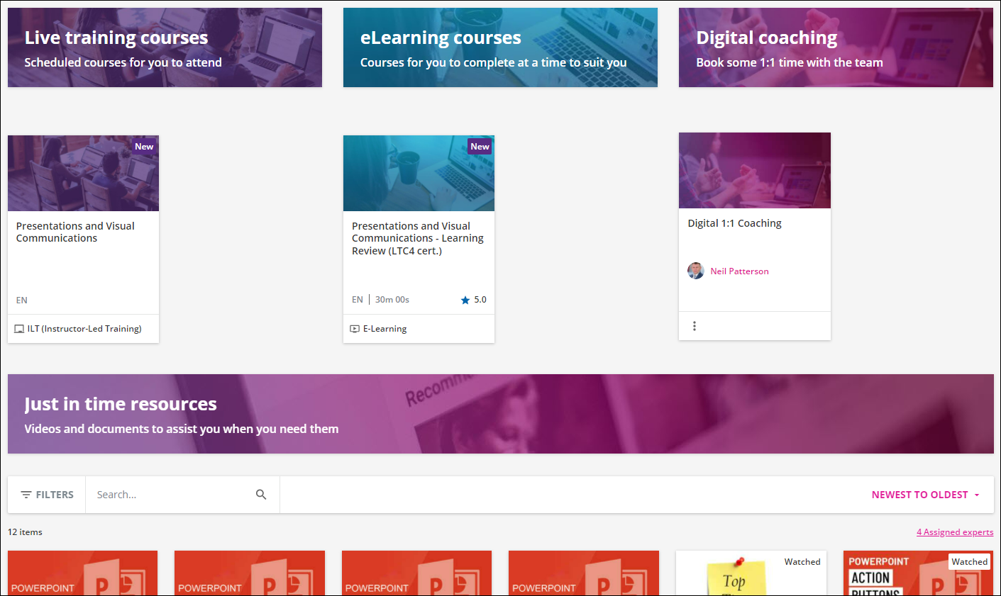
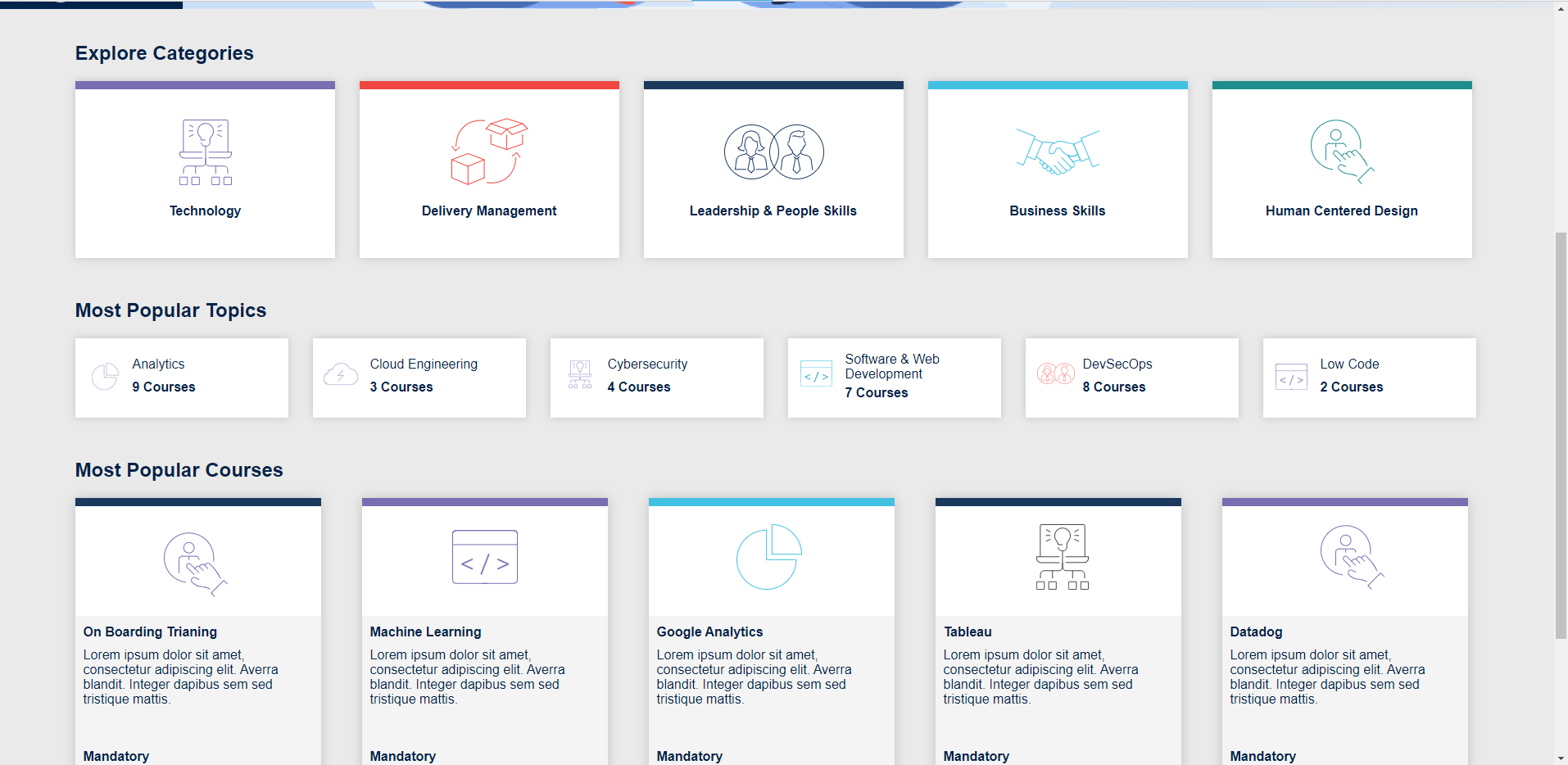
My organization is currently implementing Docebo Learn and we are trying to work with the UI/UX to create some custom catalog pages.  Specifically, we have a page on which we’ll have buttons for access to titles by category (image #1). The challenge comes in whether we can create the effect of the white back drop and course listing appear when clicking on one of the topic buttons (image #1).

Since we are so new to the application I was hoping there was an expert here who could share whether they think we can make this work and how we might approach it.  I have two excellent designers who code in HTML/CSS but we didn’t want to go too far down the rabbit hole if this simply isn’t functionality that could be supported.

Would anyone be able to share their thoughts on if this is something we can get working in our portal?

Thank you so much!

Michelle


35 replies

Userlevel 7
Badge +7

Hi @michelle.franz dont see your images...if you are looking to have ‘preset’ search filters by category, you can open you catalogue and search for a category, then add that link to your custom content box

sample link: /learn/catalog?ctldoc-catalog-0=category_id-3

Userlevel 7
Badge +5

Hi @michelle.franz 

The images didn’t come through, so it is hard to see what you are expecting to do, but I do know that you can do a lot of CSS customization of the LMS using the Configure Branding and Look found under the Admin menu.  You can change the appearance of existing elements on the LMS as well as do some fun things within HTML widgets.

Here is a post that contains links on some of the things you can do with the HTML widget: 


I am trying to find a post where someone had put up their CSS code for a navigation menu.  I re-purposed some of the code to have it do this for some tiles I built out for our categories:

If this is what you were thinking, I can share this code with you.

Userlevel 2

Grrrr, that’s my fault, I totally forgot to attach them!

Userlevel 7
Badge +5

Grrrr, that’s my fault, I totally forgot to attach them!

Oh those are super nice!  Yeah, if those are built out in HTML, then pop the CSS into here:


Userlevel 1

Grrrr, that’s my fault, I totally forgot to attach them!

Oh those are super nice!  Yeah, if those are built out in HTML, then pop the CSS into here:


Hi @Annarose.Peterson !  I am on Michelle’s team.  So I can create this accordian in html and css, but the problem is that we want the whole container to expand when you click on one of the Topics.  So for example when you click Analytics the Technology container would expand and you would see the related courses to Analytics.  If you click over to Cloud Engineering a different set of courses would display and the container would re-size accordingly.  I’m still new to docebo and what all can be customized, but do you know if this would be possible given that there is no where for me to write any custom javascript.  Thanks!


Kevin

Userlevel 7
Badge +5

Oh, I see what you are saying.  I don’t know if that is possible?  There are some limitations to the amount of things we can get the HTML widgets to do.  Usually Javascript just gets wiped and doesn’t work when I have tried to use it.  

I’m tagging @gstager because he has been super fantastic with CSS in the platform and knows very well the limitations of what is possible.  Maybe he can weigh in on this question further. 

Userlevel 1

Awesome, thanks for the help!

Userlevel 7
Badge +5

Thanks for the shout out @Annarose.Peterson - that was very kind.

@kjo133 and @michelle.franz - I am going to play around with a couple of ideas and see what I can come up with. Seems like a nice application as well as an interesting puzzle.

Userlevel 1

@gstager awesome thanks!  Yeah my initial thinking for the design was to be able to have everything on one page while displaying the courses in a relevant way for the user.  One of my other designs which was much more do-able was to have a new page for each level of the accordion.  So the first page would be the categories, then you’d click to the next page which would have the topics, and then the third page would have the courses of the topic.  

Userlevel 7
Badge +5

We attempted to do something similar in our previous LMS, and found that when we had those types of expanding boxes we had a difficult time getting page analytics in Google Analytics. That could have totally been PEBUAC (Problem exists between user and chair), but something to possibly consider if you plan on tracking clicks on the page.  

Userlevel 7
Badge +5

First of all, let me say that this idea is not for the faint of heart… LOL

Secondly - I think it is cool but I wonder about the ability to maintain this…? I mean - it is super easy to just use the built in cards with catalog. Switching to this sort of display - I think would pull you away from the ease of using Docebo built-in cards and force you to manually add a new card to this system each time a new course is made available. At least, I am not sure if you can hide the built-in cards this way - I didn’t try to do that.

I did find a way to make some neat “sticky” accordions that would display some cards - I just created some colored divs to fill the space for effect and put a different amount of course cards in each one. Again, not sure if you can do the same with built-in course cards but maybe this will provide some food for thought or at least a springboard to play with.

I like the effect - especially since there is no JavaScript involved.

If you have a couple designers - they may be able to take this much further than I could. I’m no expert - I simply know enough to be dangerous.

Here is a little video view of the effect. I did not test this across browsers or anything.


Userlevel 7
Badge +5

@steveninfinger - LOL - In my area it was always a PICNIC...

(Problem In Chair, Not In Computer)

Userlevel 7
Badge +3

First of all, let me say that this idea is not for the faint of heart… LOL

Secondly - I think it is cool but I wonder about the ability to maintain this…? I mean - it is super easy to just use the built in cards with catalog. Switching to this sort of display - I think would pull you away from the ease of using Docebo built-in cards and force you to manually add a new card to this system each time a new course is made available. At least, I am not sure if you can hide the built-in cards this way - I didn’t try to do that.

I did find a way to make some neat “sticky” accordions that would display some cards - I just created some colored divs to fill the space for effect and put a different amount of course cards in each one. Again, not sure if you can do the same with built-in course cards but maybe this will provide some food for thought or at least a springboard to play with.

I like the effect - especially since there is no JavaScript involved.

If you have a couple designers - they may be able to take this much further than I could. I’m no expert - I simply know enough to be dangerous.

Here is a little video view of the effect. I did not test this across browsers or anything.


This is very nice, important to point out the overall widget is still going to be the height it is on page load which can’t be overcome without running a script which we can’t do, so the widget needs to stay quite large when things are collapsed and will hit a limit while expanding leading to the scrolling, so I kind of back up what Greg said with going this route being curious for maintenance. What we ended up doing for things like this was to start with like a catalog or channel or other type of widget and just heavily modify their layout instead so that the additions and changes auto happened. 

Userlevel 6
Badge +2

@michelle.franz  @kjo133 - We wanted to do the same kind of thing, have topics across the top, and then you click and it reveals the relevant catalogue and channels, but couldn’t work out a way to do it.

We ended up going down a splash screen with the topics on that then takes you to a separate page for each.  It isn’t as user friendly as there are more clicks involved for the learner, but it was easy to set up and is easy to maintain.


Userlevel 1

Hi @Neil Patterson !  I like your design that you have here. I’m attaching a design that we want to go with for now.  It seems similar to yours with five main categories at the top.  I was wondering if it is possible to have five cards across the top?  Yours has the three.  Are your splash cards also custom or was this a docebo component that you used?


Thanks

Kevin


Userlevel 7
Badge +3

Hi @Neil Patterson !  I like your design that you have here. I’m attaching a design that we want to go with for now.  It seems similar to yours with five main categories at the top.  I was wondering if it is possible to have five cards across the top?  Yours has the three.  Are your splash cards also custom or was this a docebo component that you used?


Thanks

Kevin


Could be wrong but those look like the custom box widgets in a three column layout on Neil’s. That would mean not possible to do the same to accomplish the 5 row you are looking for as Docebo only has up to the 3 column layout 

The closet ways to get to the Five you are looking for would not be using built in features, but you could do one column with an html widget and either iframe in the 5  from some other place, or build out a little page into the html widget directly to make five boxes. However, keep in mind in both approaches to design for multiple screen sizes with this as it will be a significant impact to those boxes.

Userlevel 1

Thanks @Bfarkas !  This is helpful.  A follow up question I have when doing custom page building is, how do I link everything together?  For example, if I made a Category card here and when the user clicks on it, how do I get the URL for it to direct to?  On the courses/catalog pages do they have a link I can copy to my href?

Userlevel 7
Badge +3

Thanks @Bfarkas !  This is helpful.  A follow up question I have when doing custom page building is, how do I link everything together?  For example, if I made a Category card here and when the user clicks on it, how do I get the URL for it to direct to?  On the courses/catalog pages do they have a link I can copy to my href?

For the most part, if they are on this page they are logged in and should be able to access the other pages, so you can just navigate to the page you want to link to, and pull the url after the domain to put inot the link field of your custom page. Couple things to keep in mind, if the user does not have access to the page, this will not give it to them they will get a 403, on other custom pages when you change names the URL changes, if on the app, this can send the user to a browser instead of the application, make sure to keep them relative by removing the domain from the url so for instance if I was getting the link for this page, I would just put this /html-css-49/can-this-be-done-2997


Userlevel 1

@Bfarkas ok thanks very much! this is all super helpful!  I think I will try to just create my own custom html and css for the look on the top category cards.


another question is how do you think it would be best to do the Most Popular Topics, and Most Popular Courses?  There would be logic behind what is displayed.  Would you recommend just using one of the components for these sections, and then overriding the default css to try to get as close to this style as I could? 


Sorry to keep building off this and asking so many question, but greatly appreciate the support!

Userlevel 7
Badge +3

@Bfarkas ok thanks very much! this is all super helpful!  I think I will try to just create my own custom html and css for the look on the top category cards.


another question is how do you think it would be best to do the Most Popular Topics, and Most Popular Courses?  There would be logic behind what is displayed.  Would you recommend just using one of the components for these sections, and then overriding the default css to try to get as close to this style as I could? 


Sorry to keep building off this and asking so many question, but greatly appreciate the support!

Yes, if you want the logic stuff to work without heavy programming work then yes find the widget that works closest to what you want and tweak  there’s a bunch of threads around of examples of people doing this, I think I did one a while back to make the channel look like the catalog and vice versa


Userlevel 6
Badge +2

Hi @kjo133 - sorry have been back to back the last few days, and not managed to get on here. 

@Bfarkas is correct, our design just utilises the standard 3 widget rows.  We were going to create some HTML, but decided to keep it more simple.  I love your design, this is the kind of thing I would have had, but I was outvoted by the rest of the team in favour of images and colours!

With regards to pages, don’t forget that the pages need to be in a menu for people to access.  If you don’t want to add them all to the users menu, you can create a hidden menu that everyone has access to.  It’s a game changer if you don’t already know about it!  This post explains it all:


Userlevel 1

Hi @Neil Patterson ! Thanks for the reply!  So did you use a custom card for each card (Business Development for example)?  Or did you modify an existing component?


Also thanks for the tip on the menus too!  

Userlevel 6
Badge +2

They are image widgets.  We created the images in SnagIt and then put them on there withe the URL of each page,


Userlevel 7
Badge +3

They are image widgets.  We created the images in SnagIt and then put them on there withe the URL of each page,


Friendly reminder, in this type of setup using images for text navigation, anyone who has trouble seeeing, uses other ways to see the page or interact with the page will essentially see nothing here but a link since all the descriptive text is within the image and there isn’t alt text or descriptive text. This gets tricky for those with disabilities as well as other use cases like those who rely on browser translation or changes in spacing, sizing, contrast, etc.

I’m curious why not just use the custom content box which you can get extremely close to this effect and could probably mimic completely with some css changes?

Userlevel 1

Thanks @Neil Patterson !


@Bfarkas I was just curious as to how Neil achieved it.  I currently have a good layout on my local machine, but when I bring it into docebo there are a bunch of styles that aren’t coming through correctly.  I’m also running into an issue where the Docebo Row is not full width, so my cards are coming through smaller.  Not a huge issue, but was wondering if there is an easy way to make a certain row full width, or if I could add a CSS ID to one row and not change all the others.

Reply