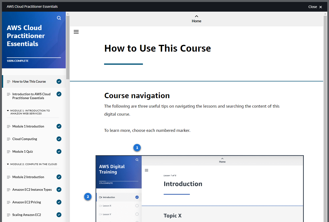
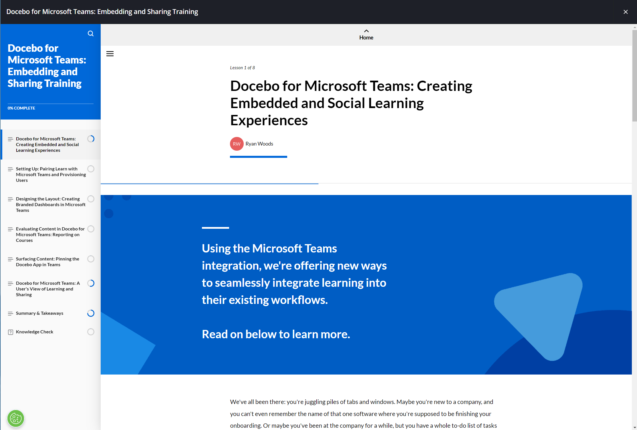
I notice that AWS skill builder and Docebo University both have the same responsive full page course design with table of contents on the left, and scrollable content for 80% of the interface. The content then includes flip cards, tabs, accordions, videos, images, text, and quizzes in similar styles, although the Amazon version is slightly cleaner.
I am interested in replicating this look for at least some of the e-learning courses on my platform. Since these are so similar, is there a “standard” method to achieve this look and functionality? I can design this if needed, but hoping there are shortcuts in the form of templates, etc. to expedite.
Here are the two examples of the look and function I am referencing:
https://explore.skillbuilder.aws/learn/course/134/play/99519/aws-cloud-practitioner-essentials
https://university.docebo.com/learn/courses/534/docebo-for-microsoft-teams/lessons/2587:550/docebo-for-microsoft-teams-embedding-and-sharing-training
Screenshots:
Any suggestions and ideas are appreciated… thanks. :)


