Hello,
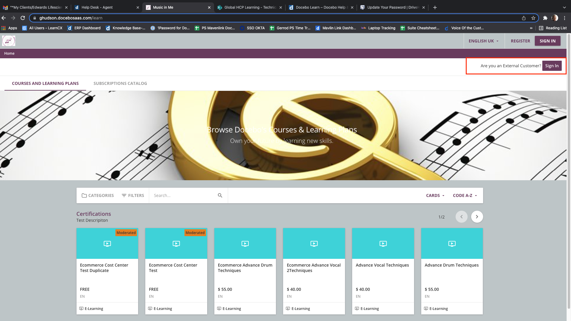
So I had a client ask me if there was another way to create a “2nd” sign in button on the Sign in page. In this client’s use case they want to quickly point learners who were external to use the Extended Enterprise if they accidentally arrived at the main parent platform page.
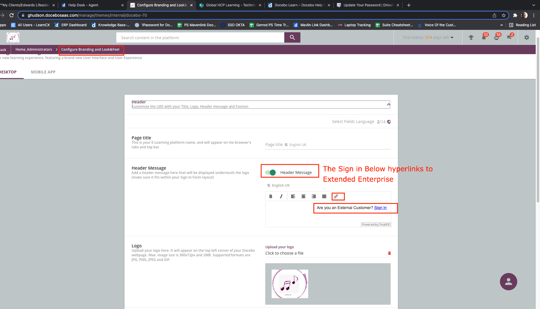
Please see the Look of the Sign and Page, the header I created, and the CSS I use to style the Sign in Button which is a link to Extended Enterprise.
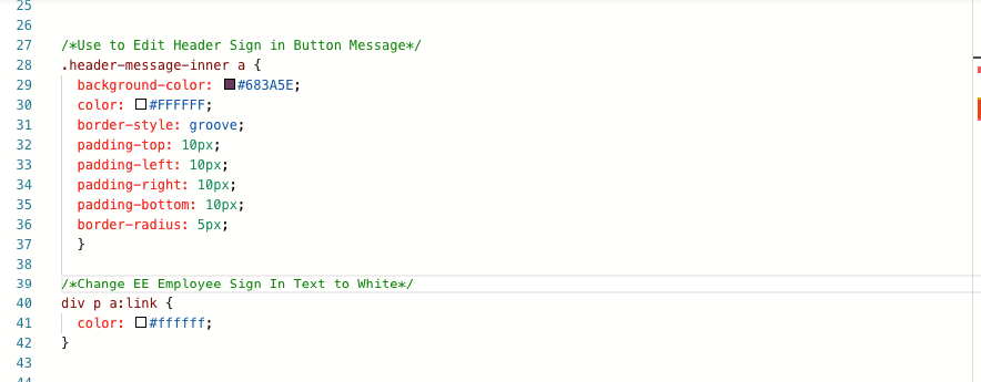
CSS Used:
/*Use to Edit Header Sign in Button Message*/

.header-message-inner a {

background-color: #683A5E;

color: #FFFFFF;

border-style: groove;

padding-top: 10px;

padding-left: 10px;

padding-right: 10px;

padding-bottom: 10px;

border-radius: 5px;

}


/*Change EE Employee Sign In Text to White*/

div p a:link {

color: #ffffff;

}
