Best Answer

CSS Challenge/Trickery/I maybe a little lazy and wanted to see if someone else has fought it

  • 28 July 2022
  • 6 replies
  • 146 views

Userlevel 7
Badge +6

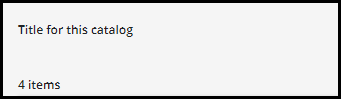
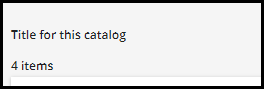
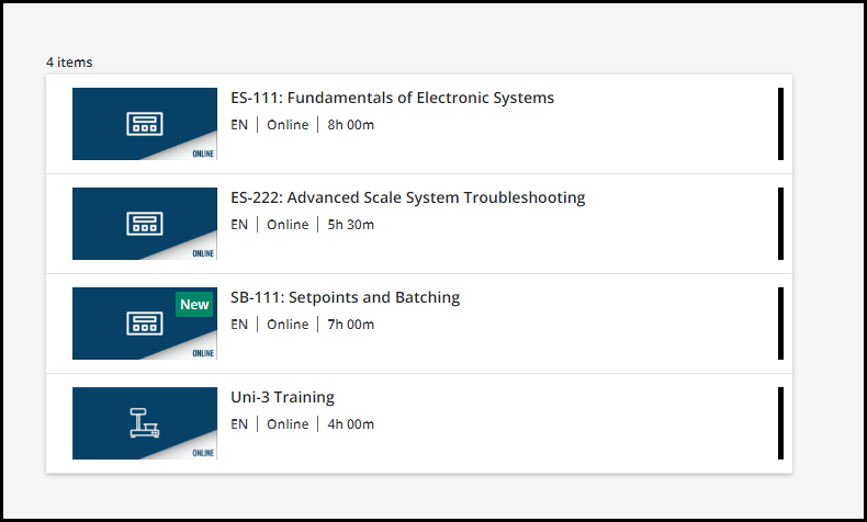
Hi - I genuinely feel lame asking this, but I have a catalog widget that I am using in list mode and there are three things that I would love to tighten up with the experience.

  1. make that title a little smaller
  2. cut down on the spacing if possible
  3. remove the status from the widget all together

With an attempt to make the widget to the left scale better with the one that is “dynamic”.

If some of you have fought this and have something that can come out of your backpocket? Maybe I can answer something for you soon enough?????

Any help would be appreciated….

icon

Best answer by gstager 28 July 2022, 15:28

View original

6 replies

Userlevel 7
Badge +5

Ok - So I will give you a couple items to get started.

I am not 100% sure I recreated your setup the same.

I went with a half-half layout assuming you had a graphic next to the actual catalog widget.

For number 1 - I simply left the title space blank in the widget settings

For Number 2 - I think it tightens up a bit when the title is gone

For Number 3 - try this.

/** Remove Enrollment Status Line from Catalog Entry **/

#doc-page-28 div.ui-list-item-content-colophon > div.ui-list-item-content-row.ui-list-item-price-enrollment-status {
display:none;
}

Be sure to change the page number to match the page on your platform you are adjusting.

See where this gets you for starters and we can tweak from there.

Perhaps I need a closer look at that gap as indicated in number 2 - Let me know.


Userlevel 7
Badge +6

Thanks Greg - it was laid out in thirds - let me start by pulling out the status.

I do want to hold onto the Title - As it is an important element.

-Dan

Userlevel 7
Badge +5

I do want to hold onto the Title - As it is an important element.

-Dan

Oops - I misread that.

Try this - adjust page number and font size to desired values

/** Adjust catalog widget title Size **/

#doc-page-28 doc-widget-course-catalog div.common-widget-title {
font-size: 12px;
}

I will take a peek at the gap.

Userlevel 7
Badge +5

How about this for the spacing?

Do some tests and let me know if any more adjustments are needed.

/** Adjust the gap between title and courses **/

#doc-page-28 ui-data-browser-content div.course-catalog-content-wrapper {
padding-top:0px;
}


Userlevel 7
Badge +6
Pretty and now I have options for maybe getting in one more row.

Thank you @gstager 

Userlevel 7
Badge +5
Pretty and now I have options for maybe getting in one more row.

Thank you @gstager 

Oooooh! I love this!! 

Reply