Question

CSS for adding a label to the "three-dots" icon

  • 16 July 2024
  • 2 replies
  • 48 views

Hello, Community! 

We’re new to Docebo (we just finished our onboarding!) and fairly new to CSS as well.

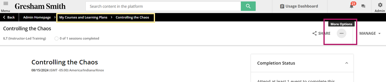
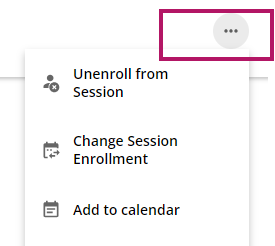
I’d like to add a label to the “three-dots” icon at the top of the course page (or any page) so that people know it is a “More Options” menu. Our people seem to be “missing” that this icon is there.

During onboarding, our rep provided the following code to add a label to our Admin gear:

#doc-layout-internal-header > nav > div.internal-header-navigation-group.internal-header-navigation-group-bordered.internal-header-admin-menu.ng-star-inserted > div > ui-button-icon::after{content: "Admin";color:#000;font-size: 0.88em;font-weight: 600;}


I could replicate this coding, and I’m typically the kind of person who likes to dig in and figure things out myself, but I’m not sure of how to locate the pathing I need to identify the “three-dots” menu. Hard to dig in when I’m not sure where to start digging :)

Any help and guidance you can provide would be greatly appreciated.

2 replies

Userlevel 5
Badge +1

So, I couldn’t figure out where you got your screenshot from 🙈 but no matter.

First, here’s some general advice on how to identify the CSS selectors.

Now, something I noted with a different round button in the top right (since I couldn’t find the specific one you mentioned) was that you could potentially make use of the aria-label attribute to be more specific about which button. The CSS selector might otherwise be broader than you’d like.

So, I came up with this (again, for a different button; you’d need to confirm the correct aria-label value):

button[aria-label="Unenroll from the course"] div span:after {
content: "Unenroll";
color: #000;
font-size: 0.88em;
font-weight: 600;
}

button[aria-label="Unenroll from the course"] span.icon.ng-star-inserted {
display: none;
}

(I had some issues getting positioning the text nicely so my solution was to hide the icon with the second declaration.)

Hope you can find a solution that works for you.

@Ian - Thank you for your help - I’ve followed the steps but I’m not getting the results I’d like. I’m wondering if you see any obvious errors in my coding. If not, maybe this just isn’t something that can be adjusted. I appreciate any help you (or anyone else in the community) can provide.

Here is a better screenshot of the button I’m trying to target on our Course Page:

The “More Options” text shows up when I hover over the icon/button, but I’m trying to get the text to show up below the icon/button even when the user is not hovering.

Here is the XPath I get when I copy out of the Dev Tool:

Full XPath:  /html/body/div[1]/div/div/div/doc-layout/div/main/div/lrn-content-overview/lrn-widget-course-header/div[2]/div/dcb-ui-menu/div/div[1]/dcb-ui-button-icon/button

XPath: //*[@id="ui-button-icon-109"]
 

Here are the various ways I’ve entered the CSS (none of which had the desired result)

#doc-layout-page-content > lrn-content-overview > lrn-widget-course-header > div.dcb-ui-menu-trigger.ng-star-inserted > div > dcb-ui-button-icon button[aria-label="More Options"]::after{content: "More Options";color:#000;font-size: 0.88em;font-weight: 600;}


#doc-layout-page-content > lrn-content-overview > lrn-widget-course-header > div.dcb-ui-menu-trigger.ng-star-inserted > div > dcb-ui-button-icon button[aria-label="More Options"] div span:after{content: "More Options";color:#000;font-size: 0.88em;font-weight: 600;}


#ui-button-icon-109 button[aria-label="More Options"]::after{content: "More Options";color:#000;font-size: 0.88em;font-weight: 600;}


Reply