CSS for completed courses


Userlevel 1

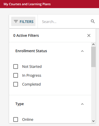
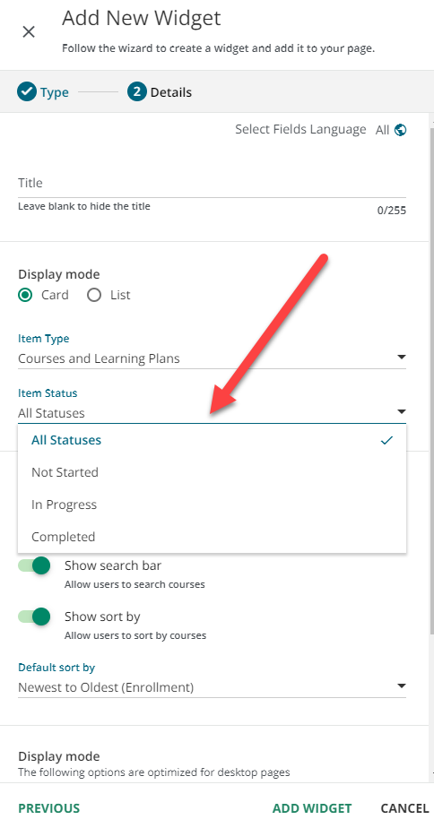
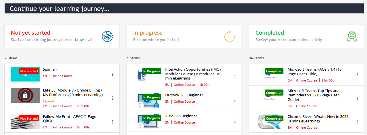
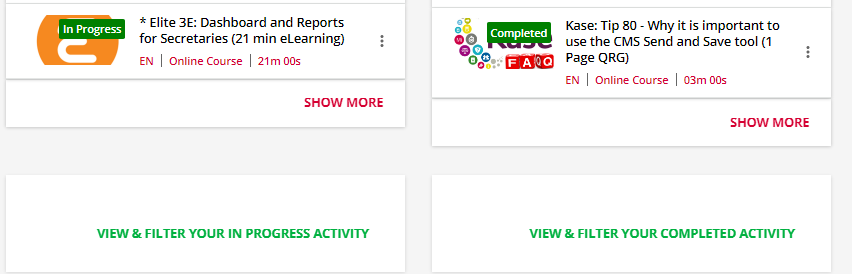
I am not seeing this specific thing posted anywhere so I do apologize if it is - But is there a way to apply CSS to sort ‘completed’ from ‘in progress’ and ‘not started?’ Looking specifically for the “My Courses and Learning Plans” page so that it shows up in the three groupings instead of just showing the courses all together.


13 replies

Userlevel 7
Badge +5

I don’t have CSS for this one but perhaps the filtering options will suffice…?


Userlevel 7
Badge +5

You can create a separate page, and put three of the “Courses and Learning Plan” widgets on the page.  Then when you select each completion status when configuring the widget.


Userlevel 7
Badge +5

@Annarose.Peterson - That would be one way to tackle it!

Userlevel 7
Badge +5

Sorry - I totally realized they were asking a CSS question - blarg.  I should have prefaced: an alternative to CSS.

Userlevel 7
Badge +5

@Annarose.Peterson - no need for apologies - I didn’t give any CSS either.

Userlevel 7
Badge +6

Here is some CSS.

C

S

S

Userlevel 7
Badge +3

Haha, no need to apologize especially since this is not really a problem for a CSS solution :) Both of your solves are the better routes.

Userlevel 6
Badge +2

We do exactly what @Annarose.Peterson suggests in our site >


Userlevel 7
Badge +3

Here’s a question, this layout comes up a lot, seems one of the most common. Is this on the home page for them? I often wonder what the value is for completed being as prominent in this type of setup instead of focusing on moving forward with what still needs work on? I know theres the need for certificates and such, but thinking just a deeplink to completions/certificates/my learning history or something along those lines. I suppose when they roll out the better versions of retakes maybe. Otherwise I often think about maybe from a focus of ‘to do’ does it make more sense to just do not started, in progress, and then a third thing, maybe open enrollment catalogs or something that they could enroll in to take? Just curious thoughts.

Userlevel 6
Badge +2

Hi @Bfarkas , it is at the bottom of the homepage. I think it’s a universally accepted fact in psychology that when humans complete individual tasks, our brains release dopamine which causes positive feelings such as happiness, pleasure, and motivation. This format just helps to reinforce that naturally occurring phenomena as they see the completed list grow ( the feedback tells us they can easily find what they have done in the past if they need to review it in the list or more broadly via the button to channel 9).


Userlevel 7
Badge +3

I’ll take that, I guess I go for that reaction via other routes like notices and badges/rewards on the moment of completion, when that physiological reaction is happening, and the way I’ve made essentially custom learning plan pages which as you complete collapse the individual items down, check off and is a pretty solid visual of learning plan status completion. I view the home page as quick actions to dive back in, so I suppose largely perspective of purpose of page. I’ll also note, not saying no completions available on the homepage, just not equal billing. 

Userlevel 6
Badge +2

I guess that highlights the benefit of a flexible interface 👍

Userlevel 7
Badge +3

100% was more just a continued curiosity. 

Reply