Ok! you guys are just great at helping I am a jack of all master of none. I do everything from ID, to graphics, to LMS, to video editing, so CSS HTML is a jack not expert trade for me.
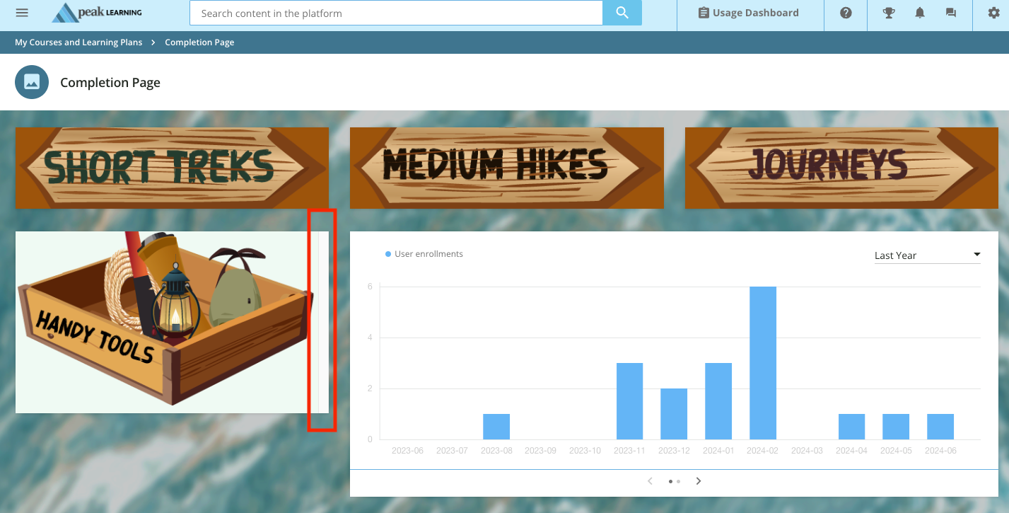
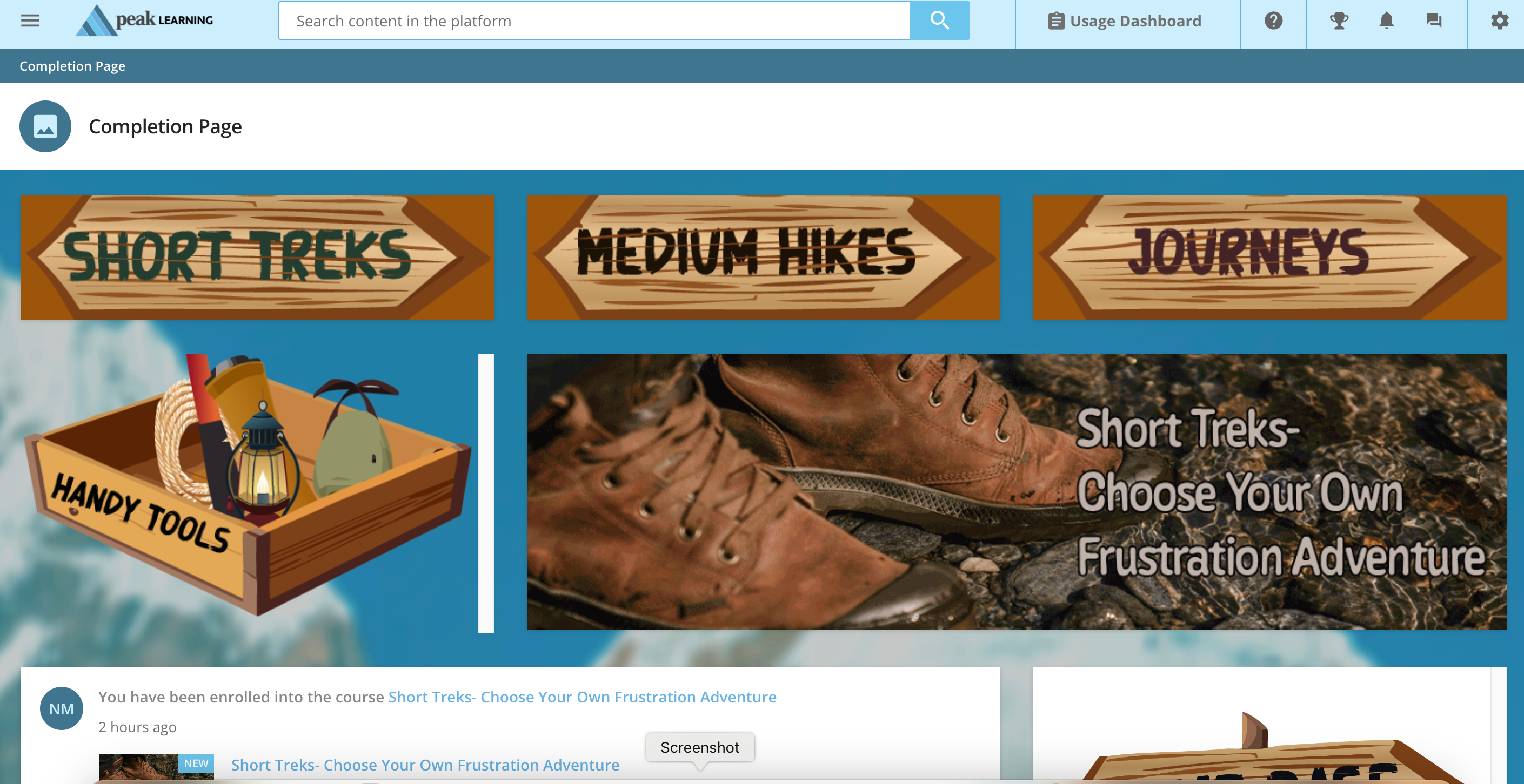
I am trying to design a new page. I really liked the hover on the map kind of example Docebo put out on the guides, but I couldn’t get it to work without a white background and scrollbar.
I moved to the custom flipcard and added those *somewhat* successfully. I don’t love the background color, etc.
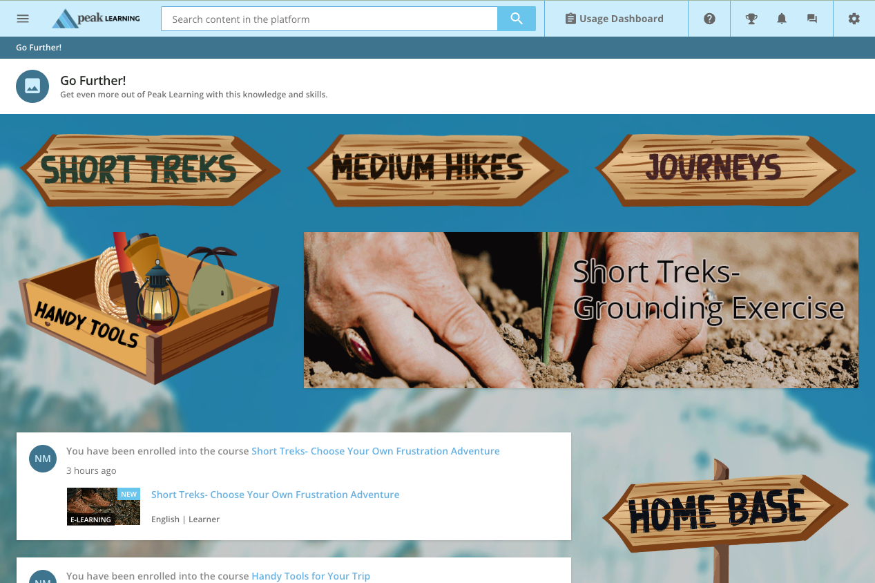
I am down to just trying to create a HTML widget that takes you to a course because I do not have Coaching or Assets. (It is also not my favorite, I would rather have just a list of downloadable files)
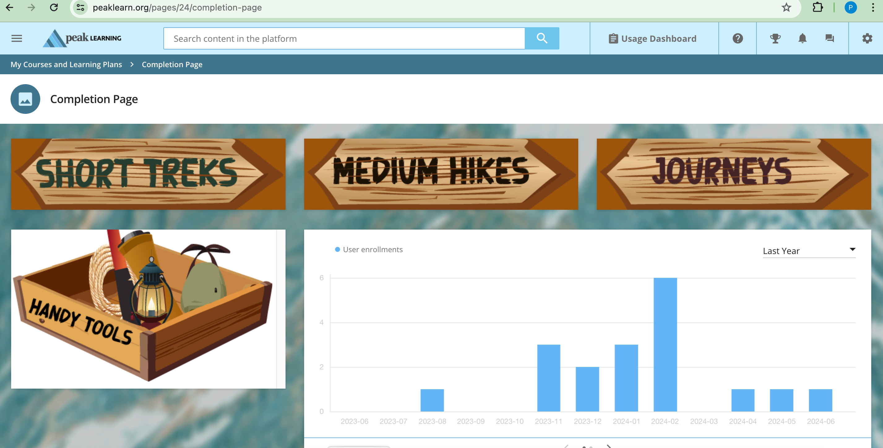
If I could JUST get rid of that padding on the image, I could be satisfied but not happy with what I’ve done so far.
Here is my CSS and my HTML for the Handy Tools/Course link widget (I gave up on the hover effect on this one):
//HandT_image
#HandT_image {width: 100%; opacity: 1.0; background: rgb(95, 200, 139, 0.1);
justify-content: center; background-size: cover; height:100%; width:100%; padding: 0px;
background-position: 50% 50%;
}
#HandTHover_image:hover {opacity: 0.5;}
<div id="HandT_image"><a href="https://www.peaklearn.org/learn/course/46/handy-tools-for-your-trip?generated_by=13034&hash=6ff5a6c8c83e762d7f3d0a8d62a0d76fde90d1ec"><img src="https://cdn5.dcbstatic.com/files/p/b/pbhtraining_docebosaas_com/userfiles/13034/handy_tools.png" alt=“Box of Tools” /></a>


