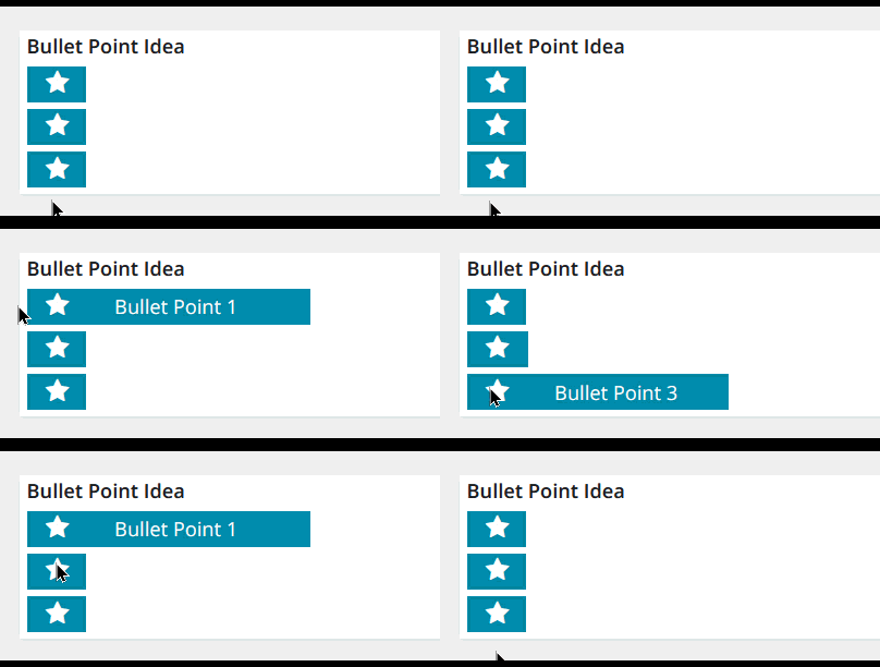
Thought I would have a little more fun with some CSS ideas.
I was thinking about how a bunch of bullet points can be really boring and what we could do to change that up a bit so here was something I thought of to make it a little more interesting.
I used a Font Awesome icon (part of Docebo) to be the new bullet and made it so when you hover over it you can read the text when the information slides out.
Of course you can modify the code however you wish for colors or the icon to suit your needs.
Here is how it turned out.

This has both a CSS and an HTML component.
Here is the code for exactly what you see above.
CSS
/** Tweak your width and height as desired **/
/** I chose to go small to just show the bullet **/
/** adjust colors and duration as desired **/
.hoverBox {
    width: 42px;
    height: 25px;
    background-color: #008aab;
    color: white;
    transition-property: width;
    transition-duration: 0.5s;
    margin: 5px;
    white-space: nowrap;
}


/** This is the new width when you hover **/
/** Set as desired - suggest enough for longest bullet text **/
.hoverBox:hover {
    width: 200px;
}
HTML
<!-- This is the little Header -->
<!-- Size and style it however you wish -->
<div>
<h4 style="margin-left:5px;">Bullet Point Idea</h4>
</div>

<!-- These are the Bullets -->
<!-- Bullets are all the same, just swap out text as needed -->
<!-- Easily copy and paste another div to make additional bullets -->
<div class="hoverBox">
<p><i class="fa fa-star fa-fw" style="font-size:18px;margin-left:10px;margin-right:25px;"></i>
Bullet Point 1</p>
</div>

<div class="hoverBox">
<p><i class="fa fa-star fa-fw" style="font-size:18px;margin-left:10px;margin-right:25px;"></i>
Bullet Point 2</p>
</div>

<div class="hoverBox">
<p><i class="fa fa-star fa-fw" style="font-size:18px;margin-left:10px;margin-right:25px;"></i>
Bullet Point 3</p>
</div>
Hopefully this helps someone out!


