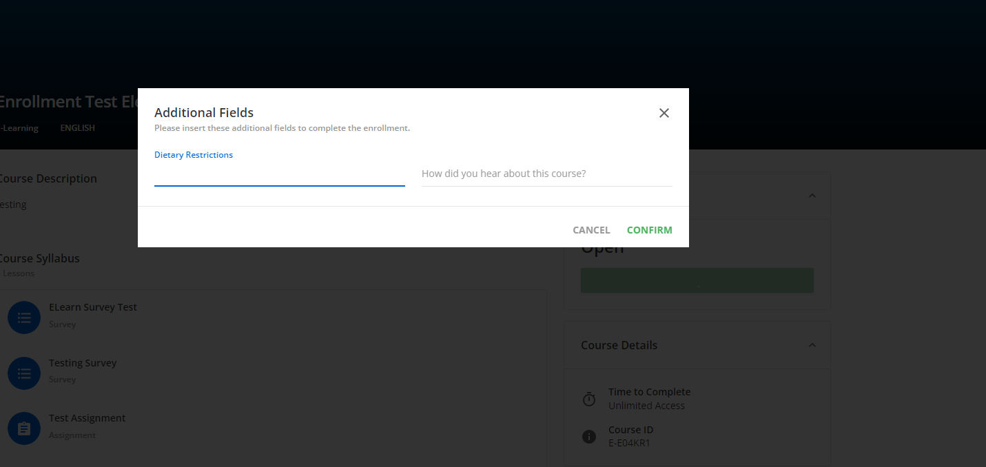
We are trying to reduce the number of START buttons and this particular pop up it just an additional click we don’t need.   I’ve been digging on the HTML/CSS pages but haven’t quite found any code that shows how to eliminate/block this pop up.   Our external users don’t care about their “learner activity”  they just want to register and start a course.   So it would be a huge win if there were code to block this box.


I don’t recognize this modal, can you explain the conditions and where it shows so I can recreate and take a look?


When you enroll in a course, you hit a yellow button Start Learning Now (we have it labeled as Start), that pop up occurs and then makes the user close, view my courses, start.   We don’t want the pop up to show at all.  It’s an extra click that is uneccesary and a common complaint.  I’m hoping there is something in CSS that can block that pop up somehow.


Ah, sorry didn’t recognize for some reason. Yeah that is annoying. I am assuming you want the box not to show and have them begin the course immediately?

So it looks like this would hide it, the problem is it is not specific so it will pretty much hide most dialogs around the system

doc-layout-dialogs ui-dialog {
display: none;
}

The real unfortunate thing is because we are restricted to css customization only not a lot to do here, the real solve would be a simple javascript to essentially select an option automatically.


Have you tried playing with this setting?


I think that only applies once on the course itself and whether it auto launches or shows you the available content to then select from, the enrollment page they are coming from doesn’t trigger that immediately until you hit the “Start” or the “Play” either on the modal or on the button under the modal.


Hi @Bfarkas  -  we also have a pressing need to hide this course enroll pop-up. Applied your useful CSS code in sandbox (thanks!) and after conducting a cursory test, can’t see it affecting other dialogs/pop-ups across the wider system UI and navigation. Just curious, did you experience this CSS hiding/impacting other dialogs? If so, which ones? 


Hi @Bfarkas  -  we also have a pressing need to hide this course enroll pop-up. Applied your useful CSS code in sandbox (thanks!) and after conducting a cursory test, can’t see it affecting other dialogs/pop-ups across the wider system UI and navigation. Just curious, did you experience this CSS hiding/impacting other dialogs? If so, which ones? 

I’ve never implemented this, was just providing for this thread, maybe the original poster did or can comment.

That being said, one of the problems of this type of thing is it may hide dialogs and so you wouldn’t see their impact. I just went back through this using the new course layout, and for instance :


which shows before getting to the confirm dialog, and would be gone.

That being said, since I was in, I saw a more specific way to do this which works on the new course layout, did not test on the old course layout:

doc-layout-dialogs ui-dialog:has(.lrn-widget-content-enrollment-confirmation-body){
display: none;
}

This checks the dialog to make sure it only contains a div with a pretty specific class, so this seems safer, although prone to breaking on Docebo changes more.

Still feels like a weird user experience to me since I have to basically refresh the page to see start in the new experience.


Thanks for the further insight @Bfarkas - have yet to switch to new course player but was able to adapt your code to the below, which seems to work for old/current course player:

doc-layout-dialogs ui-dialog:has(div.course-enrollment-body){
display: none;
}


Reply