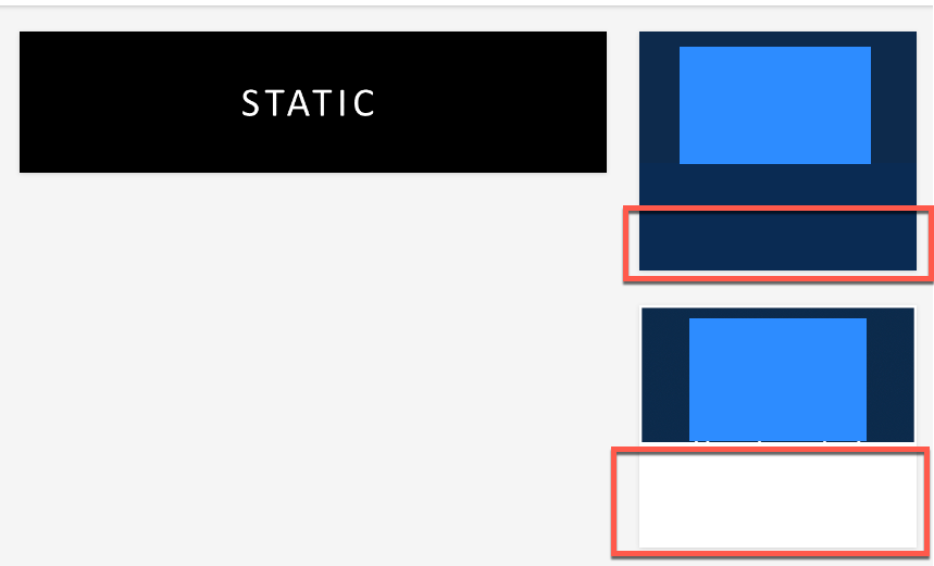
I’m trying to use HTML widgets to load images for multiple languages that will each be linked to separate catalogs. Using the WYSIWYG works great to add the image to the widget, but no matter what sizing on the image I try, I cannot get the alignment I’m looking for. 

The widget automatically adds <p> to the HTML which creates whitespace, I’m able to remove the whitespace but that makes the widget slightly shorter than the carousel I have next to it.

Whitespace


whitespace removed but widgets different sizes - both HTML/WYSIWYG widgets - both images set to 220px
Aspect ratio lost when forcing the HTML widget to 220px to align with image on left. Showing with or without white the versions showing the image doesn’t size properly

I am a novice with HTML/CSS so I’m hoping I’m just missing something simple. Any best practices out there for this? We have tried many many sizes of the image but ultimately it’s the same issue over and over again. 

Figured it out, just in case this helps anyone else using the HTML Widget, we added the below to the CSS (you’ll have to find your widget specific id for the #doc-widget-xxx)


#doc-widget-464 .htmlwidget {
background: none !important;
box-shadow: none !important;
}


I know you’re asking about the HTML widget, but we solved this issue by making sure the images we were designing were the same size for width and height, we then used the image widget and they lined up perfectly. Here are the measurements we used, and we designed all images in Venngage: 

Column Widths

1/1 - full width (1770px wide minimum)

1/2 - half width (885 px wide)

1/3 - three columns (545 px wide)

2/3 + 1/3 - two columns 

1/2 + 2/3 - two columns


Banners

1/1 - full width banner to separate sections

1770 x 150px


1/3 - three columns Banners 

545 x 140px


1/2 - half width

885  x350px


I don’t know if this response will be useful since it’s been a while since the original question was asked, but I’ve found this tactic to be very useful since I’ve heard that using !important isn’t always ideal.

Instead, I’ve found the code below to work brilliantly each time. If you specify a margin of “0” for the p element of the specific widget, it will eliminate the white space at the bottom.
 

#doc-widget-### p {
margin: 0;
}


Reply