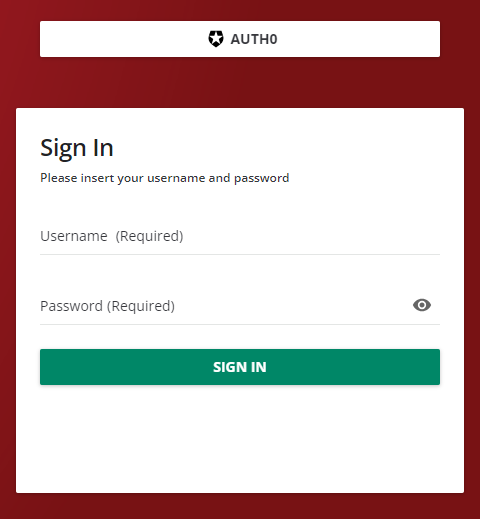
Hi all, we want to move the SSO login button futher up, so users get to see this first rather than the login (which they don’t use)….. We can’t turn off/hide the login buttons as others have suggested otherwise we wouldn't have access (security). Does anyone have any CSS code we could take a look at please?
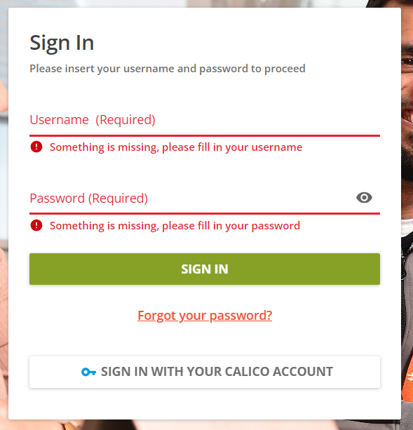
Page 1 / 1
Good morning,
Off-hand I don’t think you can reorder the elements.
I think you may be able to break them up on the page with some CSS (have them sit in a “side by side” kind of a setup). It has been a little since I have had to think along these lines (and we are supporting an SSO project sooner than later) so it would be interesting to see if someone has some further knowledge on this.
@gstager - you ever try tackling something like this?
@cchadford1 - also take a look at this thread.
There seems to be a workaround by triggering the API as an alternative login.
My former learning system supported a non-SSO login landing page as a type of workaround. It had a url that was parameterized with ….=nosso at the end. I hope these guys can support something like that sooner than later.
following
As with all CSS hacks - proceed and test thoroughly for impact on other areas.
I offer this as a starting point as opposed to a thorough solution.
The two values will adjust the horizontal and vertical positions. (left and top)
The first one here (0px) adjusts the left position. Use a negative value to move left and a positive value to move right.
The second value (-400px) adjusts the top position. Use a negative number to move up and a positive value to move down.
My code moves the button upwards by 400 pixels relative to its original position.
Adjust values as desired.
I think if there is way to translate the div that was around the button with it?
It may just get the correct answer from @cchadford1
As always - thank you @gstager.
By the way? I dont mind the taste of crow. Protein is a good thing.
The next level up would be the whole form which would move everything else along with it.
It isn’t elegant - for sure - its a hack after all.
I have heard it said that
HTML is the CONTENT
CSS is how the content LOOKS
JavaScript is how the content BEHAVES
While there are a few CSS tricks to dodge using HTML and JavaScript - without broader access to code in general - I think we might be asking too much of CSS in this case.
@cchadford1 hi! I notice that in your screenshot your SSO button says “Sign in with your Calico Account” was that a custom label you applied, and if so how? We have an OpenID Connect button that I need to change the text on. Any clue how to do that?
Hi @JEntis, we used the Localisation Tool under the settings menu to customise the wording on this, and in many other areas of the platform.
@cchadford1 you are a lifesaver, that is EXACTLY what I needed. Thank you so much!!