Morning Community,
A question - as we work with content off of the shelf - specifically Docebo Content, we are finding that people are having issues connecting the dots with activity after module.
I used to head off stuff like that with setting up a getting started page in other LMSs, but for the most part I thought I found the interface to the course player is intuitive for most. And I really dont think it is the problem of the course container itself.
Take for example this one campaign we recently ran. My first large
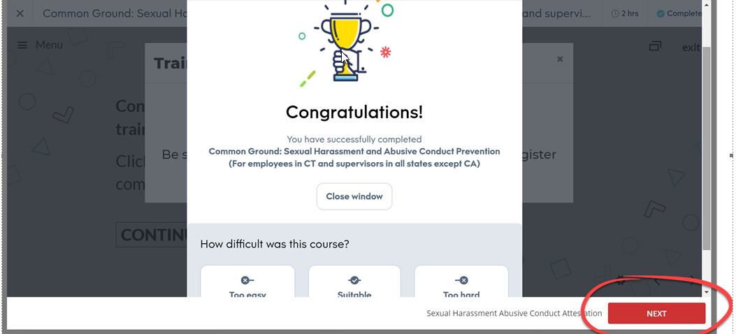
That was until some of my numbers have come back from an important large initiative that involves a course coming off the shelf. We have received a considerable amount of feedback that the messaging at the end of a Docebo Content course is not helping.
This is the one that is causing the problem

Now - where we have tested, and again - and most people get it, and move on to finish off the next step? It is definitely not everyone and from doing years of learning campaigns with learning systems? My numbers are suggesting to me that this feels like a bug to people.
And so I am probably going to have to go down of setting up a getting started page with these courses. And I know I can do that with widgets.
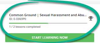
But I thought I should ask - has anyone attempted to resize this corner of the course player with CSS?

It shows people their progress thoroughly.
But how do YOU head this off? There is no way in the world that our choice to bookend “off the shelf” content is unique practice to us.


