Question

Widget box sizes on pages

  • 26 July 2022
  • 3 replies
  • 114 views

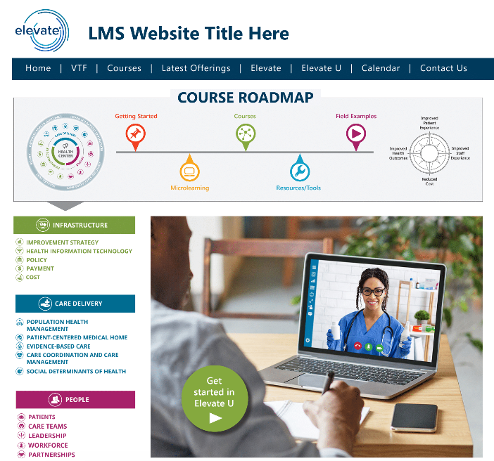
I’m working on creating a prototype page for a client...similar to this. 


(Their design they would like)


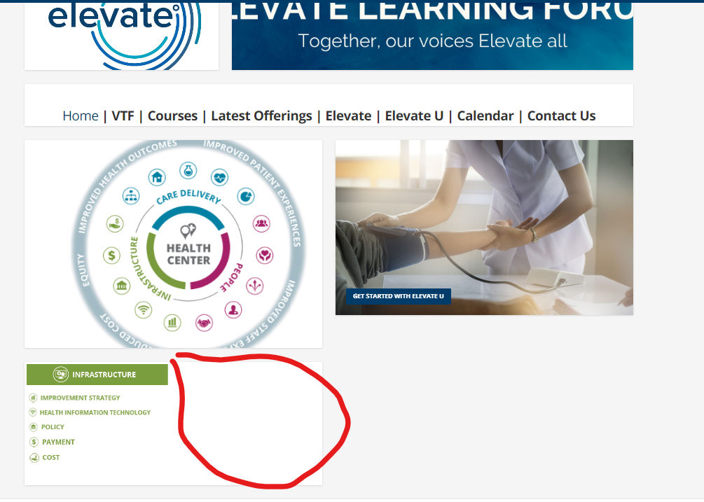
I’m getting closer and closer (please be kind...still a work in progress), however I don’t like the way some of the widget especially the WYSIWYG widget as I’m placing images and then linking to various areas (channels, learning plans, catalogs). I could be just over complicating but how to not have soo much white space and boxy look. Stepping out of my comfort zone and getting more familiar with what more Docebo can do. 


3 replies

Userlevel 7
Badge +5

For a custom page such as you have presented, I would personally step away from all the individual widgets and utilize a single WYSIWYG widget for the entire page.

In the long run it will give you better control over that whitespace but it will likely mean being a bit more CSS heavy

For a custom page such as you have presented, I would personally step away from all the individual widgets and utilize a single WYSIWYG widget for the entire page.

In the long run it will give you better control over that whitespace but it will likely mean being a bit more CSS heavy

Yikes...I was hoping not going that direction...Guess its finally time to dive into CSS :(

Userlevel 7
Badge +5

Yikes...I was hoping not going that direction...Guess its finally time to dive into CSS :(

You don’t have to, of course - no requirement there - but I think flexibility-wise it gives you the most capability. It is the route I would go.

Here is a link where I shared a custom page using a single widget. You can see the difference in block widths I was able to accomplish that way.


Reply