This just in from beta testing
Those non-transparent widgets and the header-bar are problematic, the rest I’m ok with.
Help!
Thanks in advance,
Leo
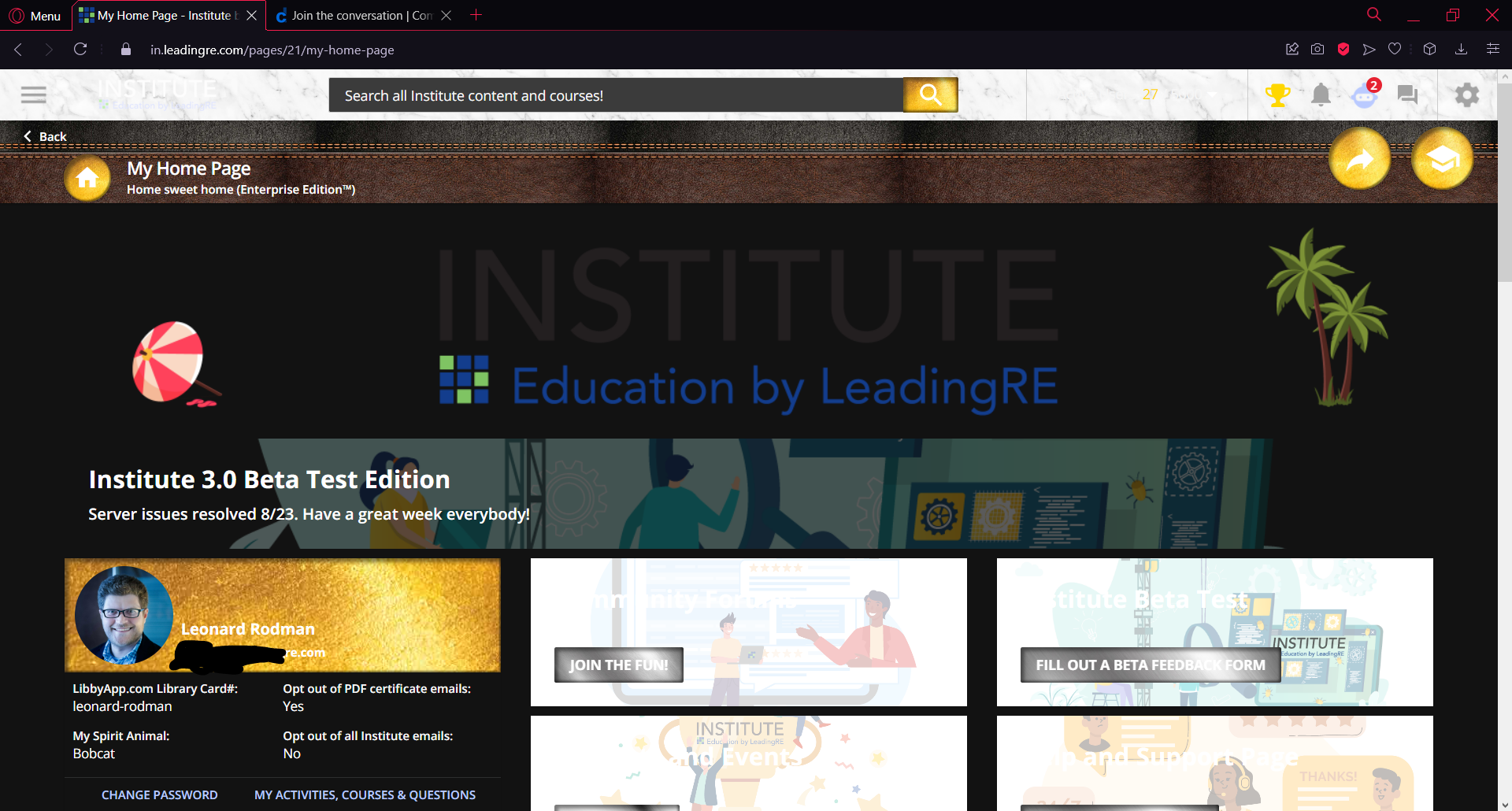
This just in from beta testing
Those non-transparent widgets and the header-bar are problematic, the rest I’m ok with.
Help!
Thanks in advance,
Leo
This is one of the huge drawbacks to doing so much customization without proper full control/support at the system level instead of essentially one editable css sheet.
there is this media query:
https://developer.mozilla.org/en-US/docs/Web/CSS/@media/prefers-color-scheme
but not sure level of support currently.
/*@media (prefers-color-scheme: dark) {
.doc-layout-header .text-grey-mid-permanent .title {
color: black !important;
}
}/*fix dark mode header - not working*/
fail. good idea though.
How about the icon image getting inverted? That's really the only major issue besides the non transparent widgets.
fail
@media (prefers-color-scheme: dark) {
.doc-layout-header .text-grey-mid-permanent .title {
color: blue !important;
}
}
Weird. This works but appears purple in dark mode.
I can live w that.
Still gotta fix the inverted logo.
I mean without more info of what isn’t working can’t help much here. As have said before, you definitely over use the !Important tags which can bite you in things like this. No idea what failed or why based on this. If you want to change an image, use the media query to change the image, that’s pretty straight forward. Or take a re-look at your original changes and find a better balance for your goals in both light and dark themes….
Enter your email address or username and password below to log in to Docebo Community. No account yet? Create an account
Enter your E-mail address. We'll send you an e-mail with instructions to reset your password.