Is there some CSS or other way to adjust the fields displayed in the Calendar Widget? Or maybe this is an enhancement?
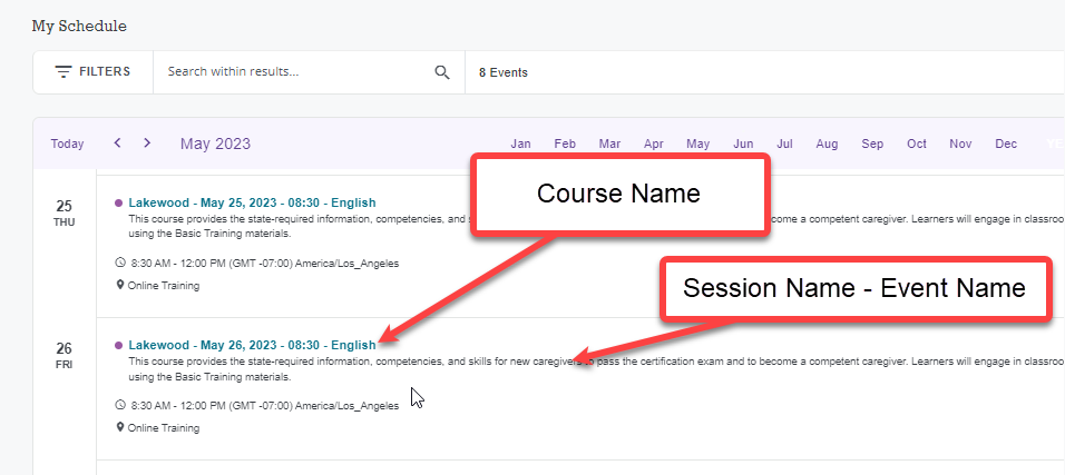
Currently, the Calendar Widget shows the Session Name and Description. The Description is too long to fit well in this position, and if a Learner wants to read the Description, they can click into the item to review additional details.
What would be more helpful in this view is the Course Name, Session Name, and Event Name (or title depending on how you’ve setup your system). It would make more sense on the calendar in all three views.
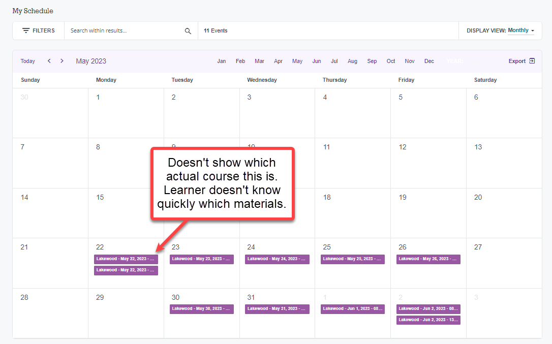
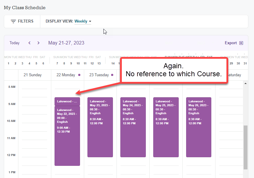
If it can’t be updated for all. Seems like there should be an option to turn on/off which fields to display (similar to My Profile). The current view is not helpful at all for Learners and we should not have to duplicate the Course Name into the Session or Event references.
