Dear all,
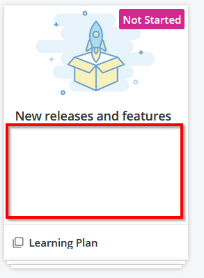
My tiles for Courses or LP are quite empty

And when I look at other online courses platforms… courses/LP are much more appealing

| 
|

| 
|
Is there a way to make our Docebo tiles more appealing for users/customers?
Dear all,
My tiles for Courses or LP are quite empty

And when I look at other online courses platforms… courses/LP are much more appealing

| 
|

| 
|
Is there a way to make our Docebo tiles more appealing for users/customers?
Best answer by gstager
I think what you are seeing is the difference between the Course Catalog view and the Dashboard view.
Can you confirm that your catalog shows the additional detail?
Enter your email address or username and password below to log in to Docebo Community. No account yet? Create an account
Enter your E-mail address. We'll send you an e-mail with instructions to reset your password.