Hi,


I’m creating a page which allows users to decide which catalogue they would like to view.   I ultimately want the page split into sections each with a header e.g. instructor led training, e-learning, etc.  

In the screen shot below I added a title to the first custom content widget ‘instructor led events”, but by doing this the other widgets on the same row do not stay aligned.  As the widgets do not accept a blank space for a title I have top put in a full stop to create the look I want (but obviously this isn't a viable solution).  I don't want to create a new row above as it pushes the rest of the content too far down the page.


So the question is how do I get all the widgets to align up if I want a title in the first widget only (without having to put full stops in the other)


I was struggling with the same and I ended up adding Custom Content boxes instead of using widget titles, but indeed they are taking quite some vertical space event at their minimum height.

An alternative would be to add a row above with an HTML widget - those don’t take that much vertical space if you only put some text in there.


ok thanks


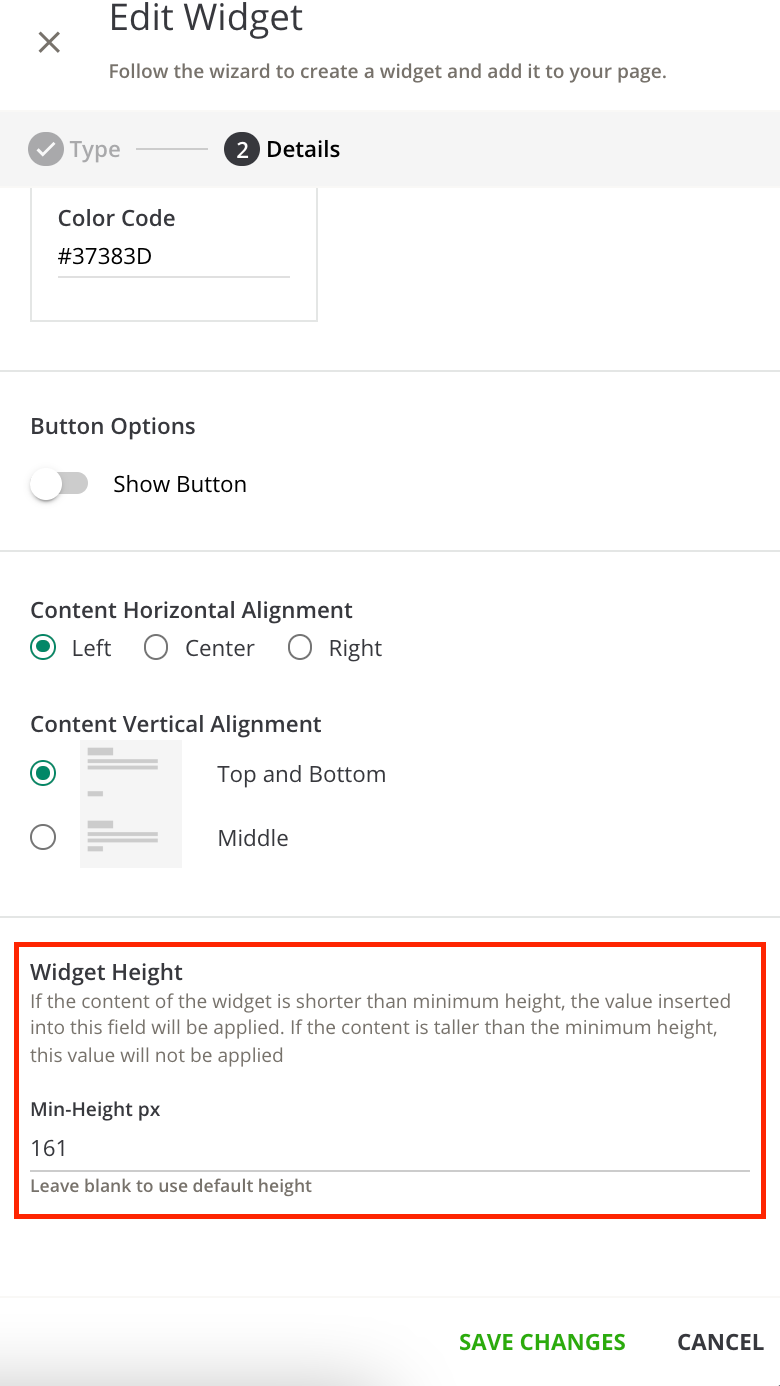
You could add “Instructor Led Events” as the Content Subtitle in the custom content box for the first one.  This will make the first custom content box a little taller than the others, but you can have the other two match the height of the first box by setting a widget height to match the height of the first widget.


You can adjust the height of custom content boxes at the very bottom of the widget set-up panel. It takes a lot of trial an error to get them just right but it’s helpful.


Hi thanks.  its not the height of the widget I'm trying to change, its the space above it.  I think I'll just have to remove the widget title.


Reply