Hi all,

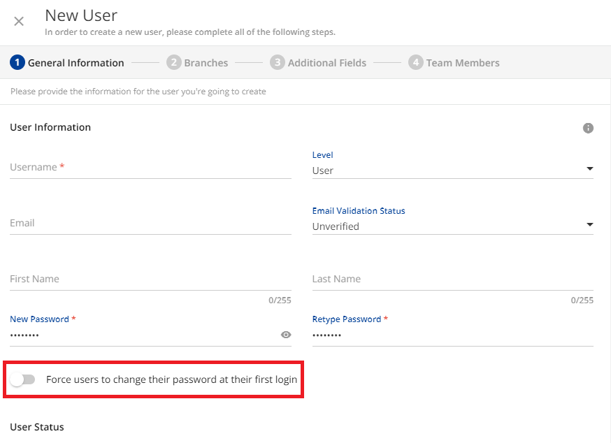
I would like to hide the option shown in the following screenshot. Does anyone know how to hide this with CSS? I’d like to hide it because we never use it and it is easy to turn it on by mistake.
 

Here is a really big and ugly option to try.

As always - be sure to test for conflicts in other areas.

I admit that I cheated on this one and didn’t really try to investigate a lighter option.
That said, it removed the switch on my instance.

/** Removes the Switch for Forcing password change in new user creation panel **/

#doc-layout-page-content > ng-component > div.users-rightpanel > rightpanel-component > div > div.mdl-rightpanel.hyd-shadow-md.bg-white.ng-trigger.ng-trigger-isVisible.ng-tns-c379-7.has-description.has-breadcrumbs.ng-star-inserted > div.ng-tns-c379-7.mdl-rightpanel__body.text-grey-dark.border-grey-light > dcl-wrapper > div.ng-star-inserted > div > div.wizard-content > div > div:nth-child(1) > form > dcl-wrapper > ng-component > div > div:nth-child(2) > div:nth-child(3) {
display: none;
}


Sounds more like a “should the user be able to” or user training problem for those who are getting access to these types of pages, if they can’t remember to not toggle something, I’d be worried of other abilities….


You know, what frustrated me most about that little switch is that I did not observe the expected behavior when using it.

If I create a user manually and assign them a password - I expect that password to be used for the first login. Once logged in the user can simply assign a new one.

Instead, the user immediately has to go through a “Forgot Password” link which is not intuitive and they never use the one I assigned in the first place.


100% agreed @gstager the behavior is not the normal/expected behavior for how that setting works in almost every other system i have come across too. Should just be use the password once, you move straight to a screen of enter old password, pick new password, verify new password, and on submission logged in.


Sounds more like a “should the user be able to” or user training problem for those who are getting access to these types of pages, if they can’t remember to not toggle something, I’d be worried of other abilities….

Hi @Bfarkas - The issue with this toggle switch is that it can be activated by accidentally clicking anywhere in the area indicated by the red frame below. If the active field was limited to the switch itself, it wouldn’t be a problem.


Thanks for the code @gstager - I really appreciate your help!


Sounds more like a “should the user be able to” or user training problem for those who are getting access to these types of pages, if they can’t remember to not toggle something, I’d be worried of other abilities….

Hi @Bfarkas - The issue with this toggle switch is that it can be activated by accidentally clicking anywhere in the area indicated by the red frame below. If the active field was limited to the switch itself, it wouldn’t be a problem.


Hmm, so if that’s the case, an alternative approach to the css change might be better, that sounds like an over all container for the interaction, which could then be adjusted back to just the toggle size and leave in as an option for folks if ever needed. Just throwing it out there. 

Yes, that would be perfect!


Hmm, so if that’s the case, an alternative approach to the css change might be better, that sounds like an over all container for the interaction, which could then be adjusted back to just the toggle size and leave in as an option for folks if ever needed. Just throwing it out there. 

You’re a pretty smart cookie @Bfarkas 

The switch and the label were pretty strongly tied together so I ended up reducing the size of that hit box (which hid the label text) - and put the text back in on the line above

Not the best fix but perhaps acceptable…? At least now the hit box is limited to the switch.

At least on my platform it was.

/** Reduces the size of the hit box **/
/** This also hides the label text **/

#doc-layout-page-content > ng-component > div.users-rightpanel > rightpanel-component > div > div.mdl-rightpanel.hyd-shadow-md.bg-white.ng-trigger.ng-trigger-isVisible.ng-tns-c379-7.has-description.has-breadcrumbs.ng-star-inserted > div.ng-tns-c379-7.mdl-rightpanel__body.text-grey-dark.border-grey-light > dcl-wrapper > div.ng-star-inserted > div > div.wizard-content > div > div:nth-child(1) > form > dcl-wrapper > ng-component > div > div:nth-child(2) > div:nth-child(3) {
width:45;
}

/** Re-inserts label text above the switch **/

#doc-layout-page-content > ng-component > div.users-rightpanel > rightpanel-component > div > div.mdl-rightpanel.hyd-shadow-md.bg-white.ng-trigger.ng-trigger-isVisible.ng-tns-c379-7.has-description.has-breadcrumbs.ng-star-inserted > div.ng-tns-c379-7.mdl-rightpanel__body.text-grey-dark.border-grey-light > dcl-wrapper > div.ng-star-inserted > div > div.wizard-content > div > div:nth-child(1) > form > dcl-wrapper > ng-component > div > div:nth-child(2) > div:nth-child(2)::after {
content: "Force users to change their password at their first login"
}


Thank you @gstager - it works perfectly!


You know one advantage of having to re-add the text is could easily tweak it here, put like WE ALMOST NEVER USE THIS, or you know something more subtle. 


Hi @gstager 

I just noticed that the hit box has returned to its original size. I haven’t made any changes to the CSS, so do you think it might have been affected by a platform upgrade?


Hi @gstager 

I just noticed that the hit box has returned to its original size. I haven’t made any changes to the CSS, so do you think it might have been affected by a platform upgrade?

Interesting.

I pasted the code back into my CSS for test and it worked OK so I cannot suspect a platform change.

I did run into an instance with the CSS for removing a link where some IDs were changing as pages were used. Read more on that issue here.

At any rate - it makes me wonder if a similar thing isn’t going on in this case as well.

What if you do a browser refresh? Does that allow the CSS to work again?


@gstager I’m not not sure what’s going on, but the CSS is now working again. I didn’t do anything, just booted up the platform this morning and it was fixed!


Reply