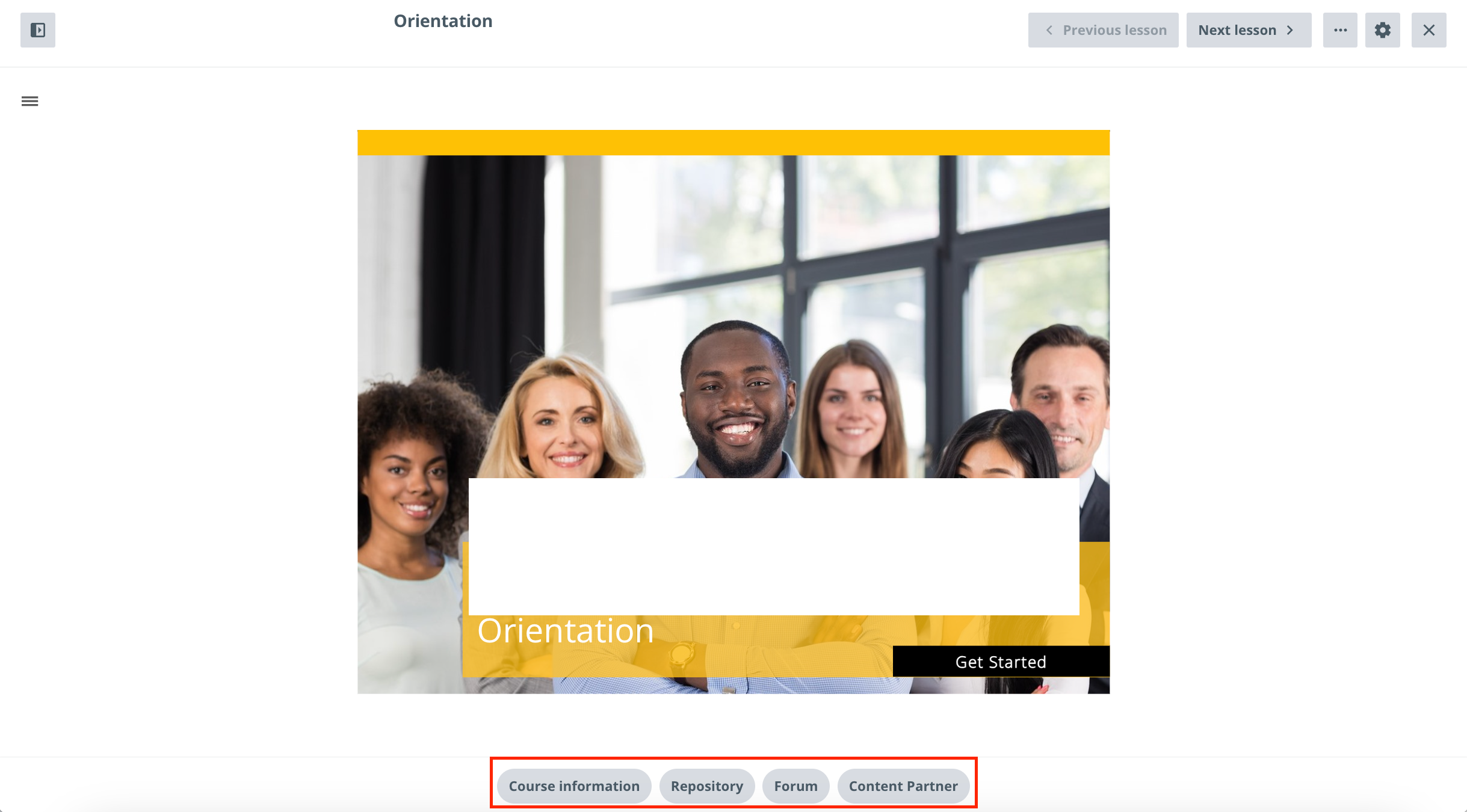
Has anyone noticed that when in Focus Mode (in sandbox), the order of the widgets is changed a well as the behaviour.
Without focus mode, it looks like this:

With Focus Mode ON, it looks like this...notice the Content Partner moves to the end (which I prefer) and the Course Details is removed; not sure why + the Course description widget is now named “Course Information” this can be confusing if you use different settings on various courses.
Is this known or bug? Anyone else see the same results?
As well, when IN Focus mode, when you click on a widget, it opens an overlay from the bottom of the page and covers the content, however when NOT in Focus Mode, the content window stays in place and the user is brought to bookmarked space below the content window.

Not sure if this is intended but the experience between the 2 settings should be similar; not as different as they are today..
Would love to hear your thoughts.
Thanks


