Question

Having the 'About this course' tab appear by default

  • 14 June 2021
  • 9 replies
  • 93 views

Userlevel 6
Badge +2

Question most likely for Docebians…

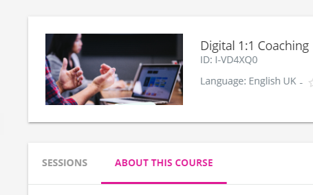
If I have an ILT with no sessions planned I would like the ‘About this course’ tab to appear instead of the default ‘Sessions’ tab that just says there are none.

Is there a way in CSS that we can amend this to show it by default?


9 replies

Userlevel 7
Badge +7

@np11 I agree...i thought I had already seen an idea for this but I did a quick search just now and couldn’t find anything on this topic...perhaps you should post one and I’ll surely vote on it. Thanks.

This was one that may be close but it has no description other than the title: LMS-I-2915

Userlevel 7
Badge +5

Bringing this back up because I’m curious to know if anyone has been able to get around this at all?  I see there was an idea to have a link that opens to this tab directly but that idea was closed.

If we are providing helpful links in our course descriptions in our ILT courses, users have no idea those links exist because the sessions tab is open by default. 

Userlevel 7
Badge +3

yeah. this is a real bad spot of user experience still for sure, have yet to see or think of a great work around for it. 

Userlevel 6
Badge +1

So the default, which is the sessions, now appears blank if there are no sessions.  This is very poor from the users point of view.  Having the ‘about this course’ the default makes much more sense.  I refuse to believe this isn't an easy thing to implement.


Userlevel 7
Badge +3

We literally make a session called “THIS IS NOT A SESSION. Do NOT REGISTER” With other info and is scheduled years in the future just to have something on the page so the full tab set shows up to switch to, but the number of people who register still was enough to build a webhook process to immediately unenroll….

Userlevel 6
Badge +1

I love your creativity but we really shouldn’t have to create such a big sticky plaster just to advise users there are no sessions.

Userlevel 7
Badge +3

I love your creativity but we really shouldn’t have to create such a big sticky plaster just to advise users there are no sessions.

100% agree, I was not suggesting anyone should do it, was more just data for the feedback on the thread for the dev team.

Userlevel 6
Badge +1

Actually I’m wrong.  We added some CSS to hide some new text that was confusing people on that session page when there were no session. I forget what it was but it had the picture of the spaceship and said something like contact your IT administrator.  I think they have updated the text and so I have removed the CSS.  So slightly better than i thought...however i would much rather land on the ‘about this course’ first.


Userlevel 7
Badge +3

Yeah, that text was less than useful I seem to remember, and we couldn’t modify it to something better.

Reply