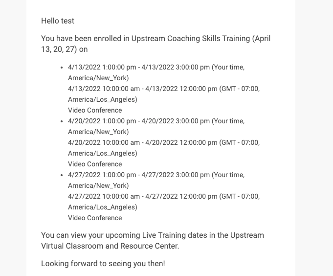
Hi I’m doing a notification for a workshop, I was wondering if anyone had found any way to remove some of the information showing when using the esession_dates] shortcode. Or found a way to style it. 

Currently the two sessions are really close together and I don’t need to see that it’s a video conference. I like that it has the ‘your time’ feature as this will be sent out to people in at least three time zones so doing a notification for each will be a bit of a pain. 
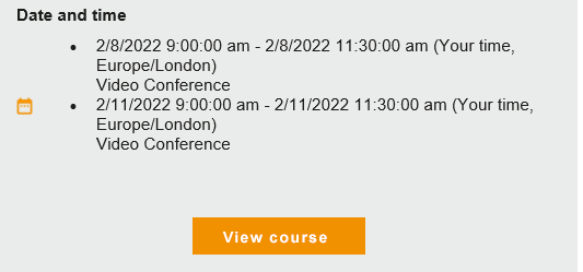
 

@Lucy.blake none that I can see. Tried formatting the short code with HTML in the past and that had no effect...it must be preformatted. I believe there are some ideas posted on this from a while back so you might look to up vote those if you can.


@Lucy.blake agree 100% we could really use something that is more readable and understandable especially when the user is in a different timezone than the default timezone on the LMS. One session I have consists of 3 different events and days and the way it lists it out is extremely hard to understand the date and time of the ILT. Example below.  A few suggestions for Docebo to fix this quickly could be: 

  • remove the seconds in the time code
  • differentiate the formatting between date and time
  • only display the time zone of the participant
  • remove the GMT - ## , there are too many numbers here - someone could easily think that is the time it is starting. etc. 

Thanks,

Alexis 


hi folks, vote on this if you feel it represents what you'd like to see improved for this short code…


Reply